


Luminaire
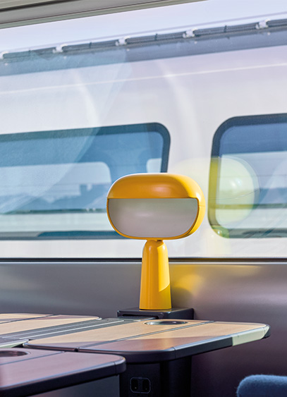
Unveiled on November 6, SNCF’s next-generation TGV features interior designs reimagined by the agency AREP and the Japanese studio Nendo. From furniture and lighting to the layout of the spaces, this new version aims to evolve the train travel experience.
After several years of development, the next-generation TGV, formerly known as TGV M, has just been unveiled. To design its new interior, SNCF Voyageurs partnered with AREP, an agency specializing in mobility projects, and the Japanese studio Nendo, founded by Oki Sato. Together, they worked on a new interior identity with the goal of offering spaces that are more comfortable and better suited to passengers' needs.
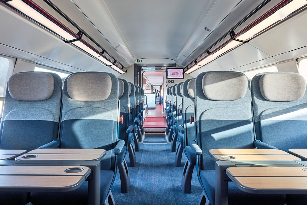
Spaces reimagined around user needs
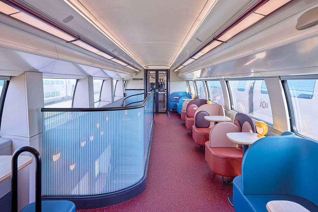
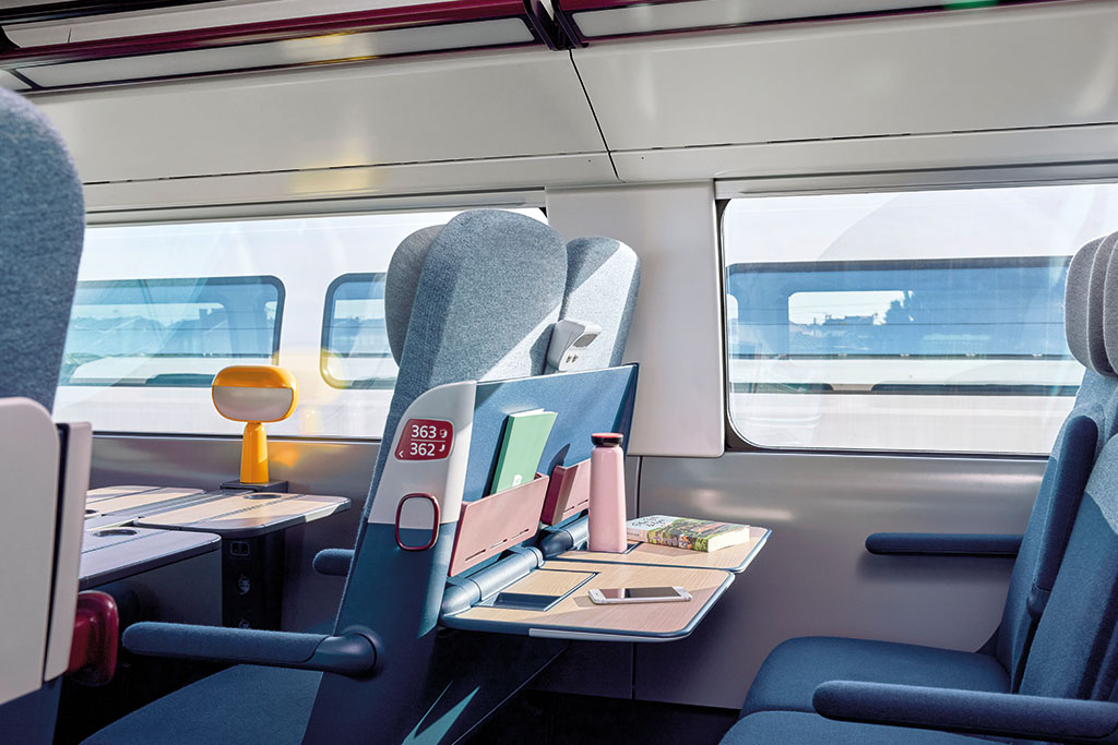
From furniture and circulation areas to materials, colors, and lighting, the entire train interior has been overhauled to create a warmer atmosphere while accounting for the constraints of rail travel. The new seats have been redesigned in terms of both shape and materials. Upholstered in a 3D-knitted fabric, they feature a structure designed to better support the back. In first class, the seats have been widened and include tables inspired by secretary desks, while in second class, the thinner backrests provide more legroom. Common areas have also evolved, with the addition of benches and relaxation zones, while the windows have been enlarged to bring more natural light into the carriages.
Light at the heart of the project
Among the other major innovations is a table lamp designed by AREP and Nendo, which revisits an object that has been present since the first generations of TGV. Recognizable by its rounded shape and yellow color, it was developed with the manufacturer Brossier Saderne, which also offers it to the public in its catalog in three colors: yellow, red, and blue. The general lighting has also been rethought, with an LED system that automatically adapts to the different stages of the journey. Brighter in the station, it dims by half during the trip to create a more subdued ambiance. This attention to light is part of the overall approach for this new version of the TGV, where every element contributes to the train's interior design.
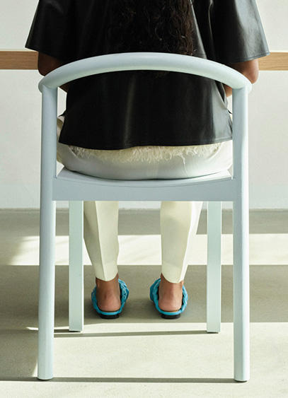
Founded by Ruben Hutschemaekers and designer Sebastian Schönheit, the German furniture brand ARWENN launched in September with an initial collection of over 40 products, ranging from furniture and lighting to accessories and small objects. The brand aims to make design accessible in every sense.
After several weeks of social media teasers, the Berlin-based furniture brand ARWENN finally debuted in early September with an initial collection featuring a wide variety of product types, some of which were created in collaboration with international designers. These include Maria Jeglińska-Adamczewska, Studio Œ, Jörg Schellmann, and Unknown, Untitled. ARWENN aims to offer simple yet thoughtful design without neglecting the customer experience, which is central to its approach. Founders Ruben Hutschemaekers and Sebastian Schönheit share their vision.
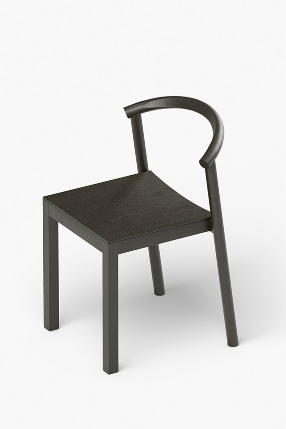
How did the idea for ARWENN come about?
ARWENN was born from a desire to meet the expectations of today's consumers. We believe that good design should combine a strong brand identity, affordable prices, uncompromising quality, and immediate availability. Too often, customers have to choose between these criteria. With ARWENN, we wanted to bring them all together.
You launched ARWENN in September, unveiling a collection of over 60 products. What were the main challenges in launching a new design brand? How long did it take to bring this project to life?
It took almost two years from the initial idea to where we are today. We started almost from scratch, as we had to build the brand identity, the supply chain, the business structure, and, of course, the collections themselves. Bringing all these elements together in such a short time was a real challenge. But having the right people around us from the start made a huge difference.
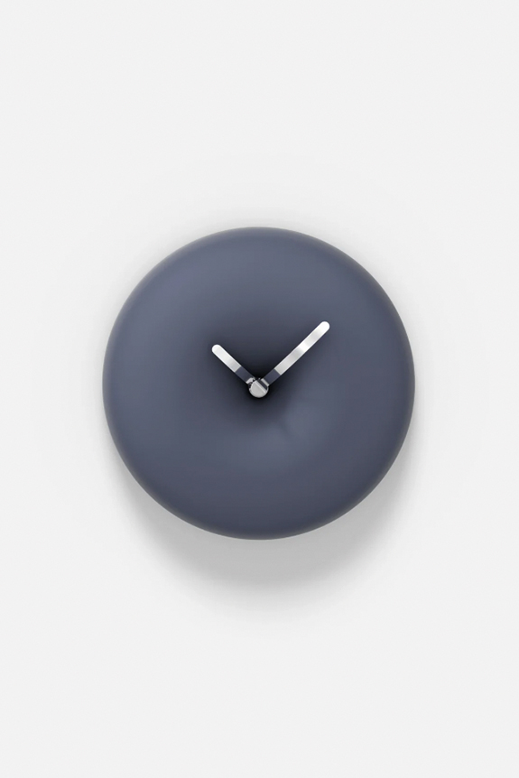
If you had to summarize the identity and DNA of ARWENN in a few words, what would you say? What vision of design do you want to convey through the brand?
"Simplicity with a twist." That probably sums up ARWENN best. This idea applies as much to our products as it does to the overall experience we want to offer our customers. We stand for simple, thoughtful design, but always with an unexpected element that gives it character. Ultimately, nothing too complicated, but never anything mundane.
For this first collection, you collaborated with several international designers. How did you select them?
From the start, we made a promise to ourselves: to work only with people we enjoy collaborating with. Obviously, talent and creativity are essential, but mindset, work ethic, and a shared desire to create something meaningful are just as important. Over the years, we have had the opportunity to meet many inspiring people whose work and personality we admire. It is particularly rewarding to see some of these relationships take shape within the ARWENN collections today. Each designer brings a different perspective, but we all share a common vision of what we want to develop.
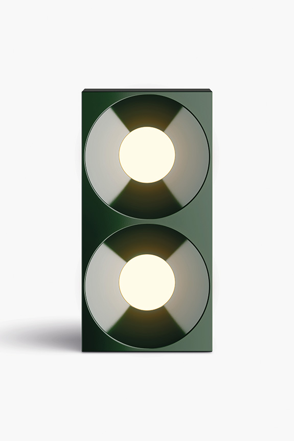
ARWENN also has its own in-house design team. How does it work and what role does it play in the development of the collections?
Design and product development are at the heart of what we love to do. It was therefore natural for us to keep this creative energy within the brand. We enjoy collaborating with external designers, but some projects also start with a very specific idea from the beginning. Sometimes, the challenge is less about exploring a new creative direction and more about finding the smartest and most efficient way to design a good product. In those cases, our internal team takes over, which allows us to approach design from different angles while staying close to the realities of production, pricing, and product availability.
How is the production of your pieces organized and where are they manufactured?
All of our furniture is manufactured in Europe, with industrial partners located in Denmark, Germany, and Slovakia. Our lighting collection is produced in China, where we found a particularly high level of technical expertise and industrial development. The production capabilities there are impressive, especially regarding innovative manufacturing processes. For all our collections, we place great importance on optimizing packaging and transport. "Flat-pack" solutions play an important role in this approach, as they allow us to reduce transport volumes and, ultimately, make the products more accessible.
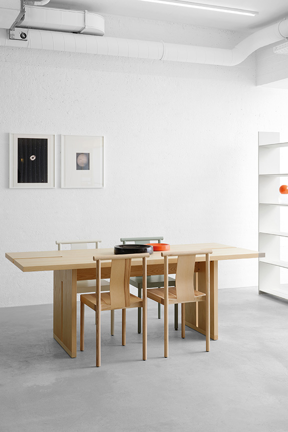
You opened your first boutique in Berlin at the end of October. What does this new milestone represent for ARWENN?
Opening our first boutique in Berlin marks a significant milestone, as it brings the entire ARWENN universe together in one place. It is a space where the brand, our collections, and the customer experience truly come to life. We view physical retail locations as an essential component of our approach. It is not just about displaying products, but about creating an experience that differs from what consumers are typically accustomed to. Berlin is our starting point, and we are excited about the prospect of expanding this concept to other cities.
You advocate for making design more accessible, both in terms of price and product availability. How have you integrated this ambition into the development of your collections? And how do you manage to reconcile accessibility, quality, and craftsmanship?
This is probably our greatest challenge, but also one of the most important principles upon which ARWENN is built. Offering accessible prices, quality products, authentic materials, efficient inventory management, and a great customer experience is far from simple. It requires looking at every decision from multiple angles. For us, accessibility is not something added at the end of the design process: it must be integrated from the very beginning. Every product must be consistent on creative, technical, commercial, and logistical levels. This philosophy is reflected in every product in our first collection. There are certainly still areas where we can improve, but we have laid a solid foundation. And that is precisely what makes this process so interesting: constantly seeking solutions to make design more accessible without losing what makes it unique.
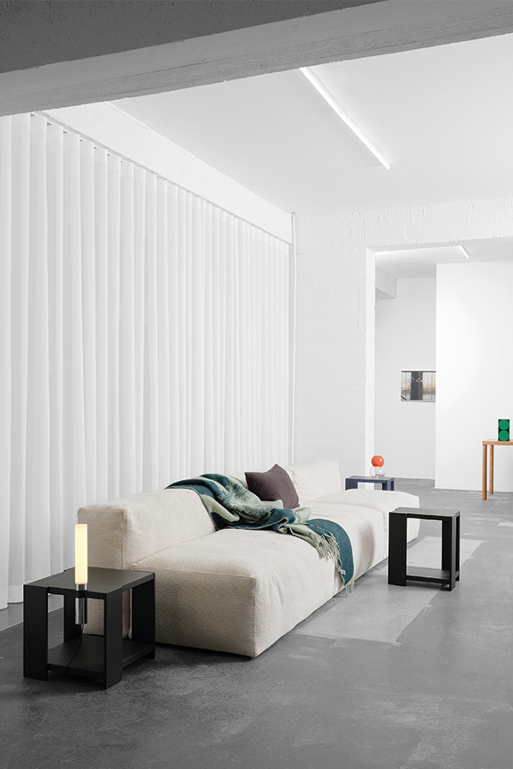
Bottom left: DADO shelf, design: Unknown Untitled © ARWENN
Bottom right: BASE sofa, design: ARWENN © ARWENN
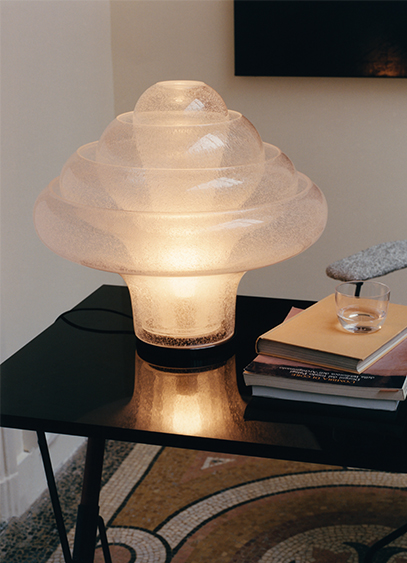
Italian designer Carlo Nason, who passed away last May, leaves behind a multitude of glass creations. Among them is the Lotus lamp, designed in 1969 and reissued by GUBI.
LT305. A somewhat cryptic name that probably doesn't mean much to you. Yet, behind this reference lies the Lotus Table Lamp. Nicknamed as such by collectors due to its shape, the model created in 1969 is now being reissued by GUBI. It serves as a tribute to its designer, Carlo Nason, who passed away in May at the age of 91. Born in Murano into a family of glassmakers, the creator left behind a vast array of objects, including vases, some of which were acquired by the Corning Museum of Glass in New York as early as 1959. These decorative typologies were quickly set aside in favor of lighting, which the Italian designer pursued in collaboration with the Murano-based specialist AV Mazzega, led by his longtime friend Gianni Mazzega. This partnership left a lasting mark on the designer's career, which was punctuated by successes including the Lotus model.
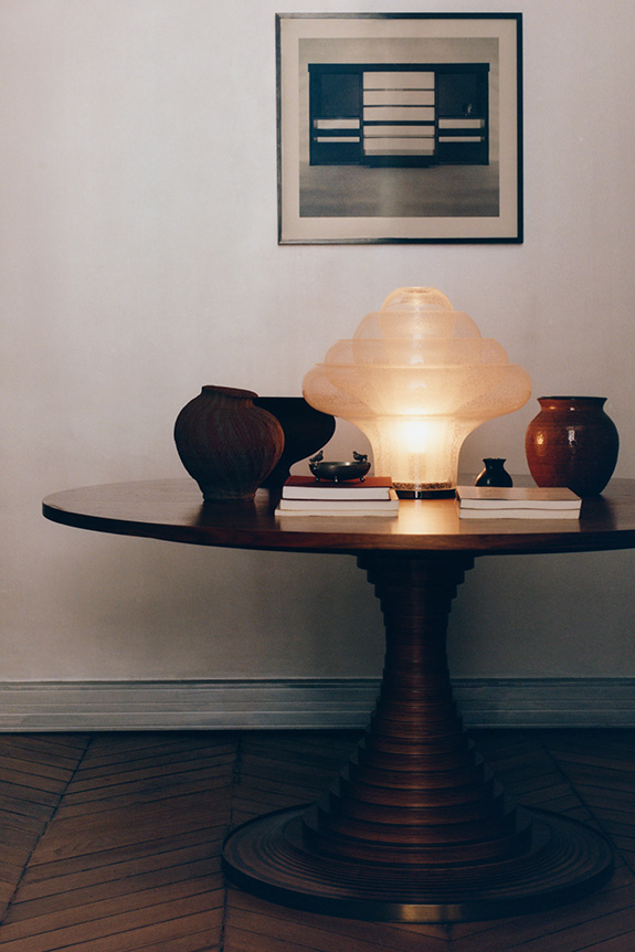
Eternal flower
Inspired by Northern European modernism and the futuristic curves of the Space Age, Carlo Nason quickly instilled an experimental dimension into his practice of blown glass. From this fusion, the LT305 was born—an iconic model driven by a new formal language. A true geometric architecture, the design combines four diffusers nested within one another. Assembled around a steel structure—now in black chrome—the globes play with light and translucency thanks to the pulegoso technique. Developed in the 1920s, this process involves trapping small air bubbles within the material. It is a technique that Carlo Nason re-employed here to create an evanescent flower.
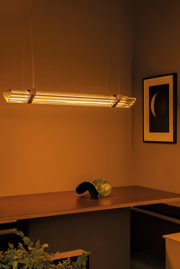
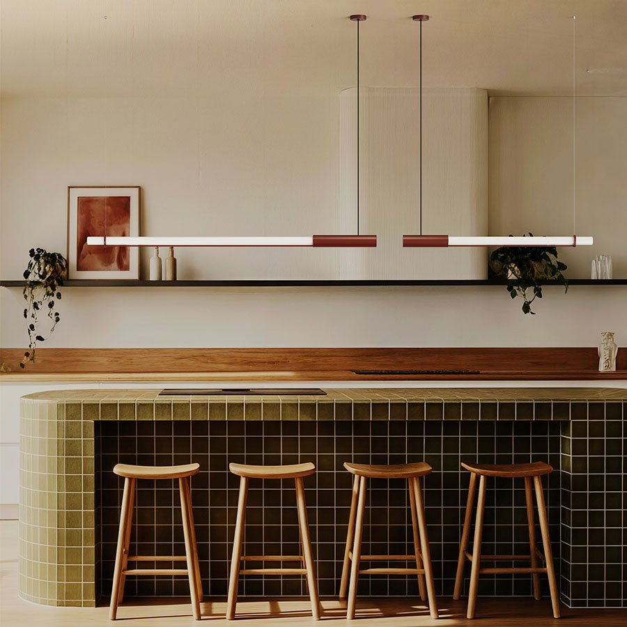
Conceived by Thierry Dreyfus for DCW éditions, the Seagull collection is expanding with a new 160 cm pendant lamp. A change in scale that maintains the luminaire's founding principle: to reveal the light rather than the lamp itself.
Making light a presence without letting the fixture dominate the space: this is the philosophy behind Seagull, imagined by Thierry Dreyfus. To design it, the designer drew inspiration from Frank Lloyd Wright's Johnson Wax Building, built in the late 1930s, where glass tubes diffuse exterior light into the interior. Thierry Dreyfus transposes this sensation to a domestic scale through a succession of horizontally arranged light tubes, in a composition with Art Deco accents.
New proportions, new possibilities
Already available in a 120 cm version, Seagull now comes in a 160 cm format, designed to complement larger tables. Ideally suspended between 80 cm and 1 m above the tabletop, the fixture stretches the light rather than concentrating it, creating a "roof of light," to use the words of Frédéric Winkler, president and founder of DCW éditions. A new scale that also opens Seagull up to other uses, because more than just a simple light source, the pendant can become a true line in space, capable of following architecture and guiding the eye. An approach that extends the research of Thierry Dreyfus, known for his light installations and collaborations with Comme des Garçons, Raf Simons, and Peter Marino. The goal is to stage the light, here in a version designed for everyday life.
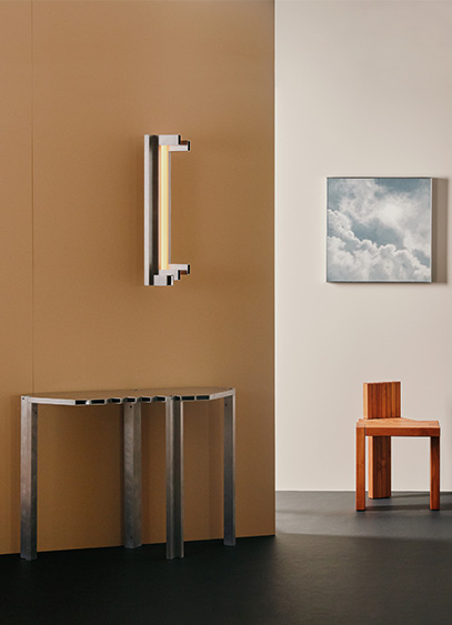
Triode recently opened 28, a new Parisian space designed as a creative playground for designers. To kick things off, Jean and Oliver Pelle, founders of the American studio Pelle, are presenting "Metallic Reverie," an exhibition featuring ten original pieces centered on metal and light.
Neither a gallery nor a showroom, 28—located at 28 rue Jacob in the 6th arrondissement—aims to offer a new exhibition format. Conceived by Jacques Barret, founder of Triode, this new space invites the designers represented by the firm to go beyond simply showcasing their collections. For each exhibition, they are given carte blanche to reveal a more personal side of their creative world. For this inaugural invitation, Triode reunites with Jean & Oliver Pelle, four years after their first joint exhibition in Paris.
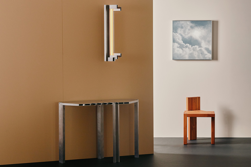
Two perspectives on material and light
Architects by training and based in Brooklyn, Jean and Oliver Pelle have developed a practice that sits at the intersection of architecture, craftsmanship, and experimentation. For the "Metallic Reverie "exhibition, the duo created ten works specifically for 28, all united by a single material: metal. Jean Pelle presents her Fountain lighting series, inspired by memories and landscapes observed in Korea and along the American coast, while Oliver Pelle explores the intersection of light, material, and space through his Light Objects. Two distinct styles, yet united by a shared focus on materiality. It is a fitting way to inaugurate 28 by showcasing exactly what this new venue aims to reveal: the intimate personality of the designers.
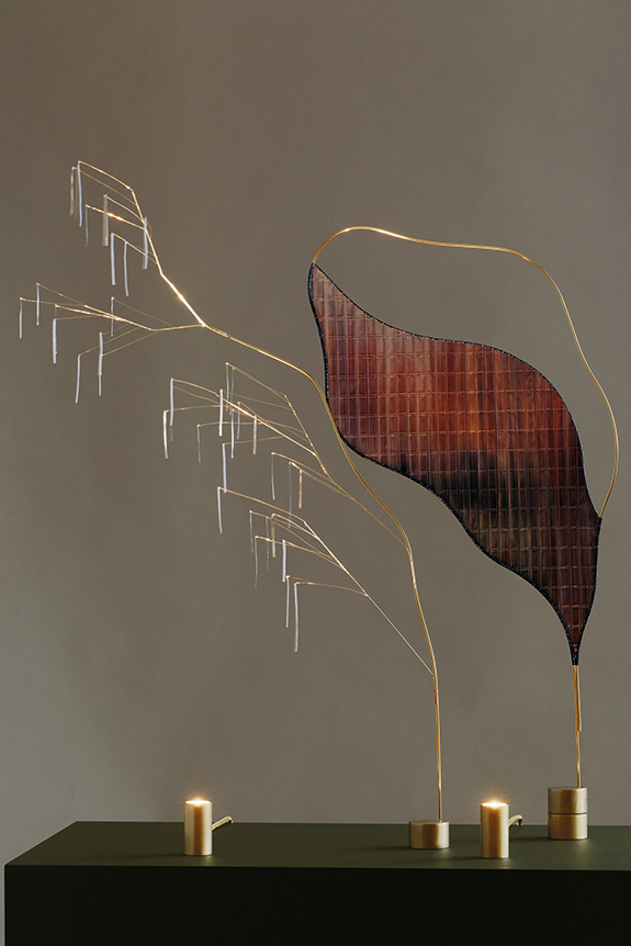
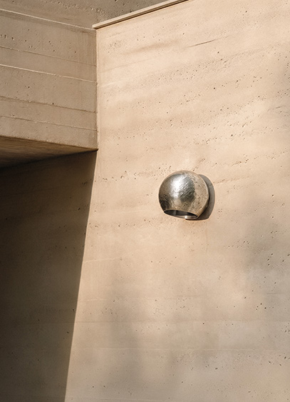
For Paris Design Week, Garnier & Linker unveiled Aurora, its first collection of outdoor lighting. This marks a new milestone for the studio as it adapts its signature approach to material and light for new applications.
With Aurora, Garnier & Linker blurs the lines between indoor and outdoor spaces. For this first foray into outdoor design, the studio does not break from its formal vocabulary but chooses instead to extend it. Several existing pieces have been reinterpreted, notably through the introduction of a new material: cast aluminum. Previously available in bronze or plaster, these light fixtures now take on a more architectural expression, adapted to the demands of outdoor use without sacrificing the studio's unique identity.
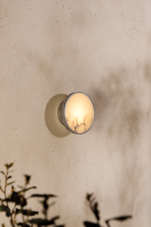
Material as a guiding thread
Used on its own for the Nezu and Kora wall lamps, or paired with alabaster for the Teree and Theo models, cast aluminum enhances the duo's ongoing exploration of materials and their interaction with light. In addition to these models, the collection features six new pieces: Aura, Cronos, Eos, Gaia, Retina, and Thala. Developed in the studio's workshop near the Fontainebleau forest, the collection continues a design philosophy where material and texture define the object. While aluminum naturally meets the requirements for outdoor use, these pieces are also designed to fit seamlessly into interior spaces. Presented as the first chapter of a growing range, Aurora aims to rethink outdoor lighting by breaking free from traditional conventions to fully integrate it into the studio's design language.
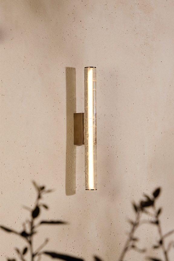
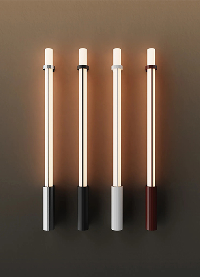
DCW éditions presents IN FINE, a new lighting collection designed by Gaëlle Lauriot-Prévost and Dominique Perrault, continuing their ongoing work with tubular forms.
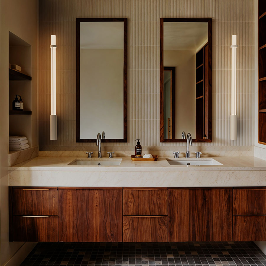
Since 2017, DCW éditions has been developing a family of lights inspired by the industrial world with Gaëlle Lauriot-Prévost and Dominique Perrault. With IN THE TUBE launched in 2015, followed by IN THE TUBE 360° three years later, and versions available as wall lights (FLAPS) or pendants (WINGS), the two designers continue their exploration of the illuminated tube. Introduced in 2026, IN FINE completes this evolution. The collection pairs an opal glass tube with a faceted metal base, complemented by an adjustable metal ring. Available in various lengths and finishes, the lights can be installed indoors or outdoors, as wall or pendant fixtures, either individually or in compositions.
The evolution goes beyond the design. The driver is now integrated into the fixture for easier installation. The manufacturing process uses corrosion-resistant aluminum, stainless steel fixings, and an IP65 rating for wall-mounted versions (IP44 for pendants), making them suitable for seaside use. With this new collection, DCW éditions continues to develop a formal language initiated nearly a decade ago, where industrial references are adapted for architectural and domestic lighting applications.
Through July 20, DCW éditions is presenting the exhibition "Il corpo della materia" in Venice. It is an opportunity to showcase the publisher's products within the historic setting of the Gothic church of Madonna dell'Orto.
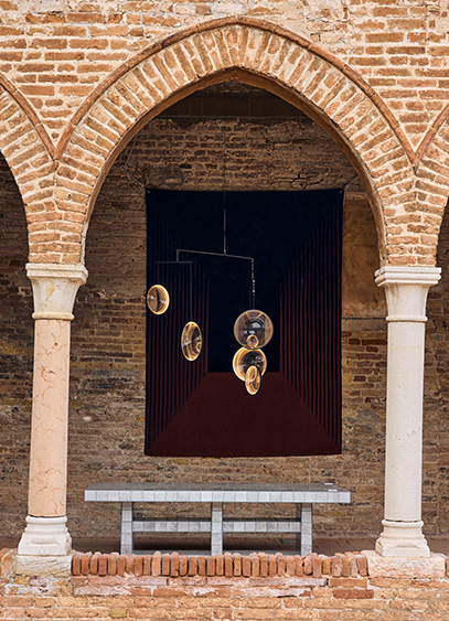
Could there be a better place than Venice to showcase glassmaking expertise? For the first edition of Bel Ouvrage, the French brand DCW éditions and its label 10 HEURES 10 are taking over the cloister of the Venetian Gothic church of Madonna dell'Orto through July 20. Titled "Il corpo della materia" (The Body and the Matter), the exhibition brings together some fifteen contemporary creators and their works, highlighting exceptional craftsmanship. This showcase was curated by Carole de Bona and designed by Andrée Putman Studio within this Renaissance-era setting. Here, the weathered brick architecture contrasts with the formal precision of contemporary glass and metal. Set up as a semi-outdoor showroom, the cloister offers a path defined by the rhythm of the colonnades and the orthogonality of the courtyard, balanced by the free-flowing volumes of the lighting fixtures on display. It is a way of confronting eras and styles in a symbolic journey dedicated to conveying the idea of timelessness so dear to the brand—a vision achieved through the fusion of modernity and heritage. Where architecture is inhabited by design, light seems to breathe new life into it.
Bel Ouvrage 2026 - Venice ©Luca Bonnefille
At Milan Design Week, Davide Groppi unveiled new pieces that continue a long-standing pursuit: making light a sensitive presence capable of transforming a space without ever imposing itself. At its Milan showroom on Via Manzoni, the lighting brand presented six notable new designs centered on movement, illusion, and structure.
Umasi: light in motion
For the delicate Umasi pendant lamp, Davide Groppi explores a new dimension of domestic lighting: mobility. With a shade that slides along a cable, it can move from ceiling to floor in a single motion. The light, filtered through several layers, diffuses without ever appearing directly, creating an enveloping atmosphere.

Vera: the art of disappearing
Encased in a borosilicate glass volume, the lamp reveals a light source that seems to float in a void when switched on, only to disappear completely when turned off. The optical device, based on refraction, produces light that is simultaneously direct, indirect, and diffused, all while keeping its mechanics hidden.

Calma S & Calma T: the essential form
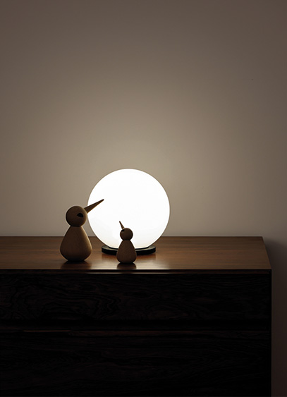
With the Calma range designed by Alberto Zattin, the collection is completed by a universal figure: the luminous sphere. Available as a pendant—Calma S—and a table lamp—Calma T—it features triple-layered blown opal glass that diffuses a soft, uniform light. In the pendant version, the sphere appears to float with lightness, while as a table lamp, it becomes a luminous, almost domestic anchor point.

Carroponte: structuring light
The Carroponte system offers a more architectural take on lighting. This modular composition transforms the electrical track into a spatial path. Positioned freely, it traverses the space wherever light is needed for specific tasks. It becomes a compositional tool, as most Davide Groppi pendants and small lights can be adapted to create custom arrangements as desired.

IPE and OcchiOlinO: two new outdoor designs
For its outdoor lighting, Davide Groppi extends its philosophy with products that are both technical and sensitive. First is OcchiOlinO, where light takes the form of an insect perched on an almost invisible stem, casting a delicate presence across the landscape. Conversely, the IPE collection, designed by Alberto Zattin and available as a Bollard or P wall lamp, asserts a more architectural language, combining robustness and precision through its adjustable spotlights and anodized aluminum finishes. These two complementary approaches reflect a desire to integrate light into the environment without dominating it.
Captions: IPE Bollard outdoor light, designed by Alberto Zattin, and OcchiOlinO © Davide Groppi

Driven by a desire to offer products that combine design, sustainability, and emotion, the Spanish brand Faro Barcelona showcased its 2026 novelties and trends at its Parisian showroom, blending aesthetics with technical innovation.
"Our goal is to offer lighting that carries meaning, provides a sense of well-being, and integrates harmoniously into the spaces where it is placed. We want to create emotion through light."explained Caroline Perez, Sales Director for France, during the presentation of the 2026 trends at the brand's Parisian showroom on Rue d’Uzès. The presentation focused on innovation, design, and sustainability, unveiling various new indoor and outdoor products, as well as innovations in their ceiling fan models, another of the brand's flagship product lines.
Dôme, lighting with a 70s vibe
Conceived by Faro Lab, the brand's in-house design team, the Dôme collection is a complete range consisting of seven models, including wall lamps, pendants, and table lamps, available in several sizes. Its spherical design diffuses a warm, inviting light that can adapt to any type of residential or contract project.

Lumina, the collection to compose as you wish
With a more architectural look, Lumina was designed by Catalan designer Carrasquet, a loyal collaborator of the brand. This collection consists of ribbed glass modules, inspired by link necklaces found in jewelry, which can be hung horizontally or vertically for limitless compositions with a poetic and aesthetic result.

Cata, pure elegance
The Cata papyrus lighting collection, created by designer Marina Mila, is defined by its finesse and lightness. It is expanding with the addition of a pendant and two wall lamps, complementing the existing range of table lamps.

Toba, Narita, and Muna: outdoor lighting in all its forms
All three designed by Carrasquet, the Toba, Narita, and Muna outdoor collections each stand out for their unique design and functionality, adapting to all types of outdoor spaces while ensuring long-term durability.

The colorful Toba pendant is made of silicone discs—a first for Faro—available in different colors and adjustable to your preference. It is a resistant and durable material, ideal for outdoor use. The Narita collection, meanwhile, is distinguished by its rawer lines and distinct artisanal craftsmanship, offering a more robust look. Finally, the portable Muna lamp stands out with its textile cover, which subtly dresses the fixture.

Ceiling fans, a Faro icon
Beyond its lighting expertise, Faro Barcelona is also renowned for its proficiency in ceiling fans. The in-house design teams at Faro Lab are constantly innovating their models to ensure they integrate seamlessly into any space through their design, while standing out for their energy efficiency and technical innovation. Notably, the brand has developed ceiling-recessed collars, visible in the Rudder and Rocker models, which provide a more discreet aesthetic and significant space savings. It is worth noting that Faro is currently the only brand to have developed this technology, which is now patent-pending.


Manufacturer Brossier Saderne unveils Collection. Behind this new lighting line, which blends contemporary editions with reissued archival pieces, lies a desire to reach a new market: the general public.
Long a major player in the contract market, Brossier Saderne is now launching into retail sales for the general public. "This is perhaps something we should have done sooner, admits brand director Stéphane Aubry, but it is now clearly part of a strategy of diversification and market expansion." Founded in 1987, the company first established itself in the hospitality sector before gradually expanding into the commercial sector. Driven by the French manufacturing of its lighting fixtures at its Angers factory, it now relies on a network of nearly 400 partners and an in-house design office. "We believe that local manufacturing is a key value to bring to the general public, especially since they already encounter and use our lighting in hotels and offices. This expansion is a natural extension." This continuity was further strengthened by the brand joining the Rivalen collective in 2022. Alongside Roger Pradier, Radian, and Securlite, this positioning allowed the brand—previously limited to in-house designs—to enter the world of publishing. "At first, we were talking about custom manufacturing, but that only represented a marginal part of our business. It was the Rivalen creative committee, led by Lætitia De Witte, Antoine Ricardou, and Stéphane Joyeux, that truly propelled us into this new dimension", the director explains.

Issues brought to light by the Collection
Comprising around twenty lighting fixtures, Collection was designed for a broad and diverse audience. In line with this new positioning, the brand is moving forward along two complementary paths. "The idea is to build on the company's DNA—namely, contemporary design that is both technical and artisanal—by reissuing pieces from our archives while also embracing the role of a publisher. Creatively, Brossier Saderne has always collaborated with designers on hotel projects, but now we are offering a freer approach. By that, I mean without the obligation to develop a full range to suit the identity of a specific space or the constraints of intensive use." This freedom is expressed as much on an industrial level as it is stylistically. By leveraging the eclecticism of materials through its network of artisans, the brand also highlights the challenges of a demanding market, such as the appetite for more decorative typologies and the search for responsible alternatives, as seen in the RM031 and Plume models. Designed by Italian interior designer and architect Roberta Molteni, the former stands out for its harmonious assembly of three geometric materials. Resting on a black lacquered glass disc, this table lamp—also available as a pendant—features a cylindrical body of perforated brass topped with an opaline glass bowl. This is a material with which the designer has a special relationship, crafted for the occasion by one of the last remaining French manufacturers. The composition emits a soft, diaphanous light that dialogues with the Plume lamp. More classic in appearance, the latter embodies the forward-looking, environmental dimension of Brossier Saderne, which began a few months ago with Brick2 Balt, a wall lamp made from spent brewer's grain. For this new model, the brand partnered with the company compo’plume, which specializes in recycling badminton shuttlecocks. Composed of 80% crushed feathers and supplemented with recycled plastic bags, the lamp base is notable for its unique, textured feel. The piece is topped with a lampshade made from recycled cotton sourced from the offcuts of major fashion houses, which is "ten times less polluting than new cotton," notes Stéphane Aubry, who is also a co-creator of the Sustainable Lighting charter.
More than just a design innovation, this lamp is above all the realization of an environmental approach, set against a backdrop of a shift that is more marketing-driven and sometimes purely decorative.


Présentée l’an dernier à Milan, Maap, la dernière création d’Erwan Bouroullec, arrive sur le marché. Une création à fleur de peau imaginée pour Flos.
« Maap est la concrétisation d'un désir qui m'habite depuis longtemps : créer des luminaires imposants dont la lumière se diffuserait au travers d'une grande surface. Et pour imaginer ce modèle, j'ai puisé mon inspiration dans deux obsessions de longue date que sont la géométrie et les structures naturelles » explique Erwan Bouroullec. S’il s’agit certainement de l’un des plus grands luminaires de Flos, Maap compte peut-être aussi parmi les plus légers. Une notion, centrale dans la démarche du designer, à laquelle cette grande applique murale doit sans doute un peu de sa poésie.
Fasciné depuis longtemps par les matériaux ultra-fins dont le papier, le designer s’est intéressé au tyvek, notamment connu sous forme d’enveloppes indéchirables. Une robustesse structurelle qui a amené ce médium dans le monde de l’éclairage ou il n’avait que très peu été utilisé. Mise en forme comme un sac, la matière prend place sur une base murale lumineuse cruciforme dotée de quatre ampoules. Fixée magnétiquement grâce aux Dots (dont le nombre évolue selon la taille du luminaire), la membrane peut être facilement manipulée. Disponible en trois formats (Wall 1, Wall 2, Wall 3 selon le nombre de Dots au mur), Maap peut mesurer jusqu’à 3,2 mètres de largeur par 1,5 mètre de hauteur.

Une matière sensible à travailler
L’une des particularités de Maap, c’est peut-être sa capacité à se magnifier au fur et à mesure des manipulations. Si l’idée d'utiliser des cartes a été un point de départ rapidement abandonné en raison de leurs fragilités, le rendu, lui, n’en est pas si éloigné, rappelant ces papiers usés par les voyages et sur lesquels semblent retranscrites les dénivelées. Mais ici, ce n’est pas tant l’œuvre involontaire du temps que celle consciente des utilisateurs qui est à l’origine des froissements. « Maap aurait tout aussi bien pu s'appeler Maak, clin d'œil à "make", puisque son principe repose sur un geste élémentaire, le "faire" de la main. Sa forme malléable est une invitation à laisser libre cours à notre instinct de création » développe son designer. Lorsque le tyvek est froissé, il adopte des formes organiques et singulières, offrant la possibilité de donner plus ou moins de caractère au luminaire. Au-delà de l’aspect esthétique, cette action relève surtout d’un besoin structurel. Sans ces pliures, le papier perdrait de son volume, et Maap de son effet. Ainsi enveloppée, la création d'Erwan Brouroullec propose également une nouvelle approche de la durabilité. Protégée mais facilement accessible, la source lumineuse dure dans le temps, là ou son design, lui, change d’une simple pression de la main. Comme un nuage égaré, ce produit nouvellement lancé par Flos, évolue au gré du temps.
Nouvellement constitué, le groupe Accent Rouge a ouvert un nouveau showroom rue du Mail, à Paris. L’occasion d’échanger avec Daniel Setton, son PDG.
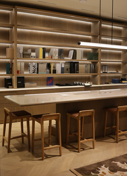
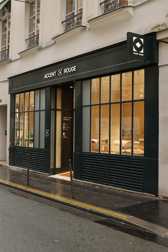
Avec l’ouverture de son showroom de 400 m² rue du Mail, en plein cœur de Paris, Accent Rouge franchit une nouvelle étape de son développement. Pensé comme un lieu de démonstration et d’échanges, cet espace met en scène l’ensemble de ses expertises - lumière, chauffage, portes & poignées et mobilier - au service des architectes, prescripteurs et professionnels de l’immobilier. Fort de 40 ans d’expérience, de 120 collaborateurs et de trois espaces d’exposition entre Paris et Lyon, le groupe affirme à travers cette adresse la volonté de proposer des solutions concrètes, techniques et adaptées, portées par un interlocuteur unique. Daniel Setton, PDG du groupe, revient pour nous sur la genèse de ce projet et sur la vision qui accompagne cette dynamique.
Le groupe Accent Rouge est l'héritier de quatre marques. Pouvez-vous nous en parler et nous expliquer cette volonté d'évoluer sous une seule et même bannière ?
Accent Rouge est né de la réunion de quatre marques historiques : Le Cèdre Rouge Business, Inédit Lighting, Passage Portes et Poignées sans oublier Worldstyle. Depuis plus de 40 ans, chacune d’elles a développé une expertise forte et une légitimité reconnue dans son domaine respectif. Cependant, au fil des projets, nous avons remarqué que nos clients ne cherchaient plus une réponse segmentée, mais une vision globale. Il nous manquait un lien visible, une bannière commune capable d’exprimer notre capacité à accompagner un projet dans son ensemble.
La création d’Accent Rouge marque cette évolution. Elle incarne le rassemblement de nos savoir-faire sur fond d’expertise, d’exigence et d’un sens du service. C’était aussi une manière d’affirmer notre positionnement en proposant des solutions décoratives et architecturales globales, cohérentes et sur mesure. Aujourd’hui, le groupe offre un accompagnement transversal, de la conception à la mise en oeuvre.
Votre expertise se scinde en 4 volets, à savoir le mobilier, la lumière, les portes et poignées sans oublier le chauffage. Qu’est-ce que cela change d’avoir une expertise globale ?
Cette approche transforme profondément la manière de concevoir un projet. Elle permet d’offrir une vision d’ensemble, portée par un interlocuteur unique capable de coordonner toutes les expertises. Pour nos clients, quels qu’ils soient, cela représente un véritable gain de temps. Mais c’est également la garantie d'une cohérence esthétique et technique.
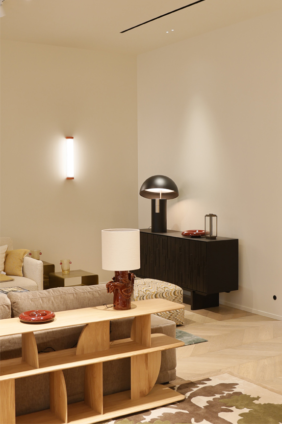
Il faut bien comprendre qu’un projet ne se résume pas à juxtaposer des éléments. La finition d’un interrupteur peut dialoguer avec celle d’une poignée de porte, d’un montant, ou même d’un sèche-serviettes. Les matières, les teintes, les textures se répondent. L’ensemble doit s’accorder pour créer une harmonie globale. C’est cette capacité à penser le détail dans une vision d’ensemble avec nos clients qui fait la différence.
Vos projets s’étendent dans les secteurs de l'hôtellerie, des appartements privés, mais également des institutions culturelles, de l’urbain etc…. Comment le travail de votre bureau d’études s’articule avec celui des prescripteurs ?
Notre bureau d’études joue un rôle central. Il fédère les expertises techniques de chaque pôle et travaille en étroite collaboration avec les architectes, designers et maîtres d’ouvrage. Chaque domaine possède ses exigences spécifiques. En éclairage, par exemple, nous intégrons les contraintes normatives, les niveaux d’éclairement, l’efficacité énergétique ou encore la scénographie lumineuse. En chauffage, nous travaillons sur les puissances nécessaires selon les volumes, les usages, les systèmes de pilotage — notamment dans l’hôtellerie où le confort et la gestion énergétique sont essentiels. Sur les portes et le mobilier, la maîtrise des normes (coupe-feu, acoustique, tissus non-feu, accessibilité…) est déterminante. Notre rôle est d’anticiper ces contraintes techniques pour permettre aux prescripteurs de conserver une liberté créative totale. En fait, nous nous positionnons comme un partenaire technique et esthétique.
Vous travaillez avec des marques très connues comme Vitra pour le mobilier, et d’autres plus confidentielles comme l’éclairagiste espagnol Parachilna. Comment ce corpus est-il choisi ?
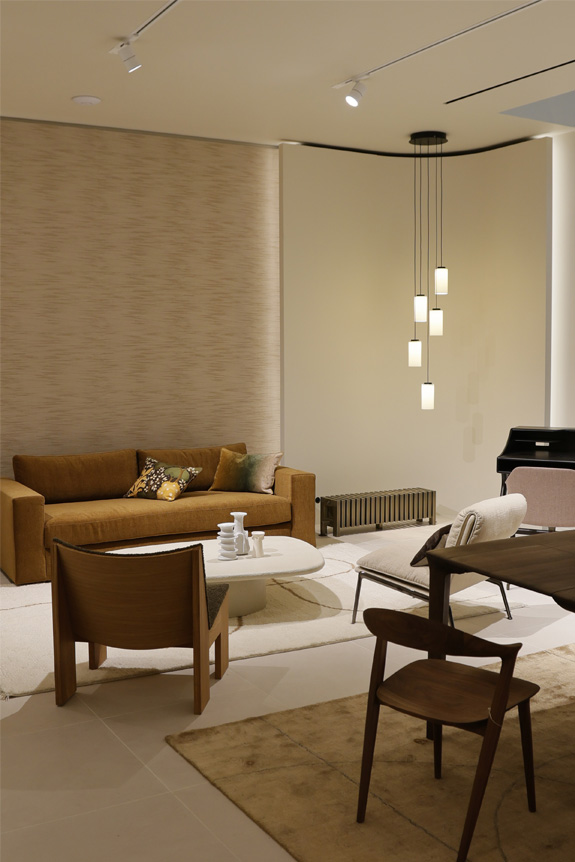
Le choix d’une marque résulte généralement d'une vision partagée. Nous privilégions des partenaires - majoritairement européens - qui défendent un véritable savoir-faire technique, une identité forte et une qualité de fabrication irréprochable. A partir de là, chaque marque doit apporter un univers distinct, tout en offrant une complémentarité avec les autres. Nous aimons révéler des signatures plus confidentielles, mais nous assumons aussi la présence d’icônes du design. Notre rôle est d’orchestrer cet équilibre tout en étant attentifs aux engagements environnementaux, aux matériaux recyclables, aux démarches RSE et aux innovations durables, qui deviennent aujourd’hui incontournables.

Flos s’est associé à Bottega Veneta pour imaginer une réédition de la lampe 600, designée par Gino Serfati en 1966. Une réédition qui combine l’icône de Flos avec le savoir-faire de la marque de mode italienne, que Barbara Corti, directrice de la création chez Flos, nous a expliqué plus en détails.
Comment s’est faite la collaboration avec Bottega Veneta ? Pourquoi cette marque en particulier ?
Ce n’est pas la première fois que nous sommes contactés par des marques de mode pour des collaborations et généralement, nous les refusons pour diverses raisons, notamment car ça peut mettre beaucoup de temps à aboutir et chez Flos nous voulons nous focaliser au maximum sur les projets actuels et les designers avec qui nous travaillons. Mais lorsque l’équipe de Bottega Veneta nous a contactés il y a 2 ans, j’ai pris le temps de la réflexion. J’aime beaucoup cette marque et Matthieu Blazy - le directeur artistique de la marque au moment de la collaboration - qui s’avère être un fan de design, avait réussi à en intégrer au sein de toutes les collections auxquelles il a participé. Dès le départ, nous avons été honnêtes les uns envers les autres et notre vision était avant tout portée sur le design.
Pourquoi avoir choisi la lampe 600 de Gino Serfati ?
Au début de nos échanges, les équipes de Bottega avait sélectionné plusieurs modèles ou projets sur lesquels ils voulaient travailler, mais c’est moi qui ai finalement suggéré la lampe 600 de Gino Serfati, qui je trouvais cohérente avec la pratique de Bottega. Très vite, nous avons travaillé ensemble pour comprendre la marque et opérer de petits changements afin de mêler au mieux les pratiques de Flos avec celles de Bottega Veneta. En proposant un modèle en cuir, nous avons réussi à mêler l'ADN des deux marques. Dans sa première version, la structure de la lampe était faite avec des billes de plomb pour permettre à la lampe de tenir debout. Dans la version 2024, nous avons changé de matériau pour passer du plomb au fer ce qui nous a contraint à changer légèrement les proportions, car le plomb est plus lourd que le fer. Il y a un eu gros travail pour réussir à mettre en place ces petits ajustements afin qu'il puisse coller avec le cuir de Bottega en termes de volume et que cela ne fasse pas perdre de qualité au produit.
Vous avez donc travaillé à partir d’un modèle existant, pourquoi ?
Partir d’un modèle de nos archives était plus simple, car nous avions juste à ajuster le produit avec l'essence de Bottega et à le mettre à jour en termes de technologies. C’est un process totalement différemment que de créer un nouveau produit. Pour autant, il y a eu un réel travail collaboratif entre les équipes internes de Flos et celles de Bottega.
Est-ce que cela vous a donné envie de tenter de nouvelles collaborations ou de rééditer d’autres ICONS ?
Ce n’est pas dans nos priorités pour le moment, nous avons beaucoup de projets en cours et d’événements qui arrivent pour l’année 2025, notamment la sortie de nos nouvelles collections et le Salone del Mobile avec la tenue d'Euroluce. Mais si nous trouvons un sujet intéressant et une nouvelle manière de remettre à jour un modèle de nos archives, nous le ferons, je ne suis pas fermée à l’idée !

Le duo britannique Barber Osgerby réinterprète la lampe Bellhop de Flos dans une version suspendue et une autre à poser.
Imaginée en 2016 pour le restaurant Parabola et la Members room du Design Museum de Londres, la Bellhop a depuis été repensé à quatre reprises. Cette année, c'est au tour du duo de designers Barber Osgerby de proposer une nouvelle approche de ce classique de la maison italienne Flos. Dessinée originellement en aluminium puis déclinée en polycarbonate, la Bellhop s'offre une nouvelle enveloppe en verre soufflé. Une approche différente en termes de matériaux mais également une diversification avec l'apparition d'une suspension en complément d'une version à poser présentée lors du Fuorisalone 2024.

Le fonctionnel réinventé
« Lorsque nous travaillons avec Flos, notre point de départ n'est jamais la forme, mais la qualité de la lumière, explique Jay Osgerby. Dans le cas présent, nous souhaitions une lumière d'ambiance chaude et accueillante, homogène et douce, capable d'éclairer un volume spacieux sans générer de forts contrastes. » Un enjeu qui a amené le duo à se tourner vers l'utilisation d'un verre opalin triplex. Un matériau nouveau, mis au point avec l'équipe R&D de la marque, constitué de deux couches de verre transparent intercalées d'une autre en verre blanc. Néanmoins désireux de proposer une lampe tout aussi adaptée au moment d'intimité qu'au travail, les designers ont allié à la diffusion du globe de suspension, un faisceau plus direct orienté vers le bas. Une source émanant de la même ampoule, mais entourée en partie basse d'une bague en aluminium de sorte à diriger le fuseau pour éviter l'aveuglement.

Adaptée pour les vastes espaces comme les plus étroits, la suspension Bellhop glass est proposée en trois dimensions (18, 33 et 45 cm de diamètre et uniquement 33cm pour celle à poser). Disponible dans les coloris Cioko, White et Aluminium Brill, les éléments en aluminium apportent au verre une touche de brillance issue des différents bains de fixation préalables. À noter enfin, la présence très visuelle du câble, voulu comme un « apport chorégraphique et source de mouvement. Il s'agit presque d'une représentation visuelle du flux d'électricité » conclut Edward Barber à propos de cette ultime réinterprétation d'une silhouette toute en rondeur, devenue familière.


Composé des marques Luceplan, Calligaris, Connubia, Fatboy et Ditre Italia, le groupe Orbital Design Collective propose une offre allant de l’éclairage au mobilier en passant par les accessoires pour la maison. Bien que faisant parties d’un même groupe, chaque marque garde son identité propre afin de proposer des produits adaptés aux besoins du client avant tout. Explications auprès de Riccardo Mattelloni, responsable contract du groupe.
Pour sa seconde édition, le salon EspritContract, organisé en parallèle d’EspritMeuble, sera de retour au Pavillon 1 de la Porte de Versailles avec 110 exposants dont le groupe Orbital Design Collective. Un groupe composée de cinq marques italiennes reconnues pour leur produits et savoir-faire qui proposent des projets complets, à l’image des clients avec qui ils collaborent.
Comment ces 5 marques en sont-elles venues à travailler ensemble ? Quel est l'objectif du groupe ?
Le groupe Orbital Design Collective, qui comprend les marques Luceplan, Calligaris, Connubia, Fatboy et Ditre Italia, a été crée dans le cadre d'une stratégie visant à offrir une offre diversifiée mais cohérent de produits de haute qualité axés sur le design. Pour autant, chaque marque apporte son propre héritage, son expertise et ses domaines de prédilection, à savoir l’éclairage pour Luceplan, le mobilier pour Calligaris, Connubia, Ditre Italia ou les accessoires pour la maison en ce qui concerne Fatboy. L'objectif du groupe est de tirer parti des atouts uniques de chaque marque tout en offrant une solution globale aux secteurs contractuel et résidentiel. La synergie entre les marques permet à Orbital Design Collective de répondre à un large éventail de besoins en matière de design et de projets, qu'il s'agisse d'espaces résidentiels ou commerciaux.
Quelle est la place du contract dans le groupe (chiffre d'affaires, part de projets, etc.) ?
Le contract joue un rôle important au sein du groupe. Bien que chaque marque puisse avoir un marché légèrement différent, il y a une tendance croissante à la collaboration croisée, en particulier dans le secteur du contract. Des marques comme Luceplan et Calligaris, par exemple, jouissent d'une forte reconnaissance dans les projets commerciaux et hôteliers. Ditre Italia est particulièrement reconnu pour ses projets résidentiels et d'hôtellerie haut de gamme, tandis que Connubia excelle dans les solutions d'hôtellerie confortable. Les projets contract sont un moteur essentiel des ventes, en particulier pour les projets sur mesure, et il représente une part importante de l'ensemble du portefeuille de projets. La capacité à offrir une large gamme de produits pour les clients du contract est un facteur de différenciation majeur pour le groupe.
Comment les projets sont-ils organisés au sein du groupe ? Existe-t-il une différenciation marquée entre toutes les marques ou le catalogue de produits est commun à toutes ?
Les projets sont généralement organisés en fonction du type de client et des exigences spécifiques du projet. Chaque marque conserve sa propre identité et son propre catalogue de produits, ce qui garantit une différenciation marquée en termes d’esthétique, des matériaux utilisés et de la fonctionnalité entre les marques. L’approche d'Orbital Design Collective permet une collaboration, offrant aux clients un mélange personnalisé de produits de différentes marques dans le cadre d'un même projet. Le catalogue de produits n'est certes pas commun à toutes les marques, mais le groupe propose une offre holistique en s'appuyant sur les forces individuelles de chacune d’elle.
Quels changements avez-vous observés dans le secteur au cours des dernières années ?
Il y a eu une véritable évolution vers des solutions de conception plus durables et adaptables. Les clients recherchent de plus en plus des produits qui allient haute qualité et responsabilité environnementale. L'accent a également été mis davantage sur les conceptions multifonctionnelles et la flexibilité, en particulier dans les espaces où l'adaptabilité est essentielle. La numérisation a également eu un impact sur le processus de conception, avec l’arrivée des outils de rendu plus avancés et la réalité virtuelle qui aident les architectes et les concepteurs à visualiser les projets en temps réel.
Un projet récent à nous présenter en quelques mots ?
L'un de nos récents projets marquants a été la conception et l'aménagement d'un hôtel à Milan, où nous avons pu intégrer des produits des cinq marques. Le projet nécessitait un mélange de solutions d'éclairage, de mobilier modulaire et de pièces extérieures distinctives. La collaboration entre les marques a permis d'obtenir un design sur mesure et cohérent qui répondait à la fois aux besoins esthétiques mais également fonctionnels. Le client recherchait un mélange d'artisanat italien et de design moderne, ce que nous avons été en mesure de faire grâce à notre catalogue diversifié.
Qu’attendez vous de votre participation à Esprit Contract ?
Notre participation au salon Esprit Contract vise à accroître notre visibilité sur le marché, en particulier auprès des architectes, des décorateurs d'intérieur et des principaux décideurs du secteur commercial. Nous voulons présenter l'étendue de notre offre et montrer comment nos marques peuvent offrir des solutions individuelles et intégrées pour des projets de grande envergure. Le salon est également l'occasion de renforcer les relations avec les clients et partenaires existants tout en explorant de nouvelles opportunités commerciales.


