The colorful world of Giulio Ridolfo exhibited by Kvadrat
©Kvadrat

The colorful world of Giulio Ridolfo exhibited by Kvadrat

For its participation in Milan Design Week 2026, Kvadrat is unveiling two exhibitions this year: one paying tribute to designer Frans Dijkmeijer, and the second dedicated to the new Twisted Flowers collection, reimagined by Giulio Ridolfo. It is an opportunity for the latter—regularly hailed as a master of color—to discuss his work and his approach.

A key figure in the world of textile design, Giulio Ridolfo has been collaborating with Kvadrat since 2007. Coming from the fashion world, the man who now dresses furniture is the creative force behind several of the Danish brand’s bestsellers, including Canvas 2, Remix, Steelcut, and Zulu. With an approach rooted in color but deeply connected to the technical dimensions of yarn, the designer develops a vibrant, lively, and resolutely contemporary language where innovation takes center stage. His creative process is often described as a blend of intuition, anthropology, and a form of self-taught botany. It was precisely this floral inspiration that led him to explore an archive by Frans Dijkmeijer, which he has reimagined and expanded into 21 colorways. Giulio Ridolfo discusses this technical and stylistic endeavor on the occasion of the "In Rainbows" exhibition. To discover the collection as staged by architect Lorenzo Bini, visit the Kvadrat showroom in Milan at Corso Monforte 15.
©Kvadrat

For Milan Design Week, Kvadrat is presenting the "In Rainbows" exhibition, where visitors can discover the Twisted Flowers collection. What is it all about?

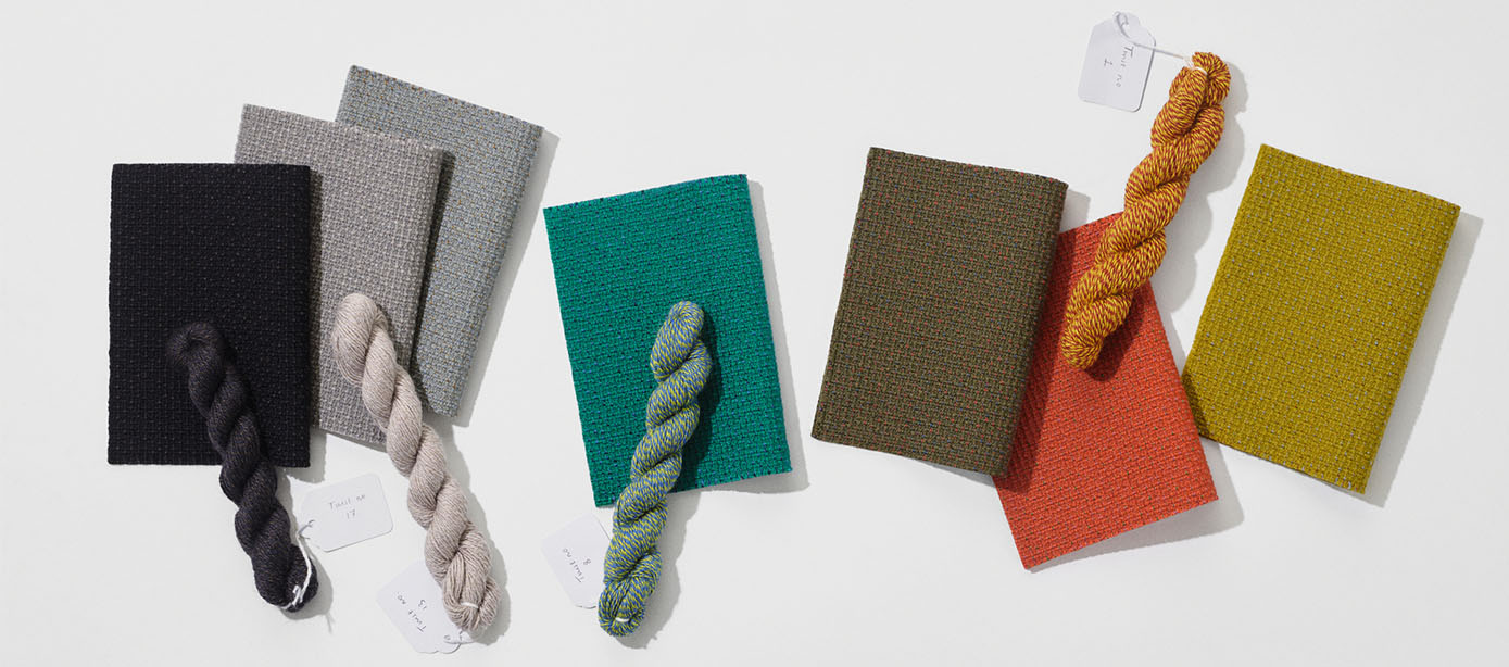
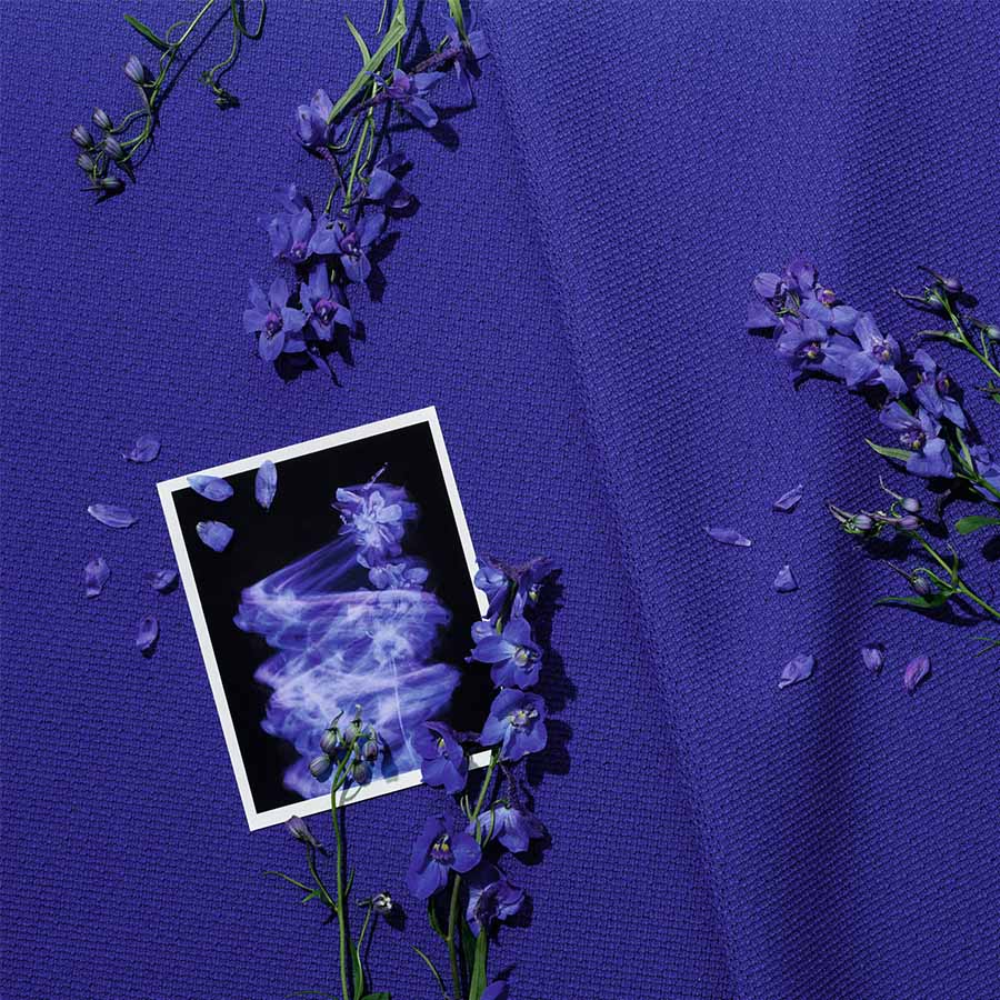
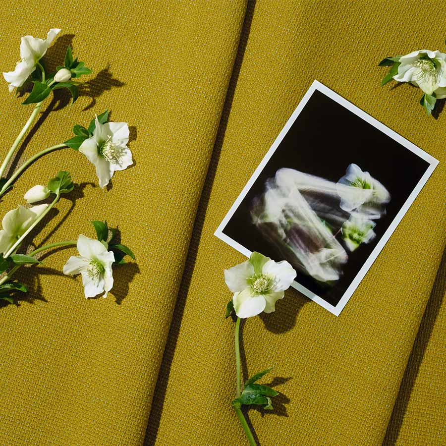
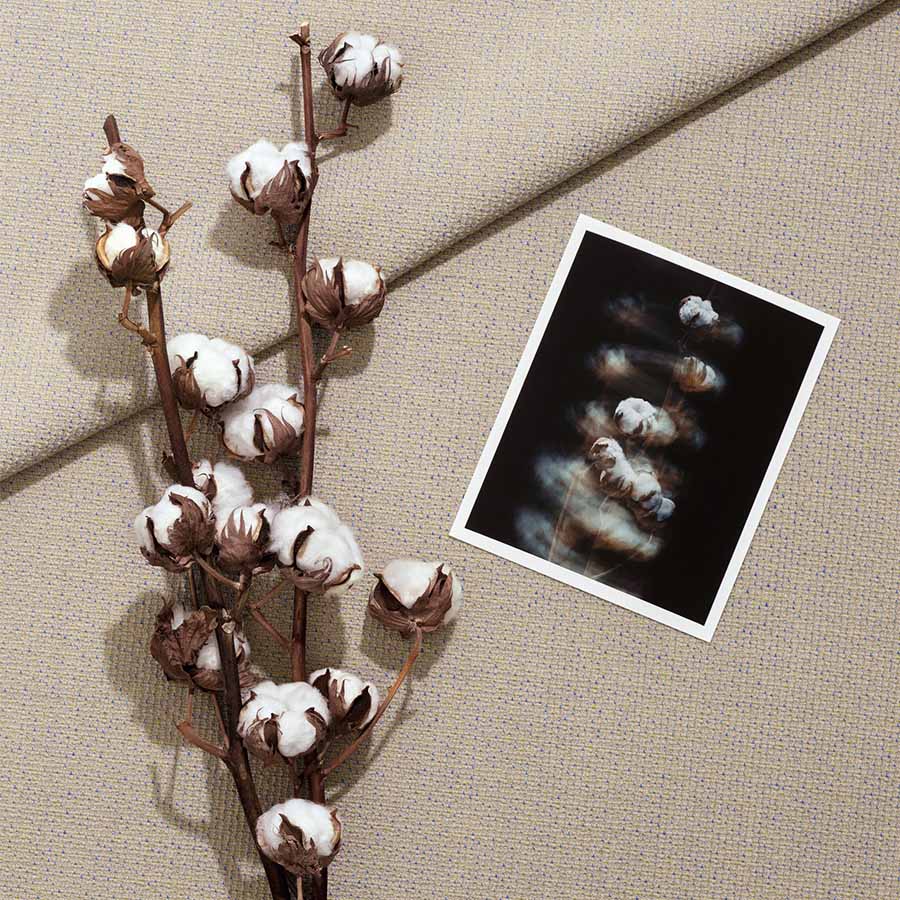
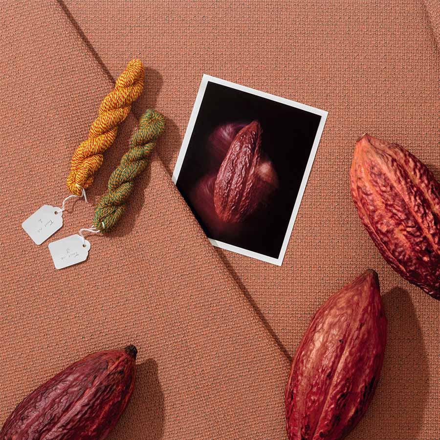
Twisted Flowers is a story of composition between my work and that of Frans Dijkmeijer. This collection is a revival of a weave by the designer—who passed away in 2011—which we have reimagined with a real focus on the tactile and visual experience. As is often the case, and it was a shared passion with Frans, I worked with color by drawing inspiration from flowers. We collaborated with a company to select seasonal plants—not exotic ones, but those linked to our environment. For example, you can find the red of the Fritillaria imperialis, the blue of the Ceanothus thyrsiflorus, and the yellow of the Gossypium, which together almost form a bouquet. I sought to translate the very experience of picking flowers into color, by observing them closely and immersing myself in floral paintings like The Dream by Odilon Redon, which I saw in Bern years ago. I was struck by a sense of suspension. It wasn’t exactly dreamlike, but suspended, with undefined colors and a meditative figure. Of course, what we have done is not a literal translation; the blue is not simply blue, and the red is not just red. It’s not like using a Pantone swatch book, which I don’t like at all. Instead, we selected colors capable of creating a kind of interference, a beautiful vibration, a pixelation of the object’s skin.

And you are presenting this in a unique setting…

Absolutely. The showroom area is usually reserved for sales, but not here. At first, I thought about hiring a florist, but I ultimately preferred to work with the structure itself, thanks to Milanese architect Lorenzo Bini. The idea was to invade the space and transform it with a more whimsical, almost magical effect. I didn’t want a clean, minimal space; I wanted to create a pleasant passage where people can linger and appreciate the quality of the colors. In this "hut," there is also furniture—ranging from standard contemporary Danish and Italian designs to pieces by great names like Carlo Scarpa, Cecilie Manz, Finn Juhl, and Jean Nouvel. And since I am very drawn to music, I collaborated with a music programmer in Milan. We have planned four performances based on vibration, intuition, and phasing, which is a technique used by Steve Reich. In fact, this installation is almost a manifesto.
©Kvadrat

You previously mentioned the work of Frans Dijkmeijer, to whom Kvadrat is dedicating a biographical exhibition at the Triennale. What was your relationship with him like?

The relationship with Frans began with great mutual respect. He thought in black and white to reveal the flaws and beauty of construction, while I worked freely with color. That was the starting point of our relationship. I originally come from the fashion industry, where I was used to handling textiles for dresses, and for the past fifteen years, I have been working on furniture pieces. I gradually became a colorist through long practice in selecting shades, textiles, and materials for companies in the furniture sector. In a way, my primary occupation was to help a project be seen, from the prototype to the industrial solution, which is what I did with Vitra and Moroso, where I started. When I was offered the chance to work with the brand, I knew textile design, but I didn’t want to become a textile designer. However, I was happy to intervene on color, provided I could establish a dialogue with the creator—and as it happens, that creator was Frans Dijkmeijer. One of my first exercises alongside him was to color a fabric with a very pronounced grain, a pinpoint which looks like grains of rice. That is how Steelcut was born; its name comes from "Cut Steel," a Victorian-era technique where iron was cut into diamond shapes to mimic the sparkle of precious stones. It was a foundational project that defined my position.

You are a colorist, but your perspective on textiles is also deeply technical, particularly regarding three-thread weaving, isn't it?

The idea that I work with three threads has become famous, but in reality, I can work with five, six, or just one. It all depends on the situation. I am very drawn to the gouache work of 20th-century artists like Paul Klee, or to a certain musicality, like that of Sibelius. For me, the complexity of a construction adds an extra quality to the color. I once saw Frans use one white thread with two black ones to reveal potential errors in the weave and understand the disruptive element. It was an artisanal way of enriching his creations. But at the same time, working with Kvadrat taught me great rigor. Their textiles must last, be reproducible, and the approach is almost scientific. You cannot have uncontrolled variations. In this context, the idea of working with three colors was born as an intuition. I wanted to understand what vibration might emerge by adding a third thread. When we developed Steelcut Trio, the results were astonishing because there was an iridescent effect, like in silk or taffeta, but with an essential difference. Where taffeta has two sides, this has three. It creates depth, a relationship between light and shadow, a kind of perspective. We continued this research, drawing inspiration from different textiles, until we created a thread composed of three distinct colors. Each thread itself became a complex blend. Two threads constructed this way give an impression of infinity where the color is never fixed. It is this technical expertise that gave rise to Remix, and which we continue to develop today.
©Kvadrat

The vibration of colors, the notion of instability, of movement… there is a living quality that almost brings to mind fashion, isn't there?

Movement is inherent to fashion because textiles are on bodies and they move. You have a kind of third dimension that must be taken into account. When I work with a textile for furniture, it is more sculptural. You can walk around it. And then, furniture has the particularity of being able to be equipped with accessories or additions that can modify impressions and feelings. Fabric is one of them. With certain fibers like those from Kvadrat, the structure must be robust, but the fabric can give another impression, of lightness for example. That is specific to furniture.

From that point of view, do you consider textile to be a kind of filter?

If you are referring to semiology like Roland Barthes, then yes, it is a filter. But in reality, it is not. Fabric is the first thing you touch; it is the skin of an object. And in that sense, it is very sensual, because when you see a piece of furniture, you touch it first, then you say "what a beautiful sofa," "what a beautiful object"... It is, let's say, in synchrony with the form of the object. The filter comes into play when you filter information, when you start considering whether it is the right textile, the right sofa for a given use, or the right color... at least, that is how it seems to me. But I am a colorist, and being a colorist means starting with the thread, not the final coloring.
©Kvadrat
Rédigé par 
Tom Dufreix

Vous aimerez aussi

Temps de lecture
24/9/2026
DCW éditions agrandit la collection Seagull

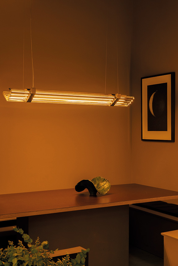
Pensée par Thierry Dreyfus pour DCW éditions, la collection Seagull s’agrandit avec une nouvelle suspension de 160 cm. Un changement d’échelle qui conserve le principe fondateur du luminaire : donner à voir la lumière plutôt que la lampe.

Faire de la lumière une présence sans laisser le luminaire s’imposer dans l’espace : c’est le parti pris de Seagull, imaginée par Thierry Dreyfus. Pour la dessiner, le designer s’est inspiré du Johnson Wax Building de Frank Lloyd Wright, construit à la fin des années 1930, dont les tubes de verre diffusent la lumière extérieure vers l’intérieur. Une sensation que Thierry Dreyfus transpose à l’échelle domestique à travers une succession de tubes lumineux disposés horizontalement, dans une composition aux accents Art déco.

Suspension Seagull, design : Thierry Dreyfus

Nouvelles proportions, nouvelles possibilités

Déjà proposée dans une version de 120 cm, Seagull se décline désormais dans un format de 160 cm, pensé pour accompagner des tables plus grandes. Suspendu idéalement entre 80 cm et 1 m au-dessus du plateau, le luminaire étire la lumière plutôt que de la concentrer, dessinant un « toit de lumière », pour reprendre les mots de Frédéric Winkler, président et fondateur de DCW éditions Une nouvelle échelle qui ouvre également Seagull à d’autres usages car plus qu’un simple point lumineux, la suspension peut devenir un véritable trait dans l’espace, capable d’accompagner l’architecture et de guider le regard. Une approche qui prolonge les recherches de Thierry Dreyfus, connu pour ses installations lumineuses et ses collaborations avec Comme des Garçons, Raf Simons ou encore Peter Marino. L’objectif étant de mettre la lumière en scène, ici dans une version pensée pour le quotidien.

Temps de lecture
21/9/2026
Paris Design Week: The Intramuros Eye

For this new edition of Paris Design Week, the Intramuros team slipped through the capital's arteries to discover the season's latest exhibitions and new releases. Here is a look back at the ones you shouldn't have missed.

From September 10th to 19th, design once again took over the streets of Paris, much to our delight! Whether industrial or collectible, the creative sector made headlines again, both through new collections and new gatherings. It was an opportunity to rediscover certain profiles and meet new minds driven by innovative concepts. Among all the installations we discovered, here are the ones that particularly caught our attention.

Picnic by Cluzel / Pluchon: an invitation to lunch

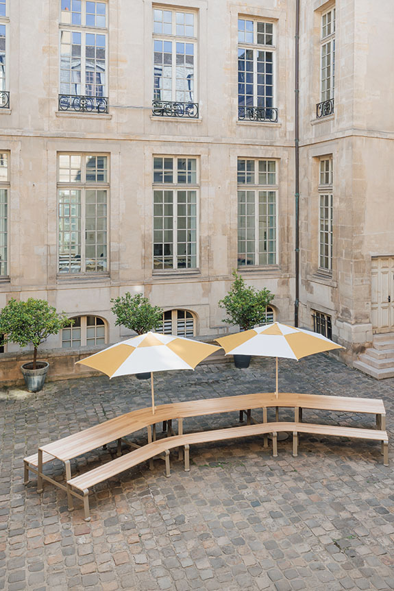
Following Marianna Ladreyt last year, designers Cluzel / Pluchon took over the courtyard of the Hôtel d’Albret to present the Picnic installation, created in collaboration with manufacturer Guyon Mobilier Urbain. Conceived as an invitation to share and wander, Picnic was unveiled as a life-sized picnic table over seven meters long. Continuing the Gier duo's well-known collection, it combined locust wood slats with a powder-coated steel structure, drawing a generous curve to create a dialogue between urban furniture and conviviality.

Picnic installation by Cluzel / Pluchon at the Hôtel D'Albret © Charlotte Bommelaer

GOOD SELECTION by Lucas Zito and Marika Caputo: new scenes

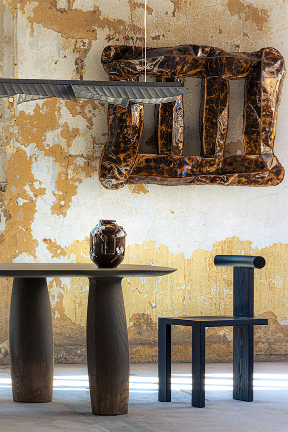
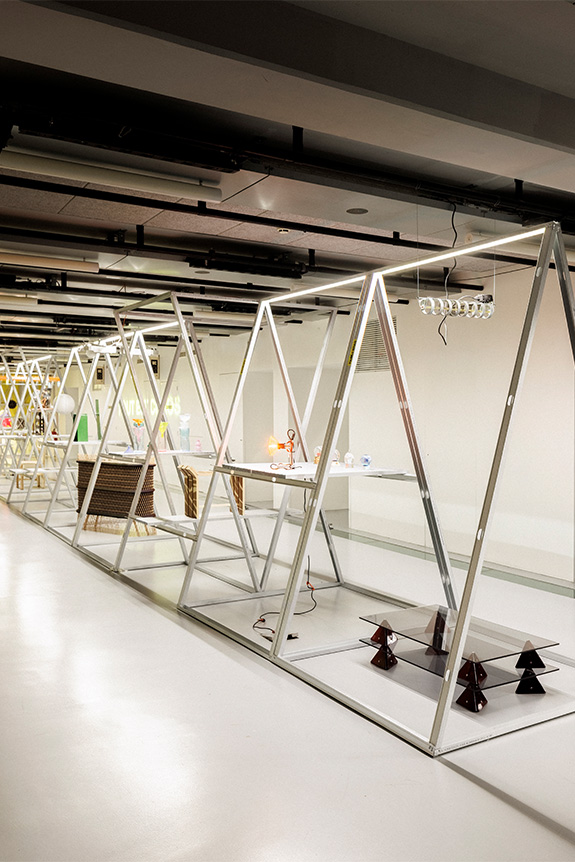
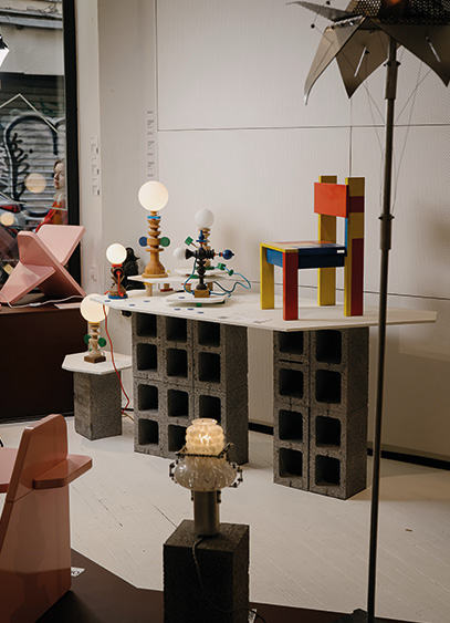
Organized by Lucas Zito and Marika Caputo, the second edition of GOOD SELECTION was held this year in the heart of the Fondation Fiminco in Romainville. Now disused, the former pharmaceutical factory—reminiscent of some of the most surprising Milanese venues chosen by Alcova—was taken over for the occasion by 47 international designers. Favoring dialogue between creations rather than formal classification, the exhibition offered various living spaces. A combination of styles and atmospheres provided visitors with a new, more embodied perspective on this so-called "collectible" design.

© Good Selection

Volt Face by Studio 5.5 and Schneider Electric: high-voltage collection

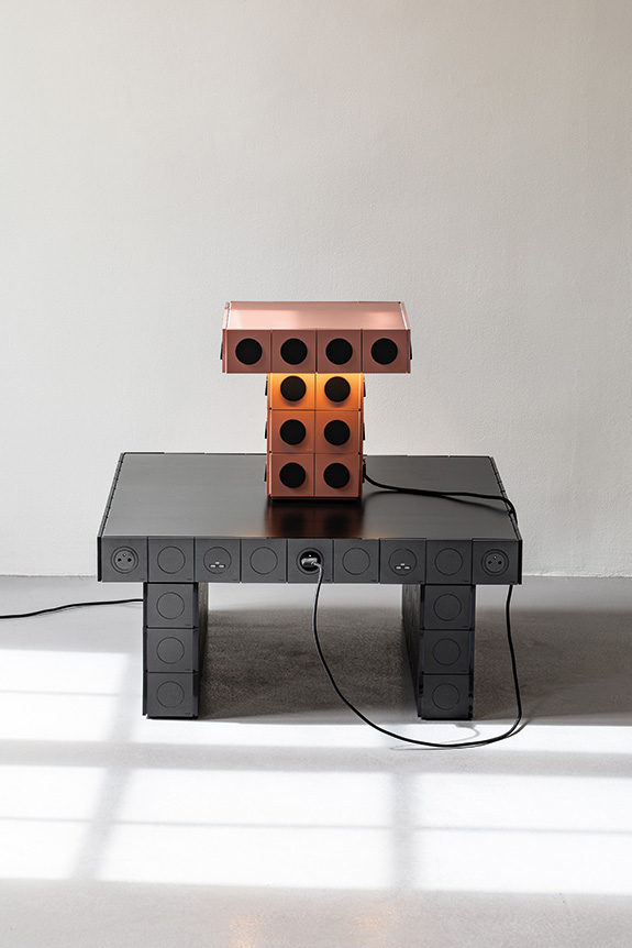
Studio 5.5 teamed up with Schneider Electric to imagine the Volt Face lighting and furniture collection, designed using the Odace range and presented at the Galerie Joseph on Rue des Minimes. Faithful to their taste for repurposing everyday objects, Vincent Baranger and Anthony Lebossé chose to make the socket and switch the main element of their creation, rather than an afterthought. Developed as wall lights, pendants, lamps, tables, and even nightstands, each piece plays with the repetition and assembly of the modules. Conceived as a true creative palette, the Odace range thus becomes a material to be composed, but also to be touched and operated, making these pieces playful and offering a fresh look at these familiar yet often undervalued objects.

Volt Face collection, Studio 5.5 x Schneider Electric © Vincent Baranger

Tout est Chaos by PLI Office: ordering the desirable

After initiating "Pour que tu m’aimes encore" in 2024 and "Design Disco Club" the following year, Christopher Dessus returned this year with "Tout est chaos." Presented at the Gaîté Lyrique, the exhibition brought together a body of work that acts as a vector for surprise. A feeling conveyed by the material or the form, but also and above all by a freer consideration of usage. It is a counterpoint to modernist design, which is generally serial and fundamentally utilitarian, here abandoned in favor of narrative. It was an opportunity to see very personal research collide, such as the non-linear or even random work of the series, the reinterpretation of industrial archetypes reworked by hand, or new explorations blending industry and craftsmanship. Driven by a nearly free participation, the 66 selected designers delivered a specific idea of design, claimed by 10 of them through installations and even a projection imagined as a manifesto.

"Tout est Chaos" exhibition by Pli Office at the Gaîté Lyrique © Florent Michel

Victoria Wilmotte: Stainless Steel Collection

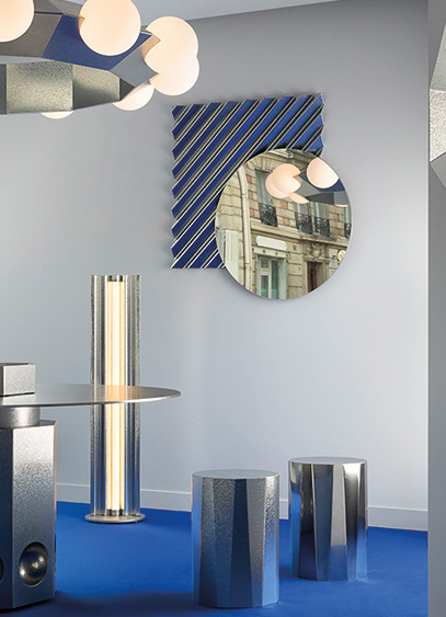
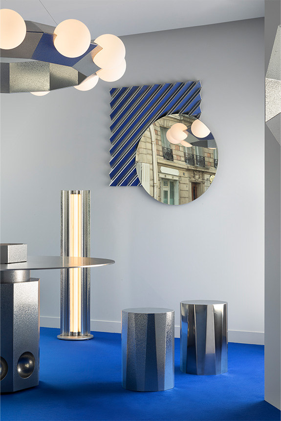
For this year's Paris Design Week, Victoria Wilmotte unveiled nearly a dozen pieces. Whether brand new or reimagined existing typologies, this collection continues to explore a world defined by geometry and a distinct industrial spirit. Crafted from stainless steel—sometimes featuring textures that evoke the technique of hammering—the various objects diffused light, along with the signature blue hue championed by the designer.

Blue Chrome Collection, Victoria Wilmotte © Jean-Pierre Vaillancourt

Opus by Studio CHHO: A New Trajectory

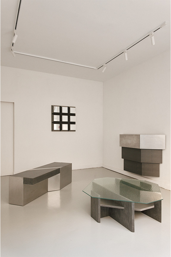
Launched a decade ago, the interior architecture firm Hoch unveiled Studio CHHO, the creative force behind Opus. This debut furniture collection, whose name suggests both a first chapter and a technical term for stone masonry, consists of five pieces. Developed over a year and a half, it highlights taut lines and 90° and 45° angles, delivering a bold aesthetic language with generous forms. Enhanced by a restrained palette of three materials—stained birch veneer, hammered glass, and vibrated stainless steel—the pieces were conceived as "objects of presence." This term, unique to the studio, reflects creations made in the south of France that embody the firm's sober yet characterful DNA.

Opus Collection, Studio CHHO © Oracle Paris

"The Light Library" by Studio Meaningfull: Coloring Light

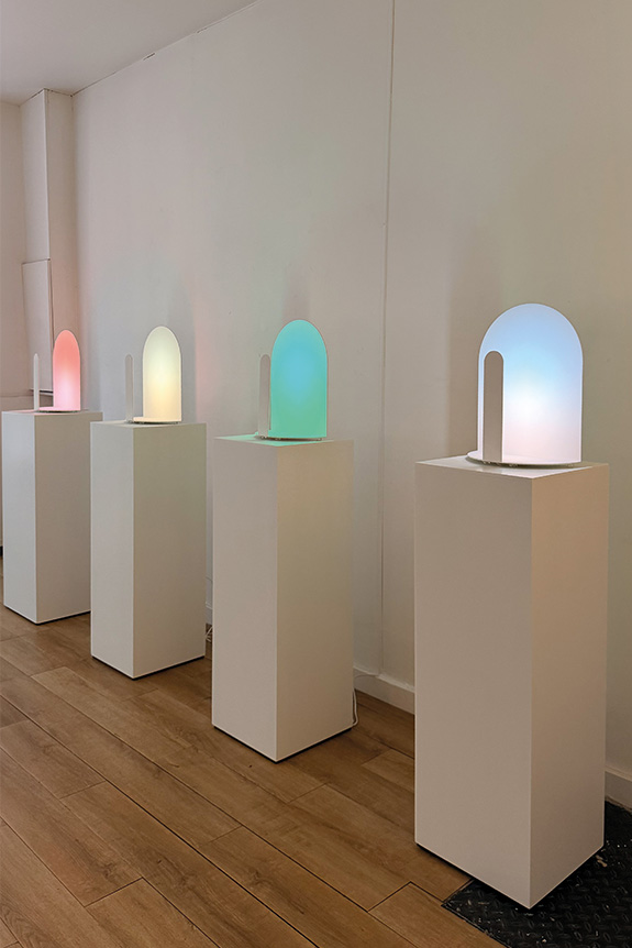
Continuing their research into color, which began with the Agora du Design grant they won in 2021, Studio Meaningfull—comprising Marine Rouit-Leduc, Galilée Al Rifaï, and Nicolas Rouit-Leduc—presented "The Light Library" at Galerie Ideal Place. The exhibition showcased nearly four years of experimentation with the color of light, conceived not as a material, but as a means of interaction. Each shade was developed with reference to natural phenomena, such as the aurora borealis, dawn, and twilight, to achieve a realistic and natural effect. The trio displayed several light-based objects and sculptures, including the Milan lamp, which recently joined the Mobilier National collections. The exhibition was designed to engage the senses and emotions while establishing new chromatic references for light, through an approach that is both sculptural and architectural.

"The Light Library" exhibition, Studio Meaningfull
Temps de lecture
17/9/2026
Frgmnt: for desirable design

Following an initial event in June, Frgmnt decided to repeat the experience for Paris Design Week by presenting its first exhibition, titled "Edition 01." On view until September 19, the show aims to put "the materials no one looks at" in the spotlight.

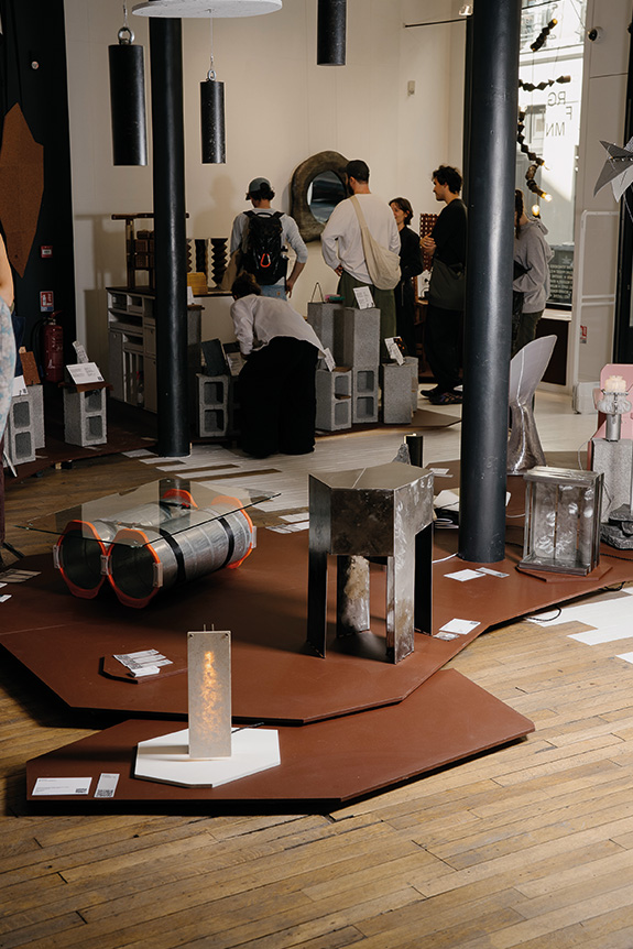
For its first participation in Paris Design Week, Frgmnt selected 43 designers and 11 material manufacturers, brought together to showcase a process and pieces imagined from forgotten or discarded industrial materials, scraps, and waste. Initiated by Meryl Benitah, the Frgmnt project began as a creative challenge launched last June. Over 48 hours, groups of designers, paired up for the occasion, imagined pieces using mediums often considered "undesirable". From wood to metal, the project also incorporated new materials, such as the one designed by Etnisi from windshields, or the Tissium developed by the company Maximum. "It was a bit like a hackathon format, but dedicated to design. We started with materials that were either salvaged or upcycled to show that reuse or even a second life can be desirable. Even though the participants didn't know each other, a certain creative synergy quickly emerged, and groups formed rapidly, managing to produce pieces in just two days", says Meryl Benitah.

LNKD coffee table by Emma Batsheva Cohen, Clémence Lucchini, and Tancrède De Beaumont / Dør side table by Céline Proust © Etienne Boulanger

This initiative caught the attention of Sabrina Piperno, manager of the Heureux les Curieux space, who wanted to support the project by inviting Frgmnt to exhibit during Paris Design Week in September. "For this edition, the idea was to invite other material manufacturer partners to create, on one hand, this material library, and on the other, to bring in designers with the same approach. Whether through the material itself or the design manufacturing process", continues Meryl Benitah.

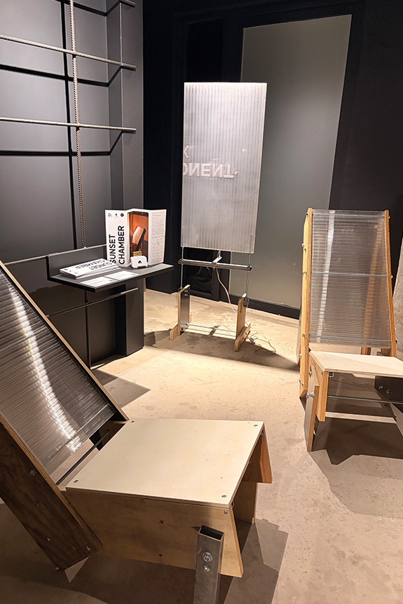
Sunset Chamber ambient screen and chimera chairs by Théo Laverne and Nicolas Guillamot © Intramuros

A new way of thinking about material

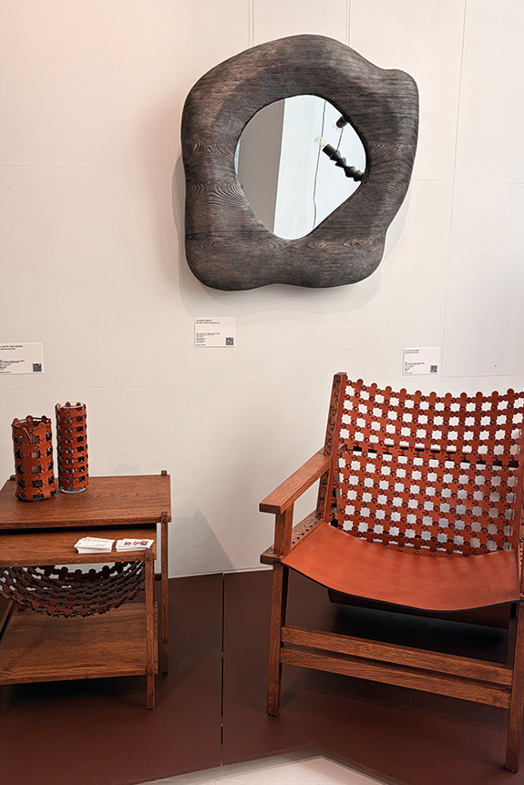
Spread over two floors, the exhibition presents unique worlds, united by a single ambition: to create from what already exists or to explore the potential of new materials. "There are many ways to make a well-designed object that meets market needs. Some use reuse, others respond through the material, while some do it through function. But they all tell a story through a piece, always asking how to create objects that are desirable in the long term." This inquiry led designers to partner with manufacturers, such as hors-studio, whose Caretta Caretta lamp was made from Celullio, a material developed in collaboration with Matériaux Urbains. The latter is also the creator of Paperio, a new medium that Atelier Alcova used to bring Tecto to life. Meanwhile, other creators are presenting original pieces born from their own unique processes. Notable examples include Atelier Perret, creator of the Séléné pendant light made from coffee grounds; the T65 vase designed from bread by studio Copain; and Emma Batsheva Cohen’s concept focused on optimizing vegetable leather.

Soulmates mirror by Clement Thevenot, Tash'rit armchair, lamp, and small table by Emma Batsheva Cohen © Intramuros

Fostering connections

These diverse profiles and explored avenues aim to demonstrate that materials, initially overlooked, can become desirable once design takes hold of them. "My personal goal is to foster this link between manufacturers, designers, and specifiers by creating a beautiful ecosystem that will encourage them to collaborate and allow these pieces to find their way into hotels, restaurants, and support their development on a larger scale." With this exhibition, Meryl Benitah intends to build new bridges between key sectors of the design industry.

Temps de lecture
17/9/2026
Triode opens 28, its new exhibition space

Triode recently opened 28, a new Parisian space designed as a creative playground for designers. To kick things off, Jean and Oliver Pelle, founders of the American studio Pelle, are presenting "Metallic Reverie," an exhibition featuring ten original pieces centered on metal and light.

Neither a gallery nor a showroom, 28—located at 28 rue Jacob in the 6th arrondissement—aims to offer a new exhibition format. Conceived by Jacques Barret, founder of Triode, this new space invites the designers represented by the firm to go beyond simply showcasing their collections. For each exhibition, they are given carte blanche to reveal a more personal side of their creative world. For this inaugural invitation, Triode reunites with Jean & Oliver Pelle, four years after their first joint exhibition in Paris.

Light Objects collection by Oliver Pelle

Two perspectives on material and light

Architects by training and based in Brooklyn, Jean and Oliver Pelle have developed a practice that sits at the intersection of architecture, craftsmanship, and experimentation. For the "Metallic Reverie "exhibition, the duo created ten works specifically for 28, all united by a single material: metal. Jean Pelle presents her Fountain lighting series, inspired by memories and landscapes observed in Korea and along the American coast, while Oliver Pelle explores the intersection of light, material, and space through his Light Objects. Two distinct styles, yet united by a shared focus on materiality. It is a fitting way to inaugurate 28 by showcasing exactly what this new venue aims to reveal: the intimate personality of the designers.

Cityscape light, Fountain collection by Jean Pelle
Inscrivez-vous à notre newsletter pour recevoir chaque semaine l’actualité du design.