


Exposition
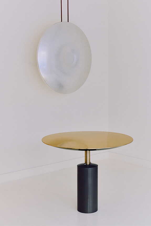
Jusqu’au 10 octobre, le duo Marie et Alexandre présente à la galerie signé l’exposition « Under Pressure », dans laquelle la pression est explorée sous plusieurs aspects : dans les techniques et les matières employées, mais aussi, plus largement, dans leur rapport à la création.
« L’idée derrière cette exposition était de travailler la pression un peu différemment, en utilisant des techniques diverses, avec cette idée d’explosion rapide, et de réussir à les allier toutes ensemble. » Pour cette exposition, le duo de designers formé en 2018 a choisi de faire de la pression son point de départ. Le titre, « Under Pressure », fait notamment référence à l’hydroformage, un procédé industriel dans lequel la pression de l’eau permet de donner forme au métal. Au sein de la galerie, Marie et Alexandre présentent ainsi des pièces façonnées par différentes forces et contraintes, réalisées en collaboration avec plusieurs artisans spécialisés. Mais la pression ne désigne pas seulement ici une technique de façonnage. Elle devient également une condition de création, exercée par la matière, par le temps, le doute, les choix parfois irréversibles ou encore la volonté de faire apparaître quelque chose qui n’existe pas encore.
Allier techniques et savoir-faire
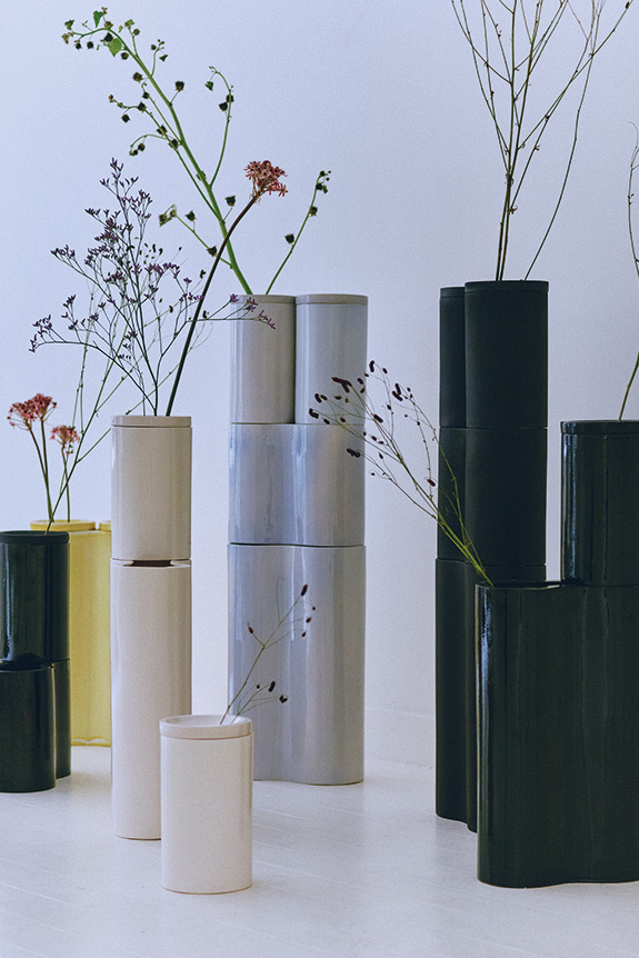
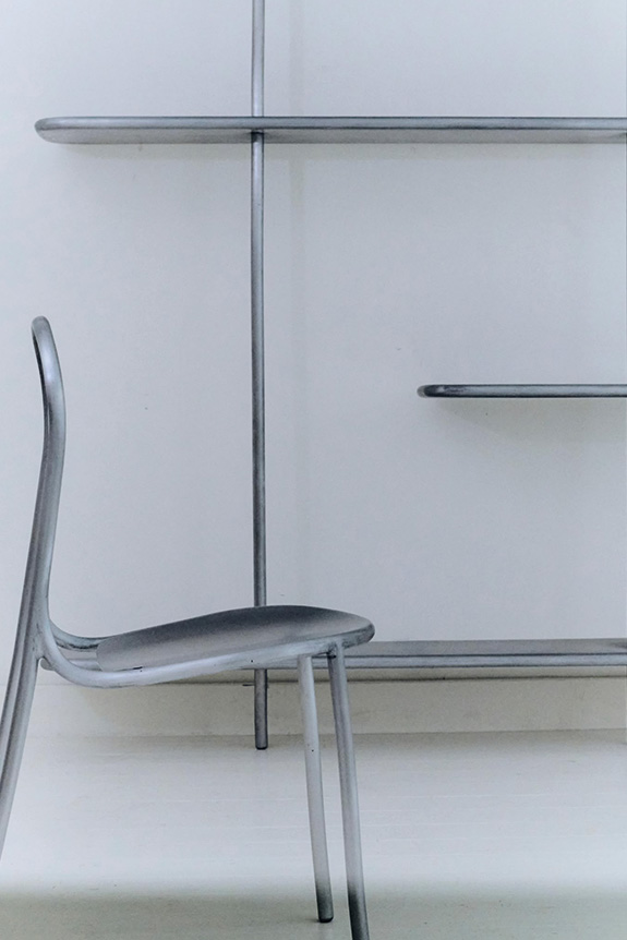
Au sein de l’exposition, qui réunit une dizaine de pièces, les designers se sont associés à différents artisans pour explorer la pression sous toutes ses formes. Avec Antoine Giret, ils présentent ainsi une console, un système d’étagères et une chaise autour d’un travail de l'aluminium fondé notamment sur la vibration de la matière et la création de systèmes. Accompagnés par Jean-Marie Foubert, ils ont imaginé une collection de vases en céramique, déclinés en versions simple et double ainsi qu’en différents formats. Avec le verrier Simon Rio, ils sont allés vers un autre registre en imaginant une table basse dont le plateau est en verre thermoformé. Enfin, avec l’atelier Blam - notamment connu pour avoir participé à la réalisation du cheval mécanique apparu lors de la cérémonie d’ouverture des Jeux olympiques de Paris 2024 -, ils ont imaginé une table sur piston ainsi qu’un médaillon en métal et feuille d'argent dont la forme naît directement de la contrainte exercée sur la matière. Ce dernier sera ensuite destiné à rejoindre la Cité du design de Saint-Etienne, récemment inaugurée.
À travers cette exposition, Marie et Alexandre semblent faire évoluer leur langage formel vers davantage de retenue. Les formes se resserrent et les moyens se réduisent, sans pour autant perdre leur fonction et leur intensité. Un moyen finalement pour le duo de questionner son propre processus créatif.
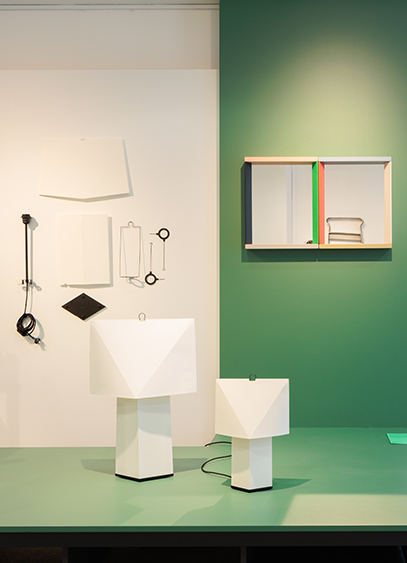
Through October 3, the Bureau de la Mode, des Métiers d’Art et du Design (BDMMA) is presenting the "Multiples" exhibition. A range of projects celebrating industrial design and the new relationships between designers and industry.
As we reflect on September's Paris Design Week, one thing is clear: collectible design seems to reign supreme. Yet, the less "Instagrammable" world of industrial design has not disappeared. To reaffirm its presence and offer a counterpoint to the current trend, the Bureau de la Mode, des Métiers d’Art et du Design (BDMMA) presents "Multiples." Conceived as a return to basics, the exhibition is not "a status report on the sector", but rather aims to "provide an overview of research and textures centered on mass production", explains Frédéric Bouchet, deputy director of the institution. This diversity is reaffirmed through thirteen studios whose utilitarian and aesthetic objects celebrate production. Through this, the focus is not on creating for the sake of creating, but on the intelligence of replicable and viable systems.
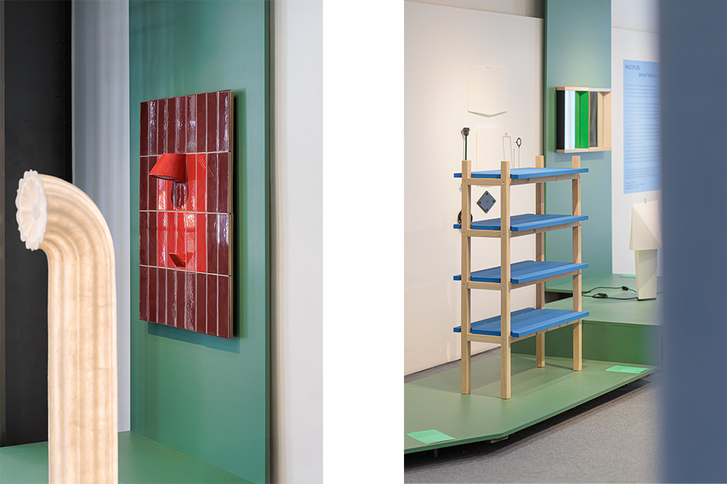
A new relationship with industry, but the same idea of design
If the sector is experiencing "a change of state", it is partly due to the upheaval that has occurred in industrial production. "The relationship with industry has changed completely, requiring designers to shift their stance and be less passive regarding production. They are now encouraged to take hold of processes themselves or repurpose production methods to engage in self-publishing", analyzes Frédéric Bouchet. These new alternative paths are prompting some designers to question the challenges related to resources and how the materials used serve their intended purpose. "It seems to me that this concern is increasingly rooted in the local fabric, as seen in the work of Jules Levasseur. He convinced a company in Burgundy, where he is based, to take an interest in his project, and together they developed 'Projet S,' made from corrugated metal sheets. His challenge today is to channel production at his own scale to produce just the right number of furniture pieces." Beyond the challenge of economic adaptability, there is the issue of formal and technical reinterpretation. "How can one avoid being beholden to traditional publishing? How can I bring local industry into my own territory while generating value? These are the two major questions that emerge in the exhibition, notably through the work of Lila Guédin, who used industrial assembly techniques to create chairs, and Nicolas Verschaeve, who uses tool handles to create small interior objects like hooks and coat racks." These captures and reinterpretations of pre-existing industrial matrices open up new aesthetic and technical doors. Whether published or not, the projects selected by curators and exhibitors Lucien Icard and Kevin Lebouvier shed different lights on these new relationships with industry, favoring "a certain stylistic purity based primarily on assembly".
An exhibition to discover at the Bureau de la Mode, des Métiers d’Art et du Design, 30 rue du Faubourg Saint-Antoine, in the 12th arrondissement of Paris, until October 3rd.
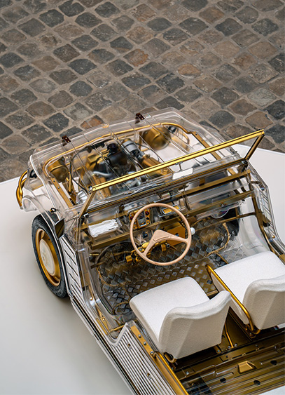
For Paris Design Week, and running until October 4, the Hôtel de la Marine is hosting a Méhari. This lunar-inspired hybrid vehicle was reimagined by Maison Lacmé as a tribute to fine craftsmanship.
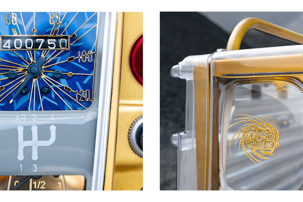
While the Hôtel de la Marine has established itself as a key venue for Paris Design Week, this year’s bold choice is sure to surprise. A curious car is parked right in the center of the courtyard, its odometer—fresh from the workshop—seemingly stuck at 40,075 kilometers. A malfunction? No, a clue. Because behind this familiar silhouette, that of the Citroën-produced Méhari, lies a true design manifesto and a tribute to the decorative arts.
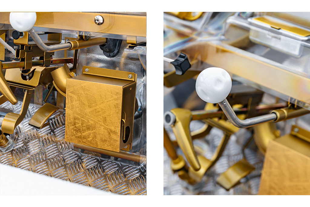
A collision between industry and craftsmanship
Behind this project are Cécile and Antoine Tauvel, the founders of Maison Lacmé, established two years ago. Their goal: to create functional works of art from everyday objects. This ambition led the two vintage car enthusiasts to explore the potential of the Méhari. "For many French people, it evokes the 60s or memories of seaside vacations. But for me, it was also the lunar aspect that spoke to me, reminding me of the covers of certain Tintin albums. So our role was to reveal the symbolism and the sense of wonder that were already there," explains Antoine Tauvel. The couple then designed the frame. It would be gold, echoing French decorative arts and art history, applied in touches to a transparent chassis. "What we found interesting was creating a certain balance between industry and fine craftsmanship by playing with contrasts." This aesthetic research was conducted with a French manufacturer to rethink the polymer composition and prevent the chassis from yellowing, after which a layer of transparent ceramic was applied. "The challenge was to transform this purely industrial typology into an art object without giving it the status of a luxury item. We first had to spark formal curiosity to then draw the eye to the smaller elements," details Cécile Tauvel. A quest for storytelling where the automobile conveys the imagination.
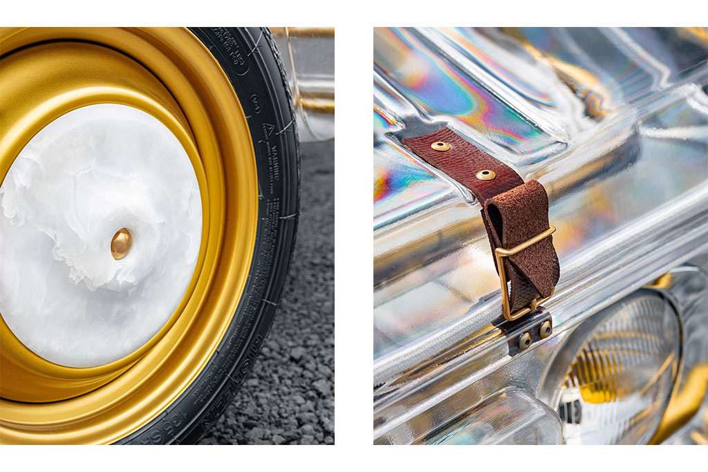
A concentration of expertise
Who said a hubcap and a lamp, or an automotive logo and a brooch, don't belong to the same world? Certainly not Maison Lacmé, whose project is centered on the ambivalence of objects. Each of the twelve elements created by master artisans has a practical function. "This car is a Trojan horse, a mobile cabinet of curiosities that hides things within itself," summarizes Antoine Tauvel, who originated these dual functions. "This idea is central. We did all the preparatory drawings and aesthetic choices in-house, then presented them to the artisans." From then on, the project became collaborative, and the sketches were adjusted for aesthetic coherence. The steering wheel, crafted from driftwood, and the seashell-embroidered upholstery open up a maritime horizon, while the feather-marquetry odometer—stuck at the Earth's circumference—can be removed and used as a desk clock. Beyond their utility, the techniques used recall those of the golden age of French decorative arts. Among them is the trompe-l’œil technique, used to replace the stone hubcaps with painted versions when the vehicle is in motion.
A true "poetic travel tool," the Maison Lacmé Méhari will be on display in the courtyard of the Hôtel de la Marine until Sunday, October 4.
For this new edition of Paris Design Week, the Intramuros team slipped through the capital's arteries to discover the season's latest exhibitions and new releases. Here is a look back at the ones you shouldn't have missed.
From September 10th to 19th, design once again took over the streets of Paris, much to our delight! Whether industrial or collectible, the creative sector made headlines again, both through new collections and new gatherings. It was an opportunity to rediscover certain profiles and meet new minds driven by innovative concepts. Among all the installations we discovered, here are the ones that particularly caught our attention.
Picnic by Cluzel / Pluchon: an invitation to lunch
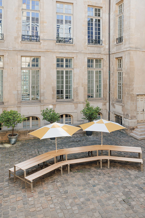
Following Marianna Ladreyt last year, designers Cluzel / Pluchon took over the courtyard of the Hôtel d’Albret to present the Picnic installation, created in collaboration with manufacturer Guyon Mobilier Urbain. Conceived as an invitation to share and wander, Picnic was unveiled as a life-sized picnic table over seven meters long. Continuing the Gier duo's well-known collection, it combined locust wood slats with a powder-coated steel structure, drawing a generous curve to create a dialogue between urban furniture and conviviality.
GOOD SELECTION by Lucas Zito and Marika Caputo: new scenes
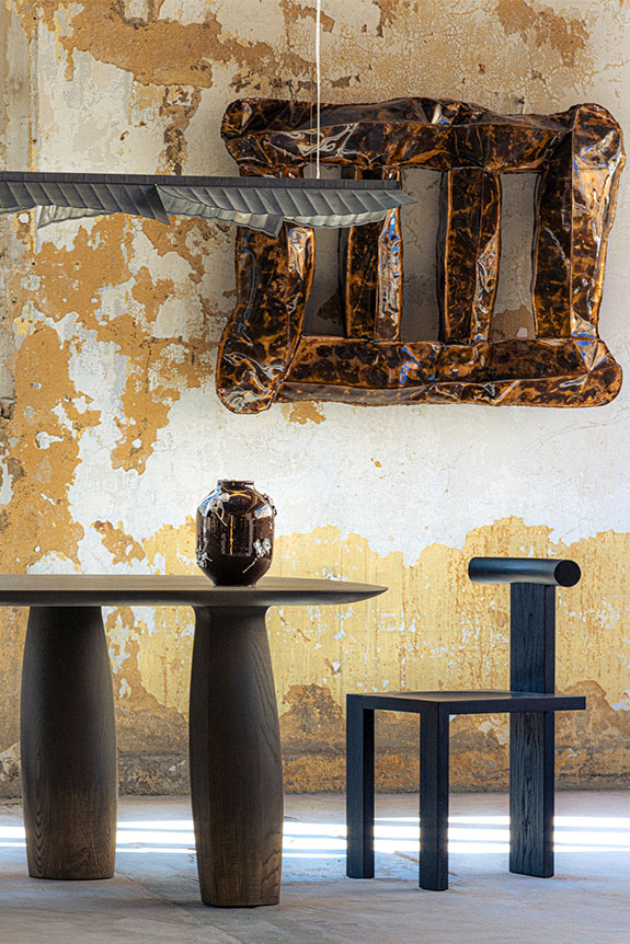
Organized by Lucas Zito and Marika Caputo, the second edition of GOOD SELECTION was held this year in the heart of the Fondation Fiminco in Romainville. Now disused, the former pharmaceutical factory—reminiscent of some of the most surprising Milanese venues chosen by Alcova—was taken over for the occasion by 47 international designers. Favoring dialogue between creations rather than formal classification, the exhibition offered various living spaces. A combination of styles and atmospheres provided visitors with a new, more embodied perspective on this so-called "collectible" design.
Volt Face by Studio 5.5 and Schneider Electric: high-voltage collection
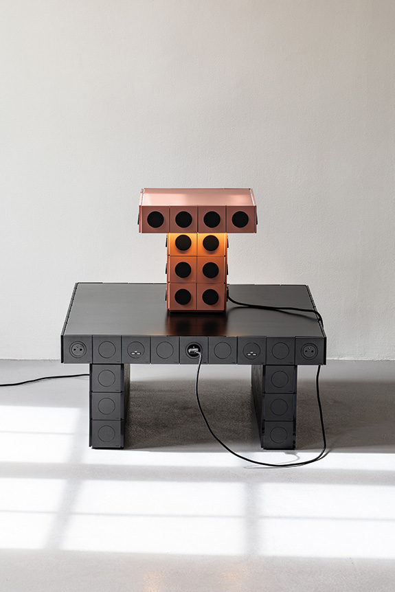
Studio 5.5 teamed up with Schneider Electric to imagine the Volt Face lighting and furniture collection, designed using the Odace range and presented at the Galerie Joseph on Rue des Minimes. Faithful to their taste for repurposing everyday objects, Vincent Baranger and Anthony Lebossé chose to make the socket and switch the main element of their creation, rather than an afterthought. Developed as wall lights, pendants, lamps, tables, and even nightstands, each piece plays with the repetition and assembly of the modules. Conceived as a true creative palette, the Odace range thus becomes a material to be composed, but also to be touched and operated, making these pieces playful and offering a fresh look at these familiar yet often undervalued objects.
Tout est Chaos by PLI Office: ordering the desirable
After initiating "Pour que tu m’aimes encore" in 2024 and "Design Disco Club" the following year, Christopher Dessus returned this year with "Tout est chaos." Presented at the Gaîté Lyrique, the exhibition brought together a body of work that acts as a vector for surprise. A feeling conveyed by the material or the form, but also and above all by a freer consideration of usage. It is a counterpoint to modernist design, which is generally serial and fundamentally utilitarian, here abandoned in favor of narrative. It was an opportunity to see very personal research collide, such as the non-linear or even random work of the series, the reinterpretation of industrial archetypes reworked by hand, or new explorations blending industry and craftsmanship. Driven by a nearly free participation, the 66 selected designers delivered a specific idea of design, claimed by 10 of them through installations and even a projection imagined as a manifesto.
Victoria Wilmotte: Stainless Steel Collection
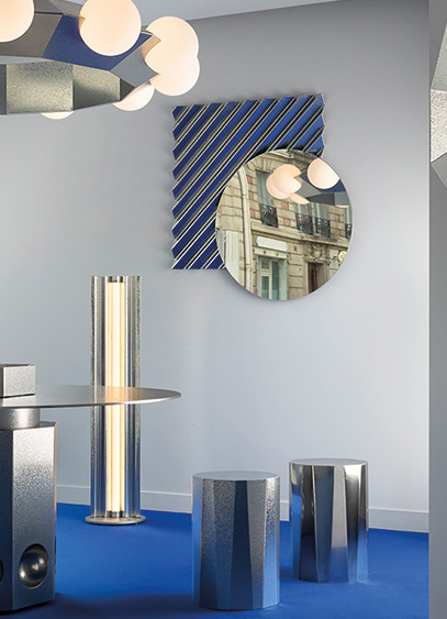
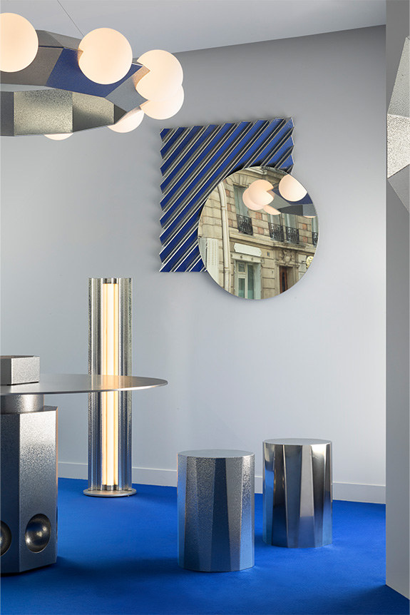
For this year's Paris Design Week, Victoria Wilmotte unveiled nearly a dozen pieces. Whether brand new or reimagined existing typologies, this collection continues to explore a world defined by geometry and a distinct industrial spirit. Crafted from stainless steel—sometimes featuring textures that evoke the technique of hammering—the various objects diffused light, along with the signature blue hue championed by the designer.
Opus by Studio CHHO: A New Trajectory
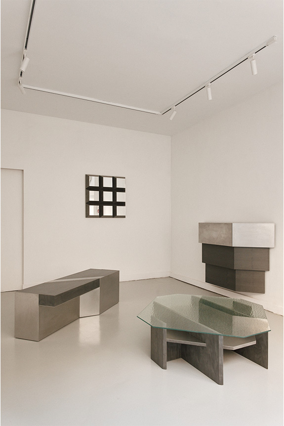
Launched a decade ago, the interior architecture firm Hoch unveiled Studio CHHO, the creative force behind Opus. This debut furniture collection, whose name suggests both a first chapter and a technical term for stone masonry, consists of five pieces. Developed over a year and a half, it highlights taut lines and 90° and 45° angles, delivering a bold aesthetic language with generous forms. Enhanced by a restrained palette of three materials—stained birch veneer, hammered glass, and vibrated stainless steel—the pieces were conceived as "objects of presence." This term, unique to the studio, reflects creations made in the south of France that embody the firm's sober yet characterful DNA.
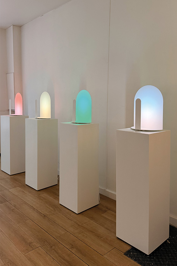
"The Light Library" by Studio Meaningfull: Coloring Light
Continuing their research into color, which began with the Agora du Design grant they won in 2021, Studio Meaningfull—comprising Marine Rouit-Leduc, Galilée Al Rifaï, and Nicolas Rouit-Leduc—presented "The Light Library" at Galerie Ideal Place. The exhibition showcased nearly four years of experimentation with the color of light, conceived not as a material, but as a means of interaction. Each shade was developed with reference to natural phenomena, such as the aurora borealis, dawn, and twilight, to achieve a realistic and natural effect. The trio displayed several light-based objects and sculptures, including the Milan lamp, which recently joined the Mobilier National collections. The exhibition was designed to engage the senses and emotions while establishing new chromatic references for light, through an approach that is both sculptural and architectural.
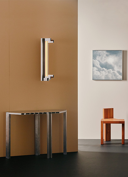
Triode recently opened 28, a new Parisian space designed as a creative playground for designers. To kick things off, Jean and Oliver Pelle, founders of the American studio Pelle, are presenting "Metallic Reverie," an exhibition featuring ten original pieces centered on metal and light.
Neither a gallery nor a showroom, 28—located at 28 rue Jacob in the 6th arrondissement—aims to offer a new exhibition format. Conceived by Jacques Barret, founder of Triode, this new space invites the designers represented by the firm to go beyond simply showcasing their collections. For each exhibition, they are given carte blanche to reveal a more personal side of their creative world. For this inaugural invitation, Triode reunites with Jean & Oliver Pelle, four years after their first joint exhibition in Paris.
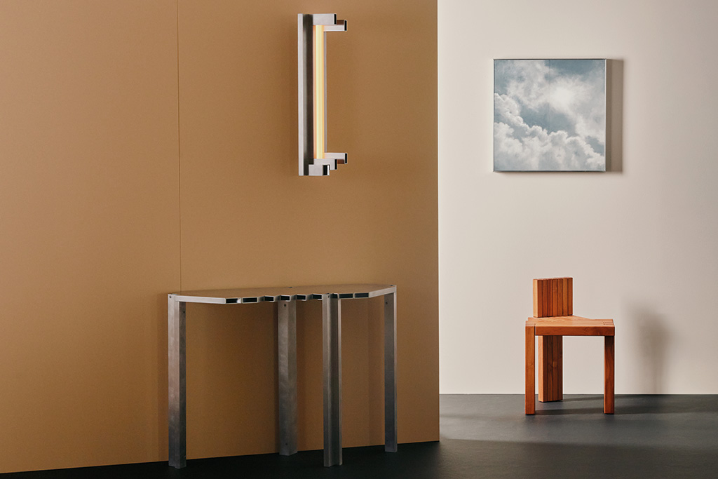
Two perspectives on material and light
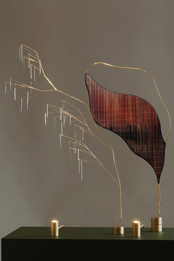
Architects by training and based in Brooklyn, Jean and Oliver Pelle have developed a practice that sits at the intersection of architecture, craftsmanship, and experimentation. For the "Metallic Reverie "exhibition, the duo created ten works specifically for 28, all united by a single material: metal. Jean Pelle presents her Fountain lighting series, inspired by memories and landscapes observed in Korea and along the American coast, while Oliver Pelle explores the intersection of light, material, and space through his Light Objects. Two distinct styles, yet united by a shared focus on materiality. It is a fitting way to inaugurate 28 by showcasing exactly what this new venue aims to reveal: the intimate personality of the designers.
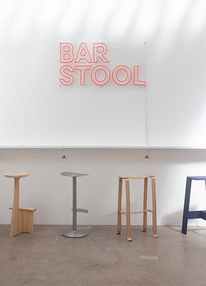
For their first joint exhibition, Athime de Crécy and Quentin Frichet have invited 35 designers to each create a stool. This free-spirited and convivial initiative, centered on utilitarian design, is on view at Espace Brownstone in Paris until September 19.
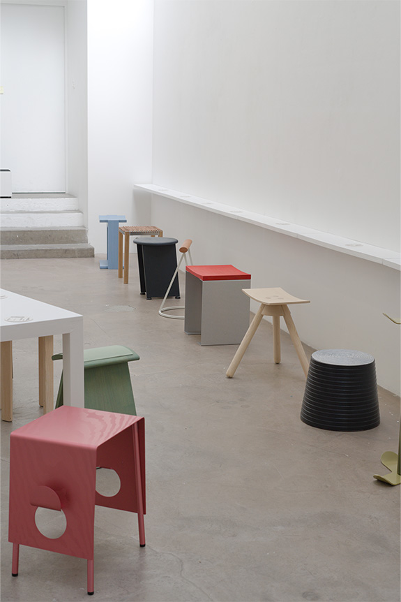
It is a sentiment some might find overused, but design, beyond its commercial and aesthetic dimensions, must be utilitarian. This philosophy, often challenged in the context of collectible design and shifting trends, is shared by Athime de Crécy and Quentin Frichet. Both ECAL graduates, having trained under Philippe Starck and Erwan Bouroullec respectively, the two young designers have taken over Espace Brownstone in Paris until September 19. It is a white-box space where 35 stools are displayed—not for visitors to look at, but for users to experience. "We had wanted to create a self-service exhibition for a long time. We initially thought about doing it in a bar, but in the end, the typology of the object took precedence over the venue," explains Athime de Crécy. Here, behavior is not dictated by the decor—which is nonexistent, save for a central table and drink storage at the entrance—but by the very nature of the pieces themselves. Presented without pedestals or labels, the seats invite everyone to pick them up, move them around, and sit down, effectively transforming the gallery into a living space. "We believe that a design exhibition that separates objects from the public invariably loses an essential aspect of what makes the discipline so powerful." The social dimension is an imperative here, carried by the stool and its characteristically lighthearted tone.
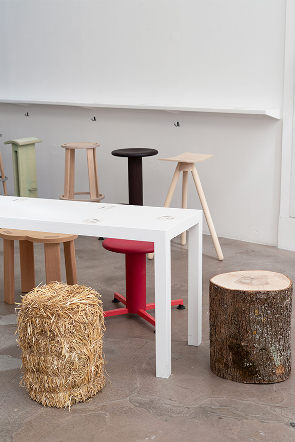
A shared idea expressed in every form
If a single object can spark different visions from one mind to another, *Bar stool* is the perfect illustration. A true synthesis of forms and materials, the exhibition is an ode to creativity. From the technical mastery of molded wood by Arthur Desmet to the high-tech 3D-printed stainless steel by the German studio Wint, the exhibition reveals a paradoxical coherence driven by the balance of diverse ambitions. "We didn't have to look far to find the designers. They are friends with whom we share a common sensibility for utilitarian and expressive design. We simply gave them total creative freedom, without even imagining that the projects might end up looking alike." A curation that gives this ephemeral refreshment bar its unique character and connects the aesthetic experience with everyday life. "It’s an approach that, in our view, draws the maximum amount of meaning from the minimum amount of resources."
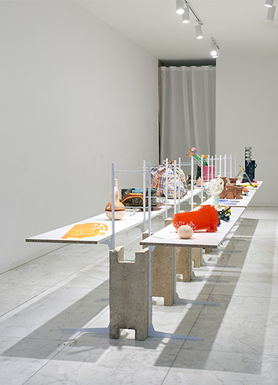
For Paris Design Week, Pierre Castignola and Alexandre Delasalle have brought together the work of 27 designers for the exhibition "take one just in case." It is a tribute to forgotten, sometimes incongruous typologies and unexpected styles.
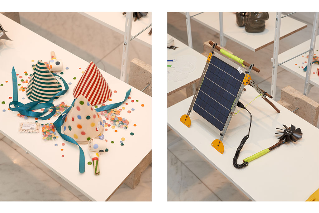
While Paris Design Week is keen to celebrate design in all its diversity, the field remains a relatively closed concept. It was based on this observation that Alexandre Delasalle and Pierre Castignola conceived an exhibition for this September edition to celebrate alternative typologies. "Over the years and editions, we were frustrated to see that the pieces presented were generally the same, ranging from chairs to tables to mirrors. Yet, my pop-culture aesthetic and Pierre’s very classic, everyday objects don’t fit into the codes of postmodern design.", analyzes Alexandre Delasalle. Convinced that the sector is more abundant than it lets on, the duo created an exhibition celebrating neglected objects.
A heterogeneous gathering
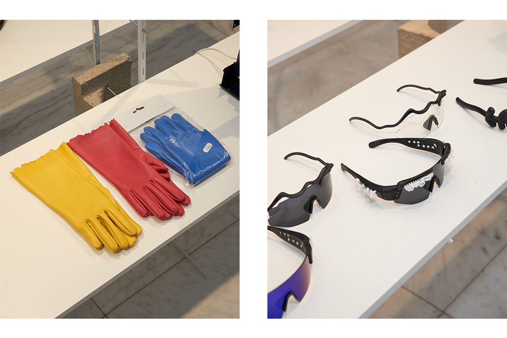
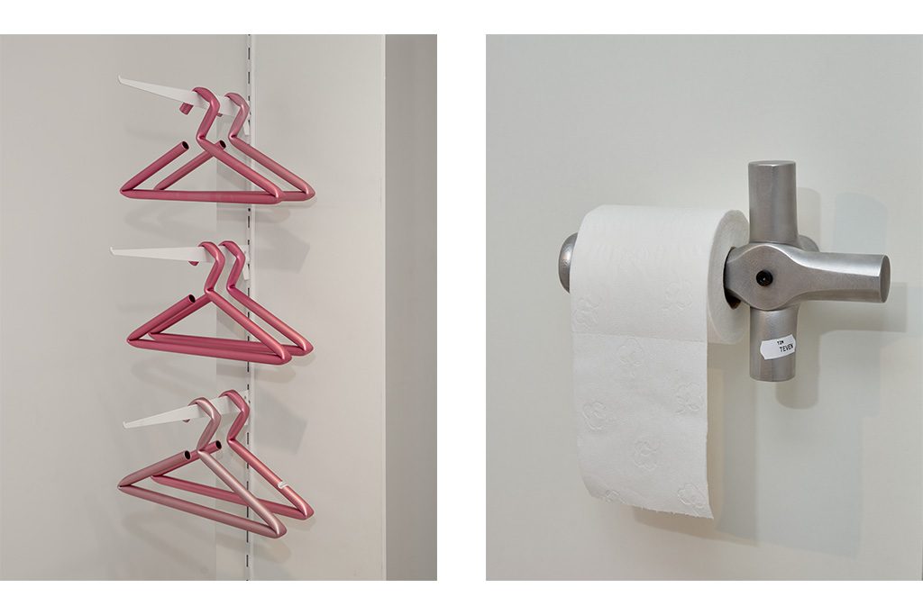
To help illustrate this diversity, the two friends invited 27 different profiles—designers and artists alike—to rework object archetypes. "Originally, Pierre and I thought of objects like a pizza cutter or a bucket, because these are objects that don't have a name in design. The former is usually inhabited by something else, like a superhero shape or an offbeat color, while the latter is so forgotten it becomes the zero degree of writing." Two opposing approaches—one loud and one silent—quickly expanded by the unique visions of the other creators. From the leather dishwashing gloves by Alice Clermont to the industrial toilet paper dispenser by Tim Teven, and the ceramic box topped with a spiked collar by visual artist Sacha Lefèvre, the approaches, sometimes very literal or more embodied, intertwine within the exhibition. "What seemed most important to us was to establish a corpus capable of surprising us. Overall, we knew all the profiles to varying degrees, but our discussions and reflections now allow us to exhibit very different objects, whether they were designed specifically for the event or not."
A creative bazaar
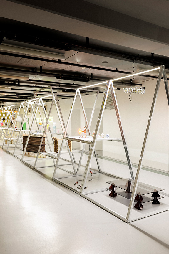
Inspired by the multitude of invisible objects that inhabit our storage spaces, Alexandre Delasalle and Pierre Castignola took an interest in bazaars. "These are spaces that bring together very contradictory elements, ranging from classics that can last a lifetime, like a frying pan, to very striking but sometimes very ephemeral things, like slippers." Drawing on the idea of these markets, the exhibition space, formerly a garage, has been shaped into a long, narrow layout. "What was interesting is that the notion of a bazaar isn't the same from one country to another. I have the one in Belleville in mind, but for other creators, it might be chain stores like Action. However, the idea of a small storefront with longitudinal aisles is common. We wanted to capture that feeling of entering the space.", explains Alexandre Delasalle. In keeping with this vision, the exhibition space features a long central shelf where a neo-futuristic hand brush and a baroque mini-fan straight out of a Disney movie engage in dialogue. "The scenography is DIY, using cinder blocks and storage racks, but it serves the concept. It’s the accumulation of a certain number of objects that gives the bazaar its spirit, not the other way around. And it’s this idea that gives 'take one just in case' a polyphonic quality," concludes the designer.
Textiles, now a matrix for space, are being celebrated at the Hôtel des Arts in Toulon. Through a hundred works, the exhibition "Follow the Thread! Design & Textile" weaves a history of creation driven by innovative designers.
Long relegated to the status of domestic ornament, textiles have now established themselves as a medium of the moment. A key player in structural and aesthetic revolutions, the medium is being showcased at the Hôtel des Arts in Toulon until October 31. The exhibition "Follow the Thread! Design & Textile" offers a historical deep dive through a hundred works from prestigious collections such as those of the Centre Pompidou and the Mobilier National. Opening with pioneering figures like Sonia Delaunay and Élise Djo-Bourgeois, the exhibition highlights the dialogue initiated between different sectors such as furniture, fashion, and architecture. It is an opportunity to recall not only the role women have played in the history of textiles but also the beginnings of a modernity where pattern and weave become one with space.
An intimate history is followed by the more impersonal yet universal story of synthetic fibers. The 1960s saw the birth of jersey, and stretch fabrics broke free from their frames to embrace the shapes of the body as well as structural armatures, driven by designers like Pierre Paulin and Olivier Mourgue. From then on, textiles became a tool for industrial innovation. At the same time, artists and creators like Sheila Hicks and Simone Prouvé explored the porous boundaries between art, structure, and habitat.
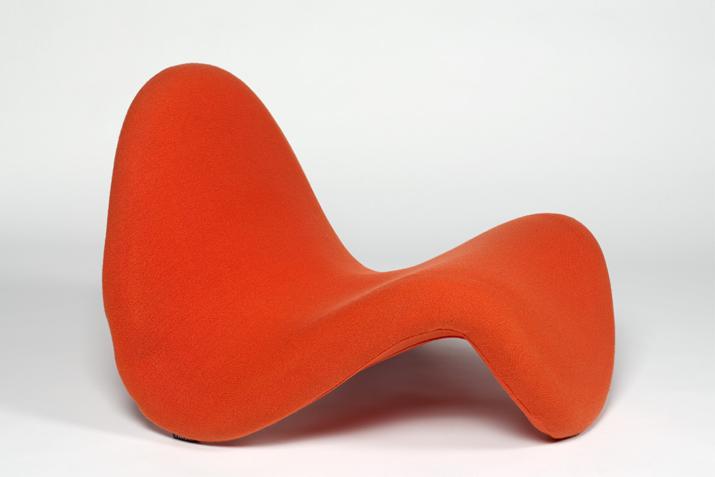
Textiles: A Flexible Universe
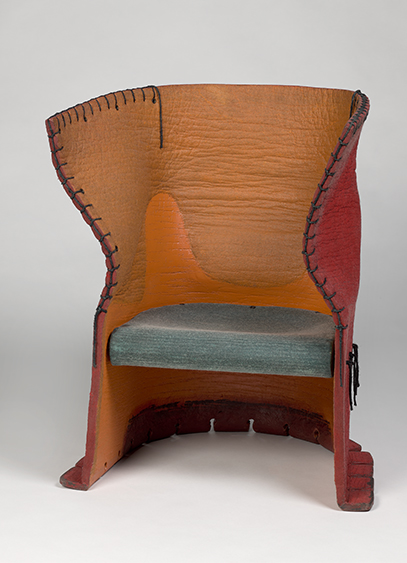
The exhibition also highlights the creative repurposing of materials. From the radical proposals of Gaetano Pesce or the Droog Design collective in the 1990s, to the sculptural metal meshes of Dominique Perrault, Gaëlle Lauriot-Prévost, or Muller Van Severen, the thread sheds its flexibility to become a rigid architectural language. This evolution opens new horizons for a new generation embracing these fibers in an era of high technology and environmental responsibility. From the hybrid pieces of Hella Jongerius and Jeanne Goutelle, which blend digital weaving with ancestral craftsmanship, to the modular acoustic walls of Ronan and Erwan Bouroullec, this exhibition invites you to trace the thread of a sector that is omnipresent in our lives.
Left: Pauline Esparon Arso Armchair, 2024 ©Adagp, Paris, 2026 © Les Arts Décoratifs / Christophe Dellière
Right: Marcel Wanders Knotted Chair, 1996 © Gaetano Pesce © Centre Pompidou, MNAM-CCI/Bertrand Prévost/Dist. GrandPalaisRmn
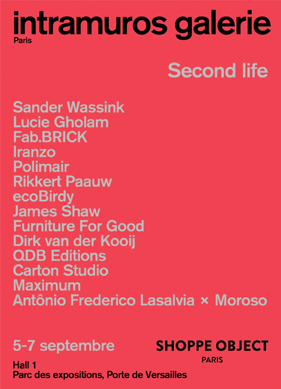
For this second edition of Shoppe Object Paris, Intramuros invites you to discover the "Second Life" exhibition and the work of the designers featured in the pages of our latest issue, now available on newsstands.
For its second French edition, Shoppe Object Paris returns to the Porte de Versailles from September 5 to 7, 2026. Dedicated to the home, design, and lifestyle sectors, this year's fair aligns with the overarching theme of Who's Next: The Dinner. Designed in harmony with this concept, the scenography will center around a large display table featuring over 80 brands, including Michie Studio, Tiptoe, and Rikke Falkow.
Intramuros at the heart of the event
Echoing the fair's curatorial focus, Intramuros will take part in the event by unveiling the "Second Life" exhibition, showcasing the work of designers featured in our September issue. More than just a timely topic, we wanted to highlight concrete and innovative perspectives. Convinced that current challenges should not lead us to stop producing, but rather to open up new creative horizons by revealing the potential of materials, this theme aims to celebrate the ingenuity of a sector that is reinventing its processes and methods. These are the practices that repair, transform, reuse, recondition, and repurpose what we, as consumers, would otherwise discard. Certain that circularity should not come at the expense of desirability, our selection brings together fourteen stories that the editorial team invites you to discover through Monday at Shoppe Object Paris:
- Sander Wassink
- Lucie Gholam
- Fab.BRICK
- Iranzo
- Polimair
- Rikkert Paauw
- ecoBirdy
- James Shaw
- Furniture For Good
- Dirk van der Kooij
- QDB Editions
- Carton Studio
- Maximum
- Antônio Frederico Lasalvia × Moroso
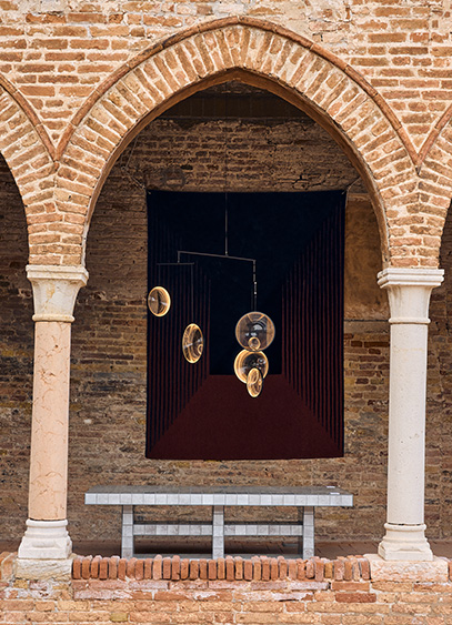
Through July 20, DCW éditions is presenting the exhibition "Il corpo della materia" in Venice. It is an opportunity to showcase the publisher's products within the historic setting of the Gothic church of Madonna dell'Orto.
Could there be a better place than Venice to showcase glassmaking expertise? For the first edition of Bel Ouvrage, the French brand DCW éditions and its label 10 HEURES 10 are taking over the cloister of the Venetian Gothic church of Madonna dell'Orto through July 20. Titled "Il corpo della materia" (The Body and the Matter), the exhibition brings together some fifteen contemporary creators and their works, highlighting exceptional craftsmanship. This showcase was curated by Carole de Bona and designed by Andrée Putman Studio within this Renaissance-era setting. Here, the weathered brick architecture contrasts with the formal precision of contemporary glass and metal. Set up as a semi-outdoor showroom, the cloister offers a path defined by the rhythm of the colonnades and the orthogonality of the courtyard, balanced by the free-flowing volumes of the lighting fixtures on display. It is a way of confronting eras and styles in a symbolic journey dedicated to conveying the idea of timelessness so dear to the brand—a vision achieved through the fusion of modernity and heritage. Where architecture is inhabited by design, light seems to breathe new life into it.
Bel Ouvrage 2026 - Venice ©Luca Bonnefille
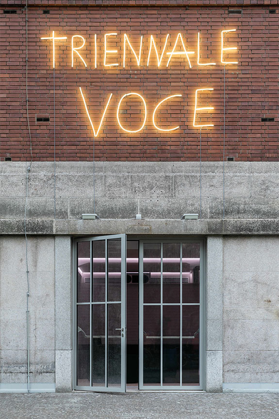
Once again this year, the Triennale hosted some wonderful events as part of Milan Design Week 2026. But more than just an exhibition venue, this essential landmark of the Lombard capital is, above all, a place steeped in history where design continues to come to life through a dense and varied program.
Milano Design Week 2026 marks a turning point. Faced with a sometimes overwhelming visual inflation, the city seems to be returning to its fundamentals, embracing a culture of design memory inherited from the 20th century. Objects are never conceived in isolation, but as the culmination of a global project blending architecture, utility, aesthetics, and social vision. Some cities tell their stories through their monuments; Milan tells its story through its archives as well. Whether drawings, models, photographs, notes, or prototypes, these archives reveal everything that precedes the finished work and preserve its potential. The Triennale di Milano fully embodies this movement.
But what exactly is the Triennale?
More than just an exhibition center, the Palazzo dell’Arte (Triennale di Milano) is a modernist building designed in 1933 by Giovanni Muzio as a true multifunctional and transdisciplinary cultural hub. From the very beginning, it brought together exhibition halls, a theater, a restaurant, a bar, an archive center, and even a nightclub.
Since 2019, the venue has been reimagined under the leadership of Stefano Boeri, President of the Triennale, Carla Morogallo, Director General, and Luca Cipelletti, Director of Architecture.
Back in 2024, this cultural space inaugurated the "Cuore – Research, Study and Archives Center," a space dedicated to research, memory, and innovation. Located on the ground floor of the Palazzo dell’Arte, this 400 m² area to the left of the main hall welcomes researchers, students, visitors, foundations, and universities. Free to access, Cuore places the research work that fuels the Triennale's entire program back at the center. With decades of national and international exhibitions, it has become a major documentary and heritage center. Its collections include books and journals, graphic, photographic, and audiovisual archives, as well as nearly 2,900 architectural pieces such as drawings, plans, models, and other documents related to projects carried out at the Palazzo dell’Arte and throughout Milan since 1933. The institution also preserves the archives of major figures in Italian design, such as Andrea Branzi, Alessandro Mendini, and Ettore Sottsass, to name but a few.
A discreet yet exemplary rehabilitation
The renovation of the Palazzo dell’Arte supports this new direction. The goal is to modernize the building while rediscovering the original spirit envisioned by Giovanni Muzio in 1933.
Three pillars structure this transformation: recovering the spirit and preserving the heritage of 1930s Italian rationalism, improving energy performance, and ensuring the spaces are more accessible, flexible, and contemporary.
The restoration highlights the architectural qualities of the site, for example by reopening perspectives (notably the view of Muzio’s helical staircase in the Cuore space), streamlining technical elements, restoring zenithal lighting by uncovering the glass-brick roof, and reintegrating the original window frames. The new, nearly invisible technical installations (insulation, heating) significantly improve the clarity and flow of the space.
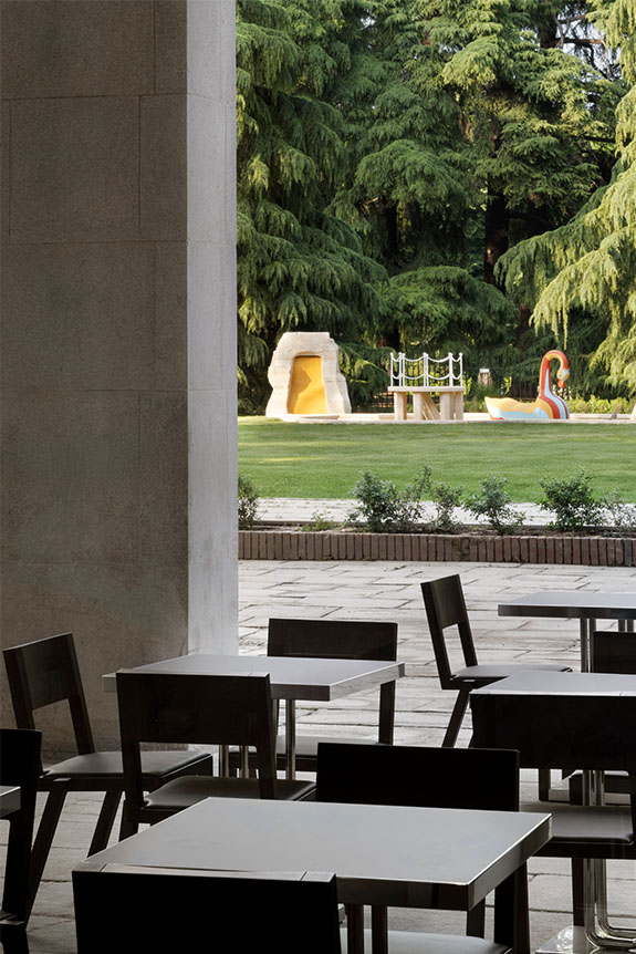
In 2025, the venue opened up to new uses. Notable additions include the return of the café and restaurant (Cucina) to their historic location on the park side, as well as the opening of Voce—a space dedicated to music and performing arts—and Gioco, a creative space for children.
Through this transformation, the Triennale also reminds us that Milan’s creative uniqueness lies in its ability to foster a dialogue between rationalism, modernist heritage, and poetic postmodernism.
Through the quality of its exhibitions, spatial design, and architectural restructuring, the Triennale presents itself more as a living, evolving, hybrid building than a static monument. It brings design to life by recounting the trajectories of those who create it, questioning its uses, its critical reach, its social dimension, and the daily joy it can still provide. The simple, human, and elegant names chosen to characterize the various sectors prove this: Cuore, Cucina, Gioco, and Voce.
So, the Triennale di Milano? A must-see, again and again!
2026 Exhibitions
Andrea Branzi — Continuous Present
Exhibition design: Toyo Ito
Through October 4, 2026
One of the major exhibitions of this edition is dedicated to Andrea Branzi, a thinker, poet, unclassifiable designer, and central figure of Italian Radical Design. He was a tireless advocate for a way of "living poetically in the world," rooted in tolerance and critical fiction.
Conceived as a tribute by Toyo Ito—a close friend and fellow thinker—the exhibition explores Branzi’s critical and deeply humanistic vision. Titled Continuous Present, it expresses his opposition to a mechanical, rationalized, and uniform modernity.
The exhibition revisits the major themes that run through his work: architecture without walls, the hybridization of nature and the city, constant transformation, encounter and adaptability, and the rejection of rigid systems.
For Branzi, deconstruction is never nihilistic. On the contrary, it opens up a space for wonder. His idea of the "continuous present" evokes a city and a world in perpetual evolution, where joy and optimism are a moral and social duty. A lesson worth remembering!
Toyo Ito’s fluid and almost organic spatial design perfectly extends this philosophy.
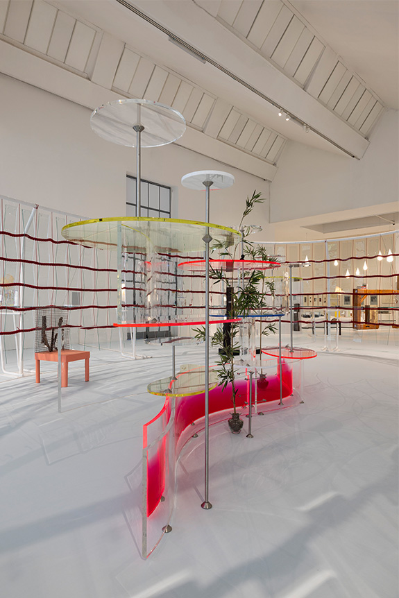
Lella and Massimo Vignelli. A Language of Clarity
Exhibition design: Jasper Morrison
Through September 6, 2026
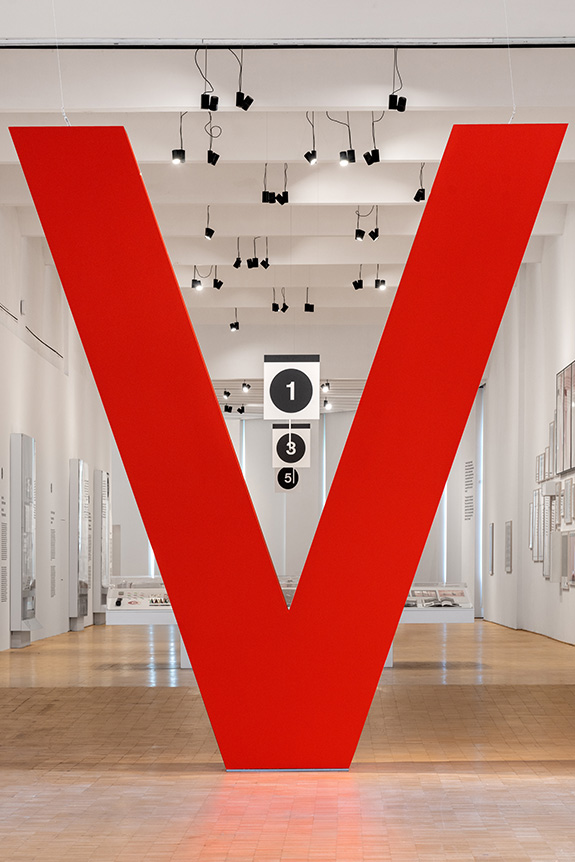
As a counterpoint to Branzi’s critical post-modern design, yet equally joyful and optimistic, the Triennale presents a major retrospective dedicated to Lella and Massimo Vignelli.
Known for their rigorous interpretation of Swiss-inspired modernist rationalism, the Vignellis left a profound mark on international graphic and industrial design between Milan and New York from the 1960s through the turn of the 21st century.
The exhibition, designed by Studio Jasper Morrison, brings together a large collection of iconic pieces. It demonstrates how their work always sought to reveal a clear, colorful, and universal logic, whether in a subway map, a book, a piece of furniture, or jewelry.
Their work serves as a reminder that beyond style, design can above all constitute a language of clarity, capable of reaching an extremely broad audience, far removed from any elitist vision.
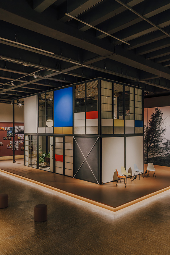
The Eames Houses - Launch of the Eames Pavilion System
In partnership with Kettal
Until May 10, 2026
The Eames Houses exhibition is based on extensive archival research into the residential projects of Ray and Charles Eames, both built and unbuilt. It presents a vision of modular, prefabricated, and deeply human architecture, supported by a vast body of documentation.
For the Eameses, a house was never a static object, but an adaptable system capable of bridging daily life, modularity, and industrial production. Their architecture developed a unique synthesis of modernist rationalism, functional prefabrication, and an organic sensibility inspired by Japanese aesthetics. This is particularly evident in the fluid relationship between interior and exterior, designed to suit the Californian climate and landscape.
This reflection continues today with the launch of the Eames Pavilion System, developed with Kettal under the direction of Eckart Maise, a long-time collaborator of the Eames Office. The system is based on repetitive structural modules combined with various roof and facade options, allowing for multiple configurations, from a small pavilion to a complete house.
The project thus reactivates one of the Eameses' fundamental ideas: to conceive of architecture as an evolving system rather than a definitive form.
Alphabet — The design of Edward Barber & Jay Osgerby
Until September 6, 2026
The exhibition occupies the beautiful Design Platform space, which, following the major architectural and functional renovation of the Palazzo dell’Arte, is now located in the large area opening onto the garden, previously—and unfortunately—occupied by the Triennale café.
The exhibition’s chronological path highlights the gradual evolution of their "stylistic alphabet" from the mid-1990s to the present day. It showcases a rigorous approach to color, technical curves, angular geometries, and constructive precision.
Key pieces on display include the London 2012 Olympic torch, the Iris tables for Established & Sons, the Tab lamp for Flos, and several special commissions and experimental projects. Through these works, the exhibition demonstrates how their practice combines industrial rigor and artisanal mastery with increasing technical sophistication.
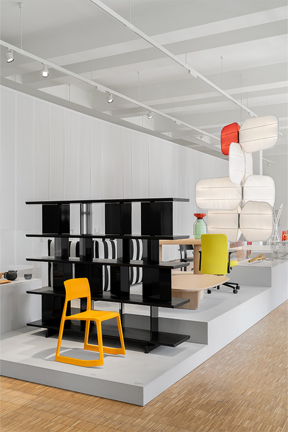
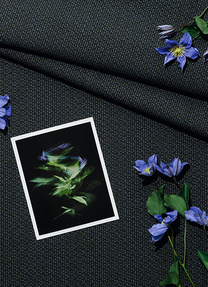
For its participation in Milan Design Week 2026, Kvadrat is unveiling two exhibitions this year: one paying tribute to designer Frans Dijkmeijer, and the second dedicated to the new Twisted Flowers collection, reimagined by Giulio Ridolfo. It is an opportunity for the latter—regularly hailed as a master of color—to discuss his work and his approach.
A key figure in the world of textile design, Giulio Ridolfo has been collaborating with Kvadrat since 2007. Coming from the fashion world, the man who now dresses furniture is the creative force behind several of the Danish brand’s bestsellers, including Canvas 2, Remix, Steelcut, and Zulu. With an approach rooted in color but deeply connected to the technical dimensions of yarn, the designer develops a vibrant, lively, and resolutely contemporary language where innovation takes center stage. His creative process is often described as a blend of intuition, anthropology, and a form of self-taught botany. It was precisely this floral inspiration that led him to explore an archive by Frans Dijkmeijer, which he has reimagined and expanded into 21 colorways. Giulio Ridolfo discusses this technical and stylistic endeavor on the occasion of the "In Rainbows" exhibition. To discover the collection as staged by architect Lorenzo Bini, visit the Kvadrat showroom in Milan at Corso Monforte 15.
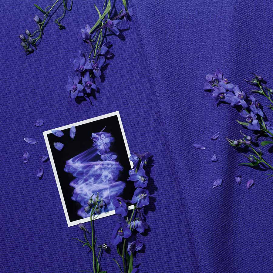
For Milan Design Week, Kvadrat is presenting the "In Rainbows" exhibition, where visitors can discover the Twisted Flowers collection. What is it all about?
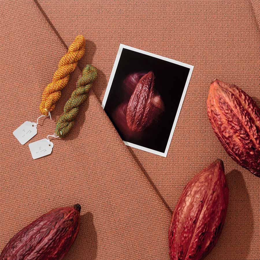
Twisted Flowers is a story of composition between my work and that of Frans Dijkmeijer. This collection is a revival of a weave by the designer—who passed away in 2011—which we have reimagined with a real focus on the tactile and visual experience. As is often the case, and it was a shared passion with Frans, I worked with color by drawing inspiration from flowers. We collaborated with a company to select seasonal plants—not exotic ones, but those linked to our environment. For example, you can find the red of the Fritillaria imperialis, the blue of the Ceanothus thyrsiflorus, and the yellow of the Gossypium, which together almost form a bouquet. I sought to translate the very experience of picking flowers into color, by observing them closely and immersing myself in floral paintings like The Dream by Odilon Redon, which I saw in Bern years ago. I was struck by a sense of suspension. It wasn’t exactly dreamlike, but suspended, with undefined colors and a meditative figure. Of course, what we have done is not a literal translation; the blue is not simply blue, and the red is not just red. It’s not like using a Pantone swatch book, which I don’t like at all. Instead, we selected colors capable of creating a kind of interference, a beautiful vibration, a pixelation of the object’s skin.
And you are presenting this in a unique setting…
Absolutely. The showroom area is usually reserved for sales, but not here. At first, I thought about hiring a florist, but I ultimately preferred to work with the structure itself, thanks to Milanese architect Lorenzo Bini. The idea was to invade the space and transform it with a more whimsical, almost magical effect. I didn’t want a clean, minimal space; I wanted to create a pleasant passage where people can linger and appreciate the quality of the colors. In this "hut," there is also furniture—ranging from standard contemporary Danish and Italian designs to pieces by great names like Carlo Scarpa, Cecilie Manz, Finn Juhl, and Jean Nouvel. And since I am very drawn to music, I collaborated with a music programmer in Milan. We have planned four performances based on vibration, intuition, and phasing, which is a technique used by Steve Reich. In fact, this installation is almost a manifesto.
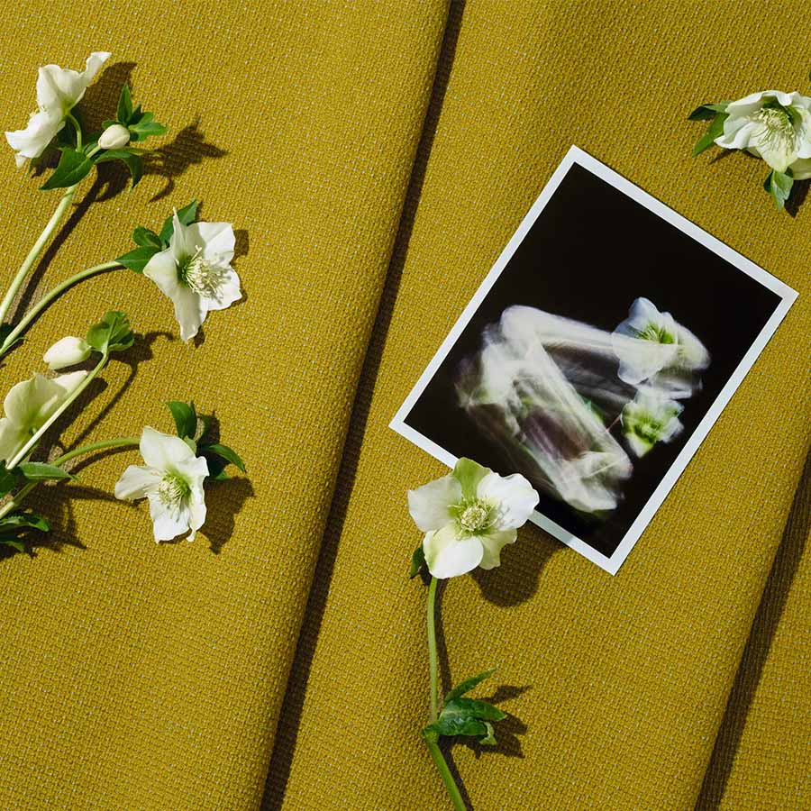
You previously mentioned the work of Frans Dijkmeijer, to whom Kvadrat is dedicating a biographical exhibition at the Triennale. What was your relationship with him like?
The relationship with Frans began with great mutual respect. He thought in black and white to reveal the flaws and beauty of construction, while I worked freely with color. That was the starting point of our relationship. I originally come from the fashion industry, where I was used to handling textiles for dresses, and for the past fifteen years, I have been working on furniture pieces. I gradually became a colorist through long practice in selecting shades, textiles, and materials for companies in the furniture sector. In a way, my primary occupation was to help a project be seen, from the prototype to the industrial solution, which is what I did with Vitra and Moroso, where I started. When I was offered the chance to work with the brand, I knew textile design, but I didn’t want to become a textile designer. However, I was happy to intervene on color, provided I could establish a dialogue with the creator—and as it happens, that creator was Frans Dijkmeijer. One of my first exercises alongside him was to color a fabric with a very pronounced grain, a pinpoint which looks like grains of rice. That is how Steelcut was born; its name comes from "Cut Steel," a Victorian-era technique where iron was cut into diamond shapes to mimic the sparkle of precious stones. It was a foundational project that defined my position.
You are a colorist, but your perspective on textiles is also deeply technical, particularly regarding three-thread weaving, isn't it?
The idea that I work with three threads has become famous, but in reality, I can work with five, six, or just one. It all depends on the situation. I am very drawn to the gouache work of 20th-century artists like Paul Klee, or to a certain musicality, like that of Sibelius. For me, the complexity of a construction adds an extra quality to the color. I once saw Frans use one white thread with two black ones to reveal potential errors in the weave and understand the disruptive element. It was an artisanal way of enriching his creations. But at the same time, working with Kvadrat taught me great rigor. Their textiles must last, be reproducible, and the approach is almost scientific. You cannot have uncontrolled variations. In this context, the idea of working with three colors was born as an intuition. I wanted to understand what vibration might emerge by adding a third thread. When we developed Steelcut Trio, the results were astonishing because there was an iridescent effect, like in silk or taffeta, but with an essential difference. Where taffeta has two sides, this has three. It creates depth, a relationship between light and shadow, a kind of perspective. We continued this research, drawing inspiration from different textiles, until we created a thread composed of three distinct colors. Each thread itself became a complex blend. Two threads constructed this way give an impression of infinity where the color is never fixed. It is this technical expertise that gave rise to Remix, and which we continue to develop today.
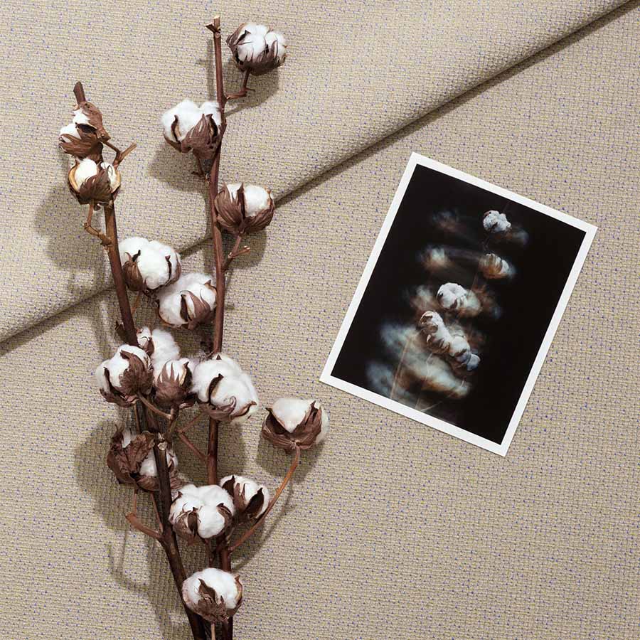
The vibration of colors, the notion of instability, of movement… there is a living quality that almost brings to mind fashion, isn't there?
Movement is inherent to fashion because textiles are on bodies and they move. You have a kind of third dimension that must be taken into account. When I work with a textile for furniture, it is more sculptural. You can walk around it. And then, furniture has the particularity of being able to be equipped with accessories or additions that can modify impressions and feelings. Fabric is one of them. With certain fibers like those from Kvadrat, the structure must be robust, but the fabric can give another impression, of lightness for example. That is specific to furniture.
From that point of view, do you consider textile to be a kind of filter?
If you are referring to semiology like Roland Barthes, then yes, it is a filter. But in reality, it is not. Fabric is the first thing you touch; it is the skin of an object. And in that sense, it is very sensual, because when you see a piece of furniture, you touch it first, then you say "what a beautiful sofa," "what a beautiful object"... It is, let's say, in synchrony with the form of the object. The filter comes into play when you filter information, when you start considering whether it is the right textile, the right sofa for a given use, or the right color... at least, that is how it seems to me. But I am a colorist, and being a colorist means starting with the thread, not the final coloring.
Until August 1st, Carpenters Workshop Gallery is showcasing a selection of contemporary designers. Among them is artist Ingrid Donat, whose works are presented alongside pieces by Pierre Jeanneret, some of which have been reimagined.
It is often easier to start a conversation when everyone speaks the same language. When that is not the case, you have to find a common dialect. For its "Dialogues" exhibition, the Carpenters Workshop Gallery, located at 54 Rue de la Verrerie in Paris's fourth arrondissement, has brought together a diverse collection of works, all (or nearly all) of which are highly contemporary. This theme serves as a focal point for a dozen designers and artists, including the Campana brothers, Nacho Carbonell, Rick Owens Furniture, and Wendell Castle. Despite their distinct personalities, their creative worlds manage to communicate through a layout that highlights connections—particularly in color—across the gallery's three levels. It offers a glimpse into the omnipresence of unique craftsmanship, even in the absence of shared techniques.
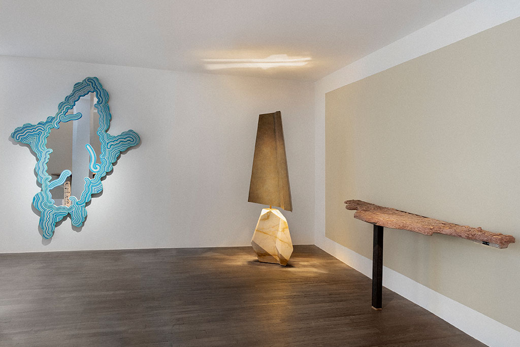
A timeless conversation
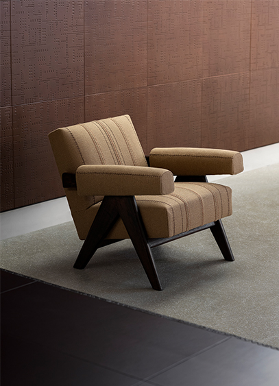
On the ground floor, the gallery has sought to establish a different kind of dialogue. More refined than the others, this one does not merely combine aesthetics but fuses them, transcending eras. Bronze specialist Ingrid Donat engages in a conversation with pieces by Pierre Jeanneret. For the occasion, the contemporary artist has reupholstered two Committee chairs and a Lounge Set. Beyond the new stylistic expression provided by the burlap, she offers a more contemporary interpretation of the objects while preserving the soul of this mid-century furniture through the choice of this industrial-coded textile. This is complemented by a desk covered in leather and decorated with the artist's signature motifs—a pictorial and ornamental language also found in the large compositions lining the gallery walls. It is a way of demonstrating that contemporary art can still evolve these well-established modernist icons.
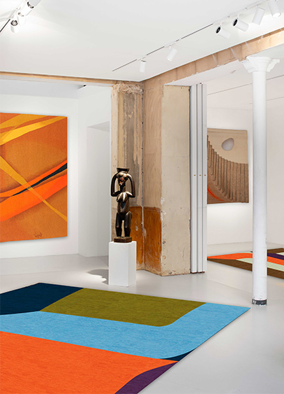
Le designer Gaspard Fleury-Dugy présente Continuum, une collection de tapis dont l’un d’eux est visible à la galerie Chevalier Parsua jusqu’au 18 avril. Un nouveau terrain d'exploration stylistique et colorimétrique pour le créateur connu initialement par ses objets en volume.
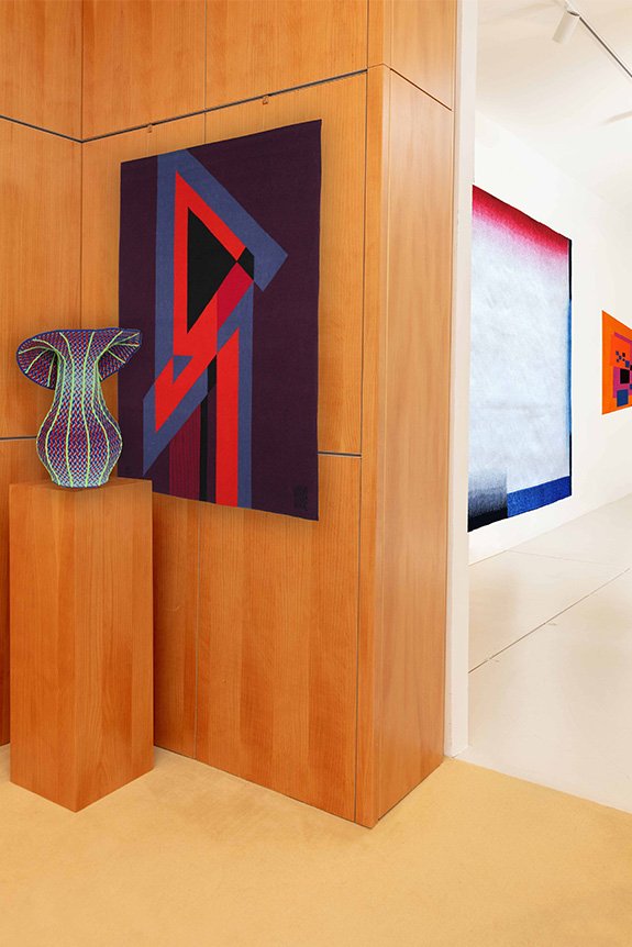
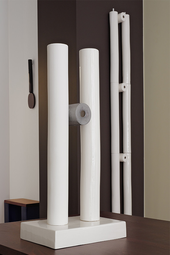
Pour changer de dimension, mieux vaut ne pas perdre le fil. Repéré pour ses vases tricotés en 2024 et sa série tournée vers l’univers du totem et de la colonne l’année suivante, Gaspard Fleury-Dugy a exposé à Milan comme à Eindhoven et Stockholm. Mais c’est à Paris, ville de résidence et d’expérimentation, qu’il dévoile Continuum, une première collection de tapis. Après des études à l’Ecole Dupperé puis à la Swedish School of textiles, cette nouvelle typologie aurait pu être un commencement, mais c’est finalement comme une déclinaison de ses précédents travaux qu’elle apparaît. Un choix surprenant qui n’a pourtant rien de décousu. « Il y a tout un cheminement logique entre mes dessins, mes maquettes, les différents objets présents dans l’exposition et les tapis. Effectivement, je viens d’un univers ou le motif à toujours eu une forme attirante. Mais ce qui m’intéresse, ce sont les sauts entre la 2D et la 3D ; entre les plats et les volumes » précise le créateur. C’est d’ailleurs cette idée qui l’a amené à nommer l’exposition, présentée à la galerie Chevalier Parsua jusqu’au 18 avril, Arrondir les angles.
Habiller l’espace
Spécialisée dans le textile mural pour la partie Chevalier, et les tapis avec l’éditeur Parsua, la galerie se dote de tentures au mur et au sol. Deux environnements entre lesquels un espace vide demeure. « Lorsque la collaboration avec la galerie a commencé, je tenais à dessiner les maquettes des tapis. Je suis arrivé avec plein de propositions que nous avons étalé partout par terre. Dans le même temps, je me suis rendu compte que les angles de cet espace blanc et rectiligne n’étaient pas habillés. Je me suis demandé comment y remédier. La réponse a été de retranscrire les perspectives du lieu sur les tapis. » Une approche très géométrique et abstraite de l’architecture qui a amené le designer à travailler de manière moins conventionnelle qu’à l'accoutumé. « Pour un designer textile, son fond de commerce, c’est plutôt de faire des motifs au raccord, c'est-à-dire qui se répètent à l’infini. Ici, la nouveauté pour moi était de créer une composition placée qui puisse se regarder de tous les côtés. C’est ce que l’on appelle un motif placé, unique » explicite le designer également curateur de l’exposition et à qui l’on doit la sélection d’art africain et les photographies de Georges Rousse, dont les anamorphoses dialoguent naturellement avec les tapis.
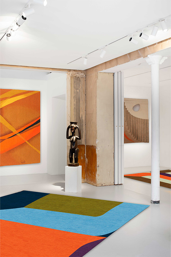
Une identité visuelle assez différente
Habituellement reconnaissable à ses fils polymères aux couleurs vives, parfois fluo, rappelant l’univers du sportswear, Gaspard Fleury-Dugy à cette fois-ci adopté des couleurs plus profondes et calmes. Une contrainte plus qu’un choix, imposée par la gamme Parsua. « Les tapis sont tissés en Iran avec des laines teintées par des colorants naturels. Il a donc fallu réfléchir autrement, et comme je n’étais pas très familier avec ces couleurs, j’ai joué sur les contrastes. » Un parti-pris dont se dégage une certaine vibration, également soutenue par la technique. « Si l’on prend l’exemple des vases, lorsque je les travaille sur ordinateur, un pixel correspond à une maille. Ici, la technique n’est pas la même. Un nœud correspond à une pointe de couleur et la méthode artisanale créée un léger crantage. On peut y voir une sorte de dialogue avec les projets précédents présentés jusqu’au 9 mai au Pavillon Vendôme de Clichy. » Plus qu’un nouvel objet, c’est surtout une déclinaison de son travail habituel, confié pour la première fois à d’autres mains, que le designer propose de découvrir. Un lien entre idée et geste solidement noué tout au long de l’année de travail pendant laquelle Continuum s’est tissée.
Exposition Arrondir les angles, à la galerie Chevalier Parsua, 41 rue de Seine, 75006 Paris, jusqu’au 18 avril.
Exposition Salto, au Pavillon Vendôme, 2 rue du Guichet, 92110 Clichy, jusqu’au 9 mai.
Le portrait de Gaspard Dugy-Fleury est à retrouver dans le numéro 224 d’Intramuros, en vente sur notre boutique.
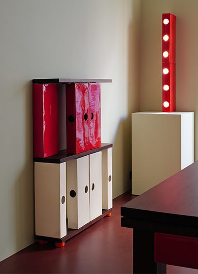
Créateur d’objets en céramique, le designer Stéven Coëffic présente L’Office. Un univers fait de lignes irrégulières et de couleurs vives, imaginé comme un hommage contemporain à cette pièce oubliée dans la maison. Une exposition à découvrir jusqu’au 30 avril dans la Tiny Room d’India Mahdavi.
« L’office, c’est cette pièce située entre la cuisine et la salle à manger. C’est l'espace où l'on sublime le plat. Mais c’est aussi et surtout un lieu dans lequel on ne reçoit pas et où l'on peut de fait retrouver un peu de poussière, des affaires qui traînent ou des cales sous les meubles… » En fait, il s’agit surtout d’un lieu fonctionnel et vivant de l’habitation dans lequel rien n’est dissimulé. Et c’est notamment ce qui a intéressé Stéven Coëffic, nouveau bénéficiaire de la Tiny room d’India Mahdavi, avec qui le designer avait collaboré l’an passé pour la création d’une couleur.
Plus qu’une collection, L’Office est donc une forme d’incarnation visuellement ludique et contemporaine d’une pièce aujourd’hui disparue. « Ici, l’idée est de sublimer ce que l’on cache habituellement dans les pièces d’apparat, que ce soient les tuyaux, la robinetterie ou les assiettes qui sèchent. » Autant de typologies recréées en céramique et contextualisées dans cette petite architecture qu’est la galerie. Un dispositif scénographique habituel pour le designer sensible à l’idée d'aménagement d’espace.
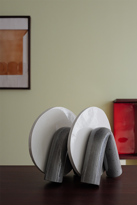
La contrainte technique comme identité
« Ma recherche s’articule autour de ce que je nomme la sculpture quotidienne. Ce sont ces objets omniprésents dans nos espaces de vie, mais oubliés, dont la fonction masque souvent la dimension décorative. C’est pour ça que je me suis intéressé à la plinthe il y a quelque temps. » Un élément architectural que Stéven Coëffic s’est amusé à agrandir puis colorer, et qu’il introduit aujourd’hui comme un module récurrent de sa nouvelle collection. Pour l’occasion, la plinthe devient structurelle et impose sa trame graphique aux meubles. Une connexion entre mobilier, matière et architecture héritée de sa formation à l’École des Arts Décoratifs, et de son apprentissage chez un sculpteur mouleur travaillant la céramique.
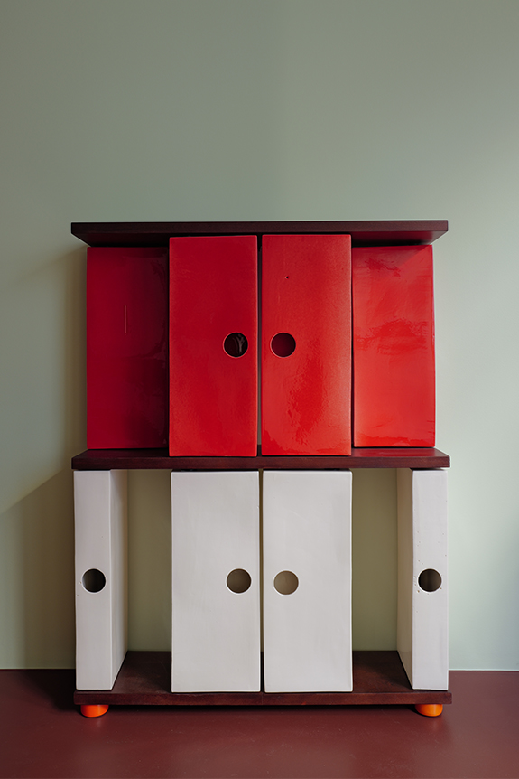
« J’entretiens une certaine fascination pour les objets industrialisés, très orthonormés et modélisables en 3D. Mais ça me semble un peu à l’encontre du design collectible, plus désirable, plus malléable et surtout plus tendance aujourd’hui. J’essaye donc de me placer à la frontière en présentant un répertoire très géométrique mais fabriqué dans une matière sensible qui évolue lors de sa cuisson. » Un rapport entre la forme et le médium qui confère à L’Office, le charme d’une époque passée. « Il y a dans l’esthétique du studio quelque chose que l’on peut rapprocher de Perriand, d’une époque ou il existait des fonctions disparues aujourd’hui. » Un effet renforcé par des arêtes et des courbes comme érodées par le temps. « Pour moi, le rond parfait est patatoïde et c’est ce qui m’intéresse » résume le designer en désignant les trous de coulée volontairement agrandis pour servir de poignées aux différentes portes et tiroirs. Une contrainte technique déformée qui illustre à elle seule l’ambition de conférer aux objets la poésie d’un design terre-à-terre.
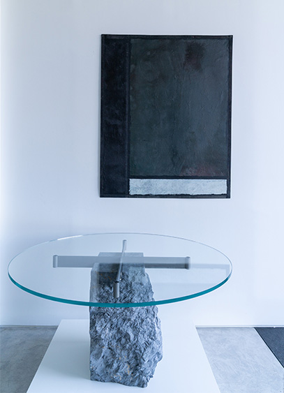
Jean-Michel Wilmotte et la galerie Dutko exposent Rockstone jusqu’au 31 mai. Une collection dans laquelle le verre et l’acier soulignent l’imperfection des pierres destinées au rebut.
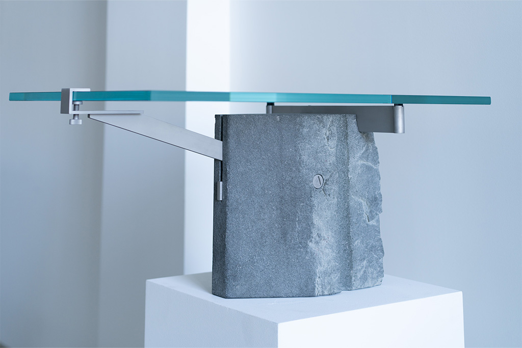
« Dans les années 80, je me rendais régulièrement à Carrare pour visiter et explorer les carrières de marbre ainsi que les dépôts ou s’entassent des pierres du monde entier » raconte Jean-Michel Wilmotte. Un contact avec la matière qui a largement influencé l’architecte connu pour ses projets caractérisés par la clarté du dessin. Pour sa nouvelle collection, Rockstone, l’architecte - qui a longtemps préféré la simplicité des pierres lisses et peu veinées dans ses projets - pose un regard plus brutaliste sur la matière.
Présentées au sein de la galerie Dutko, les quinze pièces ont été dessinées comme autant de supports aux singularités des roches. Choisies parmi les rebuts des carrières de Carrare - qui ont donné leurs noms aux pièces - les différentes typologies de mobilier se déclinent en marbre, granit et pierres calcaires. Fendues, sciées, percées ou plus grossièrement arrachées d’un autre bloc, les pierres portent les stigmates de leur exploitation. Plus que le veinage ou la granulométrie de la roche, ce sont les conséquences de l'extraction qui servent de point de départ à l'architecte qui adapte son dessin aux accidents d’origine humaine. « Je conçois et découpe les blocs pour mettre en exergue les parties les plus brutales. » Des aspérités dans les masses que l’architecte encadre ou souligne avec « l’exactitude et la finesse de l’acier microsablé et du verre ». Une recherche d’équilibre née de la confrontation des matériaux et de leur association, par vissage ou encastrement. Si la collection a été réalisée « comme un hobby, pour penser à autre chose », elle fait évidemment écho aux principes constructifs utilisés par l'architecte dans certains projets. Et parmi eux, une future usine aéronautique prochainement livrée par l’agence à Toulouse confie Jean-Michel Wilmotte.
Une collection en résonance
Initiée conjointement par le galeriste Jean-Jacques Dutko et Jean-Michel Wilmotte, la collection, ode à l’imperfection des masses naturelles et à la précision des lignes manufacturées, s’inscrit en résonance avec l'œuvre de Jean-Pierre Pincemin. Contemporain de l’architecte qui le collectionne, le peintre se distingue par un travail des trames et des aplats nuancés. Une approche de la peinture moderne qui entre donc naturellement en dialogue avec Rockstone. Deux manières de concevoir les volumes, mais un même goût pour la création et ses déclinaisons. Forme d’évolution libre et intuitive de sa précédente exposition, Doppia V, la collection présentée jusqu'au 31 mai par l’architecte est avant tout le fruit d’une démarche prospective et intuitive de la matière. Une forme de cycle que Jean-Michel Wilmotte envisage de compléter avec une dernière collection dédiée à la roche et la couleur.
Exposition Rockstone by Jean-Michel Wilmotte à découvrir jusqu'au 31 mai 2026 à la Galerie Dutko, 17 quai Voltaire, 75007 Paris.

.svg)


.svg)