Actualités
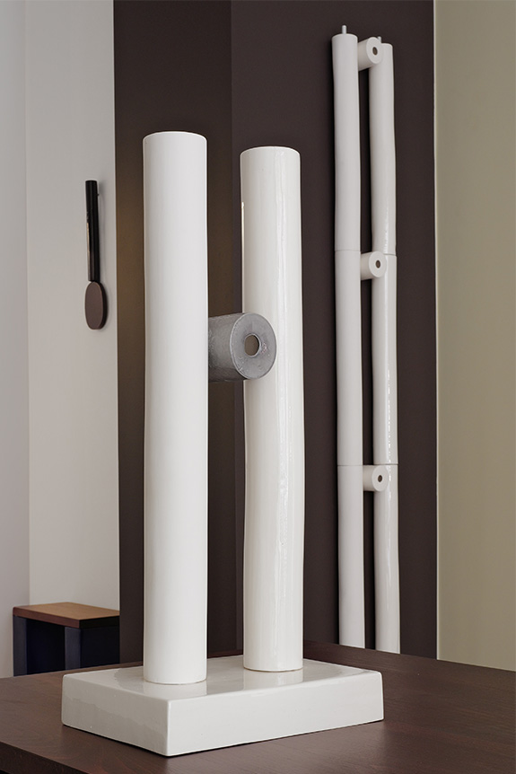
Until August 1st, Carpenters Workshop Gallery is showcasing a selection of contemporary designers. Among them is artist Ingrid Donat, whose works are presented alongside pieces by Pierre Jeanneret, some of which have been reimagined.
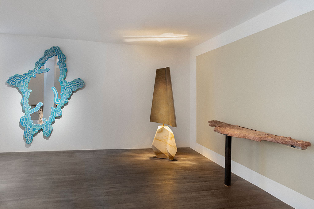
It is often easier to start a conversation when everyone speaks the same language. When that is not the case, you have to find a common dialect. For its "Dialogues" exhibition, the Carpenters Workshop Gallery, located at 54 Rue de la Verrerie in Paris's fourth arrondissement, has brought together a diverse collection of works, all (or nearly all) of which are highly contemporary. This theme serves as a focal point for a dozen designers and artists, including the Campana brothers, Nacho Carbonell, Rick Owens Furniture, and Wendell Castle. Despite their distinct personalities, their creative worlds manage to communicate through a layout that highlights connections—particularly in color—across the gallery's three levels. It offers a glimpse into the omnipresence of unique craftsmanship, even in the absence of shared techniques.
A timeless conversation
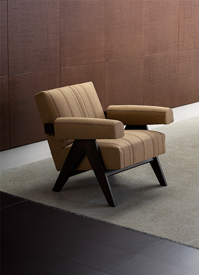
On the ground floor, the gallery has sought to establish a different kind of dialogue. More refined than the others, this one does not merely combine aesthetics but fuses them, transcending eras. Bronze specialist Ingrid Donat engages in a conversation with pieces by Pierre Jeanneret. For the occasion, the contemporary artist has reupholstered two Committee chairs and a Lounge Set. Beyond the new stylistic expression provided by the burlap, she offers a more contemporary interpretation of the objects while preserving the soul of this mid-century furniture through the choice of this industrial-coded textile. This is complemented by a desk covered in leather and decorated with the artist's signature motifs—a pictorial and ornamental language also found in the large compositions lining the gallery walls. It is a way of demonstrating that contemporary art can still evolve these well-established modernist icons.
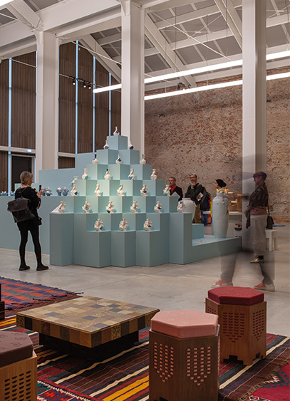
From April 20 to 26, for Milan Design Week, the 5VIE district returns for its 13th edition with the theme "QoT, Qualia of Things," which places humans and emotions at the center of everything. We get the details from Ernesta Del Cogliano, co-founder of the event.
How did the 5VIE project begin?
The project started 13 years ago. Originally, there was a desire to revitalize Milan's historic center, which was somewhat neglected during Design Week, as is often the case in many historic districts. We looked at all creative sectors: fashion, art, gastronomy... but art and design quickly took the lead. The name 5VIE is quite anecdotal: it simply comes from a street sign at the intersection of several streets. It wasn't even indexed on Google at the start; the district's popularity grew over the years thanks to our work.
The theme chosen for this edition is "QoT, Qualia of Things." What does it mean?
Qualia, in Italian, refers to every personal experience we live, perceive, and feel when faced with something. It is highly subjective and deeply individual. It felt important to us to put the individual and the human being back at the center, rather than artificial intelligence, which is being talked about so much right now. We wanted to focus above all on sensations and emotions. Along with my co-founder, Emmanuel Tessarolo, we attended many conferences and read a lot of books on the subject.
Would you say there is a form of opposition between humans, emotions, and digital technology or AI?
It’s not really an opposition, but rather a matter of perspective. We believe that human perception, thought, and sensitivity are more essential than the Internet of Things and digital technology, in a way. We simply want to put humans and emotions back at the center, while technology should remain a support, a tool, without ever replacing the human. It’s a fairly holistic vision.
A few words about the participants in this 13th edition?
More than 90 artists and designers are expected, while in parallel, we will be exhibiting 5VIE productions, which bring together pieces specifically designed for the event. It is important for us to show that 5VIE is not just an exhibition space or a district, but also a producer committed to supporting designers. Among them are Tadeas Podracky, Marco Guazzini, Danny Candotto, Elisabeth Lewis, and Noe Kuremoto. And every year, several creators close to the project join us, like Richard Yasmine from Lebanon, to whom we offer space and support to exhibit his work. We are also presenting a major project with the studio mo man tai, who were already present last year at Cesare Correnti. We asked them to design the entrance to the Cavallerizze, which is a long, brutalist-style corridor, by creating an installation specific to the space.
Where will the event take place?
Three main venues will host the program: the apartment at 14 Corso Magenta, which will feature between 20 and 25 designers; the Cavallerizze at the National Museum of Science and Technology at 4 Via Olona, a 1,600 m² space that will host about twenty installations; and finally, the SIAM at 18 Via Santa Marta, the headquarters of 5VIE. Beyond these locations, the entire 5VIE district will be filled with exhibitions.
How does the selection process work?
Many participants come directly to us because they identify with our identity and our DNA. For the productions, I work on a long-term basis: I discover designers throughout the year and then invite them to participate. Sometimes, they come to me. It is above all a question of sensitivity. We also have the help of curators, as is the case with Maria Cristina Didero and Anna Karnik, with whom we have been collaborating for a long time; they know our vision perfectly and are thus able to propose new designers every year.
What are your expectations for this edition?
I want people to enjoy themselves. There are currently many tragedies in the world, and this edition is here to soothe and do some good. We don't claim to solve these issues, but just to offer a moment of joy. The goal is not to show objects intended for sale, but rather to offer visions and suggestions, with the main desire to spark emotion. The message I would most like to convey is to encourage everyone to think in a more human and less technological way, so that hearts can connect.

Unanimously acclaimed by both the industry and museums, this duo has invited us since their debut to ask the tough questions in design, while providing elaborate answers that never sacrifice visual appeal.
The Italian duo of Andrea Trimarchi and Simone Farresin needs no introduction. Graduates of the Design Academy Eindhoven, they have applied the famous academy’s experimental approach to their work more effectively than ever. Since their start in 2009, the studio has carved out a unique path, simultaneously pursuing product design for manufacturers and more personal, avant-garde research—each feeding into the other. This explains the global interest in their work, which has led to a wide variety of collaborations, from product manufacturing and scenography to brand consulting and exhibitions. Everyone wants the Formafantasma seal of approval: the perfect blend of analytical spirit and aesthetic desirability.

Early collaborations
With her keen eye, gallerist Libby Sellers discovered them and showcased their work in London, exhibiting their project *Moulding Tradition*, which challenged the relationship between Sicilian ceramics—specifically traditional Moor’s heads—and local identity. That was in 2010. Since then, Fendi followed suit, this time with leather, as did the ultra-chic Viennese crystal maker J. & L. Lobmeyr, who produced their *Still* tableware project, a charcoal-based system for filtering tap water. Flos, Bitossi, Artek, and many others soon followed, while more experimental projects pushed the duo to deepen their thoughtful, innovative approach, blending in-depth research, material exploration, and a commitment to environmental and social issues. Formafantasma engages in a broader questioning of culture, consumption, and sustainability, where the product becomes a form of visual and analytical storytelling, all while remaining firmly rooted in the issues of our time.

The importance of materials
In 2010, their *Autarchy* series explored sustainable materials and self-sufficiency in production. In this project, Formafantasma investigated the use of local, renewable natural materials, focusing particularly on terracotta and the artisanal processes associated with it. Later, in 2017 at the NGV Triennial in Melbourne and in 2018 at the Milan Triennale, *Ore Streams* illustrated their interest in recycled materials and the circular economy. Collaborating with chemistry experts, Formafantasma studied metals extracted from electronic waste to create various objects, while raising questions about mining and electronics manufacturing processes. By repurposing these materials as a creative source, the duo continued their journey, seeking to raise public awareness about the environmental impacts of modern industries. But the duo’s field of investigation knows no bounds, as proven last year by the furniture collection *La Casa Dentro*, produced by Roman gallerists Giustini Stagetti and exhibited at the Fondazione ICA in Milan. Here, the clichés of gendered domesticity were dissected and subverted, playing on the contrast between the tubular aesthetics of modernism and the unmistakable flourishes of a painted flower or hand-stitched embroidery. It was an opportunity for Formafantasma to challenge the sober, rigorous masculinity championed by figures like Adolf Loos, in opposition to the "criminal" ornamentation of decorative art movements seen earlier in history. Yet another design trope that could not escape the Formafantasma lens. What will be next?

Latest news
In June 2025, the duo reached a new milestone with their first American exhibition in New York at the Friedman Benda gallery. Titled *Formation*, it presented a collection of 11 wooden pieces, where the board is used as a primary form to unfold across products ranging from sofas and chairs to tables and lamps. It was a notable project, which was showcased again in March 2026 at the TEFAF fair in Maastricht, resulting in a display of perfect balance, true to the duo’s style.


Avec le Piédestal et le Trolley, String Furniture diversifie sa collection Museum. Dessinées par les Suédois de TAF Studio, ces deux nouvelles typologies, destinées à la sphère domestique, poursuivent l’héritage minimaliste et mobile de la marque.
Initiée pour la rénovation du Musée national de Stockholm en 2018, la collection Museum s’enrichit aujourd’hui du bout de canapé fixe Piédestal et du Trolley. Si le premier prolonge la logique d’exposition domestique chère à String Furniture, le second se distingue par une typologie plus inattendue. Faisant suite au bougeoir et à la table d’appoint conçus quelques années auparavant, ce petit chariot s’inscrit dans la continuité d’une collaboration entre deux visions contemporaines du design suédois. Avec ses lignes pures et sa construction orthogonale, la gamme convoque des références industrielles. « Nous nous sommes beaucoup inspirés d’objets utilitaires et plus globalement du monde de l’industrie. C’est ce qui explique notre palette de couleurs ou encore les formes des modules rappelant les poutres en I », explique Mattias Ståhlbom, cofondateur du studio. Un dépouillement autant qu’« une approche pragmatique », traduite notamment par le traitement monochrome de la matière. Le meuble s’efface ainsi au profit des objets qu’il accueille, devenant un support presque muséal pour le quotidien.

Le mouvement comme geste de design
Forts de « cette bibliothèque de constructions et de formes mise en place progressivement avec la création des modules Museum », les designers ont imaginé « un petit meuble dynamique et étroit, dessiné pour s’adapter à de nouveaux emplacements où un chariot peut se glisser et être utile ». En dépit de ses étagères fixes, le Trolley fait du mouvement un principe central grâce à ses roulettes. Au-delà du contraste formel avec la construction rectiligne de l’objet, ce détail lui confère une véritable polyvalence d’usage. « Pour nous, la dimension utilitaire des objets et leur capacité à bien vieillir doivent susciter une forme d’attachement. » Une vision à long terme, fondée sur l’évolution et l’usage, qui rejoint pleinement l’ADN de String Furniture.

Deux créations dans la continuité
Fondée en 1949 par les architectes Nisse Strinning et Kajsa Strinning, String Furniture s’impose comme une figure majeure du design scandinave grâce à une approche rationnelle et évolutive du mobilier. En développant dès l’origine le String System, une structure légère et modulable restée presque inchangée depuis plus de 75 ans, la marque a su s’adapter aux mutations des modes de vie. Cette pérennité repose notamment sur la sobriété visuelle du système initial. Depuis, la gamme s’est enrichie en passant du format compact String Pocket aux évolutions contemporaines comme Pira G2, réinterprétée par Anya Sebton et Alexander Lervik. Fidèle à cette continuité, la marque s’ouvre aussi à des collaborations ciblées, prolongeant son esthétique et son identité fonctionnelle. Outre TAF Studio, les Suédois de Form Us With Love ont développé plusieurs extensions, dont la solution de rangement modulaire Center Center destinée aux espaces de travail grâce à ses cubes métalliques. Véritablement structurantes, ces collaborations sont pour l’entreprise nordique autant d’occasions de conjuguer un héritage moderniste et un certain renouvellement stylistique. De quoi maintenir un dialogue entre rigueur industrielle et usages contemporains pour String Furniture.
Ci-dessous : Museum Piédestal ©String Furniture

eba, a brand specializing in high-end kitchen design and customization, is dedicated to creating projects that reflect its clients' personalities while embracing current trends, particularly in color.
For 2026, kitchen color trends are all about finding a balance between naturalness, softness, and personal expression. Palettes are shifting toward enveloping tones inspired by raw materials and landscapes, while still leaving room for bolder choices. At eba, these shades are designed as structural elements of the project, engaging in a dialogue with volume, light, and texture. Discover a selection of the brand's signature colors, crafted to perfectly suit any kitchen style.
Earth Walnut
This warm shade, deeply rooted in the world of wood, evokes a sense of material continuity. The grain detailing enhances the feeling of unity and authenticity within the kitchen space.

Cloud Dancer
Selected as the 2026 color of the year, Cloud Dancer belongs to a palette of delicate, subtle, and luminous grays. At eba, it is similar to Mist Gray, a soft, enveloping shade that captures light without ever making the space feel harsh.

Sage Green
The more expressive Sage Green shade naturally finds its place in classic or farmhouse-inspired kitchens, adding a soothing, botanical dimension while establishing a more distinct identity.

Mink Gray
A timeless, elegant, and understated neutral color that provides a solid foundation for structuring the kitchen, while offering the flexibility to pair with other materials and colors.

Shades of blue
At eba, blue reveals itself in all its nuances, from pastel tones to deep, rich hues. It paves the way for more personal kitchens, especially thanks to the option of custom lacquering. This approach allows for the exploration of the entire RAL color chart, offering great creative freedom to harmonize the kitchen with wallpaper or a piece of furniture.

Find more information and inspiration via THIS LINK, and to start a project, it's right HERE.

Driven by a desire to offer products that combine design, sustainability, and emotion, the Spanish brand Faro Barcelona showcased its 2026 novelties and trends at its Parisian showroom, blending aesthetics with technical innovation.
"Our goal is to offer lighting that carries meaning, provides a sense of well-being, and integrates harmoniously into the spaces where it is placed. We want to create emotion through light."explained Caroline Perez, Sales Director for France, during the presentation of the 2026 trends at the brand's Parisian showroom on Rue d’Uzès. The presentation focused on innovation, design, and sustainability, unveiling various new indoor and outdoor products, as well as innovations in their ceiling fan models, another of the brand's flagship product lines.
Dôme, lighting with a 70s vibe
Conceived by Faro Lab, the brand's in-house design team, the Dôme collection is a complete range consisting of seven models, including wall lamps, pendants, and table lamps, available in several sizes. Its spherical design diffuses a warm, inviting light that can adapt to any type of residential or contract project.

Lumina, the collection to compose as you wish
With a more architectural look, Lumina was designed by Catalan designer Carrasquet, a loyal collaborator of the brand. This collection consists of ribbed glass modules, inspired by link necklaces found in jewelry, which can be hung horizontally or vertically for limitless compositions with a poetic and aesthetic result.

Cata, pure elegance
The Cata papyrus lighting collection, created by designer Marina Mila, is defined by its finesse and lightness. It is expanding with the addition of a pendant and two wall lamps, complementing the existing range of table lamps.

Toba, Narita, and Muna: outdoor lighting in all its forms
All three designed by Carrasquet, the Toba, Narita, and Muna outdoor collections each stand out for their unique design and functionality, adapting to all types of outdoor spaces while ensuring long-term durability.

The colorful Toba pendant is made of silicone discs—a first for Faro—available in different colors and adjustable to your preference. It is a resistant and durable material, ideal for outdoor use. The Narita collection, meanwhile, is distinguished by its rawer lines and distinct artisanal craftsmanship, offering a more robust look. Finally, the portable Muna lamp stands out with its textile cover, which subtly dresses the fixture.

Ceiling fans, a Faro icon
Beyond its lighting expertise, Faro Barcelona is also renowned for its proficiency in ceiling fans. The in-house design teams at Faro Lab are constantly innovating their models to ensure they integrate seamlessly into any space through their design, while standing out for their energy efficiency and technical innovation. Notably, the brand has developed ceiling-recessed collars, visible in the Rudder and Rocker models, which provide a more discreet aesthetic and significant space savings. It is worth noting that Faro is currently the only brand to have developed this technology, which is now patent-pending.


The Bureau of Design, Fashion and Fine Crafts is launching the exhibition "30 Faubourg, the art of everyday life made in Paris." It is an opportunity to showcase contemporary fine crafts scattered throughout the capital.
Running alongside the European Artistic Crafts Days (JEMA), which take place from April 7 to 12, the Bureau of Design, Fashion and Fine Crafts (BDMMA) is presenting "30 Faubourg, the art of everyday life made in Paris" until May 16. Curated by the agency Sinople, the exhibition highlights 29 creators based in Paris and its inner suburbs. "You won't find precious materials or objects under glass here, because that's not the point. We wanted to bring fine crafts back into everyday life by showing that these workshops are still present right in our neighborhoods," explains Julien Strypsteen, co-founder of the studio specializing in creative industries.
Beyond the location of the workshops and their expertise, the selection was also based on the contemporary nature of the objects. "At Sinople, we have a minimalist and rather radical vision that defines us. The challenge was to showcase a Parisian heritage without falling into a purely historical perspective." Blending lifestyle, fashion, and art, the agency also wanted to illustrate a heritage firmly rooted in its time by featuring five workshops committed to upcycling. "Whether it's repairing cutlery, transforming shoes, or restoring watches in a more contemporary way, the idea was to highlight the second life of objects, an aspect that is rarely celebrated."

A pop-up store archetype
An exhibition that feels like a shop, "30 Faubourg, the art of everyday life made in Paris" stands out for its staging. Accustomed to more traditional exhibitions, the BDMMA has opted for a retail-inspired scenography this time. Echoing the pieces on display and the desire to integrate craftsmanship into the daily lives of Parisians, the space adopts retail codes. Entrusted to Index Office, the gallery's layout was designed to feel like a natural extension of the many shops on the Faubourg. "The idea was to give the impression that a new boutique had just opened to invite passersby to come in. It's a sort of 'real-fake' concept store, with all the usual codes like wood and metal displays, or even a neon structure by AlexisNeon placed in the window. Since we weren't allowed to sell anything, we also took inspiration from the labels of a famous brand to display prices and QR codes that link directly to the online shops."
With a wide price range starting at 20 euros, the selection aims to reaffirm the unique place of fine artisans in the city and among its inhabitants, even beyond the specific collection presented for the occasion.
Exhibition "30 Faubourg, the art of everyday life made in Paris" until May 16, 30, rue du Faubourg Saint-Antoine, Paris 12th.


Manufacturer Brossier Saderne unveils Collection. Behind this new lighting line, which blends contemporary editions with reissued archival pieces, lies a desire to reach a new market: the general public.
Long a major player in the contract market, Brossier Saderne is now launching into retail sales for the general public. "This is perhaps something we should have done sooner, admits brand director Stéphane Aubry, but it is now clearly part of a strategy of diversification and market expansion." Founded in 1987, the company first established itself in the hospitality sector before gradually expanding into the commercial sector. Driven by the French manufacturing of its lighting fixtures at its Angers factory, it now relies on a network of nearly 400 partners and an in-house design office. "We believe that local manufacturing is a key value to bring to the general public, especially since they already encounter and use our lighting in hotels and offices. This expansion is a natural extension." This continuity was further strengthened by the brand joining the Rivalen collective in 2022. Alongside Roger Pradier, Radian, and Securlite, this positioning allowed the brand—previously limited to in-house designs—to enter the world of publishing. "At first, we were talking about custom manufacturing, but that only represented a marginal part of our business. It was the Rivalen creative committee, led by Lætitia De Witte, Antoine Ricardou, and Stéphane Joyeux, that truly propelled us into this new dimension", the director explains.

Issues brought to light by the Collection
Comprising around twenty lighting fixtures, Collection was designed for a broad and diverse audience. In line with this new positioning, the brand is moving forward along two complementary paths. "The idea is to build on the company's DNA—namely, contemporary design that is both technical and artisanal—by reissuing pieces from our archives while also embracing the role of a publisher. Creatively, Brossier Saderne has always collaborated with designers on hotel projects, but now we are offering a freer approach. By that, I mean without the obligation to develop a full range to suit the identity of a specific space or the constraints of intensive use." This freedom is expressed as much on an industrial level as it is stylistically. By leveraging the eclecticism of materials through its network of artisans, the brand also highlights the challenges of a demanding market, such as the appetite for more decorative typologies and the search for responsible alternatives, as seen in the RM031 and Plume models. Designed by Italian interior designer and architect Roberta Molteni, the former stands out for its harmonious assembly of three geometric materials. Resting on a black lacquered glass disc, this table lamp—also available as a pendant—features a cylindrical body of perforated brass topped with an opaline glass bowl. This is a material with which the designer has a special relationship, crafted for the occasion by one of the last remaining French manufacturers. The composition emits a soft, diaphanous light that dialogues with the Plume lamp. More classic in appearance, the latter embodies the forward-looking, environmental dimension of Brossier Saderne, which began a few months ago with Brick2 Balt, a wall lamp made from spent brewer's grain. For this new model, the brand partnered with the company compo’plume, which specializes in recycling badminton shuttlecocks. Composed of 80% crushed feathers and supplemented with recycled plastic bags, the lamp base is notable for its unique, textured feel. The piece is topped with a lampshade made from recycled cotton sourced from the offcuts of major fashion houses, which is "ten times less polluting than new cotton," notes Stéphane Aubry, who is also a co-creator of the Sustainable Lighting charter.
More than just a design innovation, this lamp is above all the realization of an environmental approach, set against a backdrop of a shift that is more marketing-driven and sometimes purely decorative.


No one is a prophet in their own land
When a certain design world tries to mimic the fashion industry by seeking out its talents of the year in the faux-radical, marketed posturing of silent poseurs, designers whose humble ambition is to create beautiful and useful objects must sometimes look to other shores. As the primary destination for our designers in search of partners with the innate intuition and cultivated courage that make certain manufacturers great talent scouts, Italy has been attracting young French designers for four generations.
Backpacks on their shoulders or portfolios under their arms, from Ronan and Erwan Bouroullec to Julie Richoz, Constance Guisset, Ionna Vautrin, and Guillaume Delvigne, they have all walked the streets of Milan to find success, which they then brought back to French soil or, like Marc Sadler and Philippe Tabet, to permanently adopt the country that gave them their start. While this issue celebrates French excellence on Italian soil, with everyone sharing the small and large stories that changed their lives, their journeys should also prompt us to question how we can reinvent ourselves, by learning from rather than copying the lessons of a country that turned its weaknesses—multiple but regional expertise, companies too family-oriented to become national flagships—into part of the reason for its success.
For while France continues to train some of the greatest talents in international design, it still needs to support them further in the dream of every object creator: to change people's lives by becoming a part of their homes.
Contents
Design 360

Design Story
USM, Swiss connection
Hahn Cuesta Wolf, creating with honesty
Bram Vanderbeke, architectural designer
Baptiste Vandaele: sustainable forms

BrichetZiegler, designer-makers
Lucile Soufflet, the collective test
Cecilie Bahnsen, alchemist of clothing
Aaron Probyn, the perfect size

Propeller Design, electrified mind
Studio Moritz Putzier, simply a creator
RBC, new chapters
Citroën × Decathlon. ELO, creator of mobile living space

French
Designed in France, made in Italy
Marc Sadler, design explorer
France-Italy: a shared design ecosystem

Storie d’amore
Hermès at La Pelota
Villa Medici, a mixed marriage

In-situ
Le Vau Pavilion: geometry of learning
Louis Vuitton, Chinese tribulations
Zyva Studio, 20,000 leagues under the sea
Club Med South Africa Beach & Safari: double horizon

Experimenta
Laboratory of sustainable practices
Digital craft: hybridization or disruption?
In the Air
Cassina, or the art of making and remaking
News
Events
Find this issue on newsstands or directly on our shop online.

The Fondation d’entreprise Hermès is now accepting applications for its 2027 Académie des savoir-faire, dedicated to leather, with the goal of using design as a driver for innovation.
The Fondation d’entreprise Hermès is relaunching its Académie des savoir-faire with an eighth edition focused on leather. More than just a transmission program, this initiative serves as a laboratory for applied design, where artisans, designers, and engineers combine their practices to reinvent the material. Throughout a journey of lectures, site visits, and collaborative workshops, participants are encouraged to move beyond traditional approaches to experiment with new uses for leather, exploring its technical, cultural, and symbolic potential. In doing so, the foundation aims to provide creators with the opportunity to put their practices into perspective and promote transdisciplinary exchange. It is an invitation to question processes, resources, and production models—current challenges that will be led by designer François Azambourg, known for his research into lightness and material hybridization, who will serve as the pedagogical director for this new edition.
Open to professionals looking to expand their skills who are available to participate in the entire program (five weekends in the first half of 2027 and two non-consecutive weeks in the second half), the call for applications is open until June 28, 2026. The application must include a cover letter and a curriculum vitae. Candidates are also free to include a concise portfolio (recommended for artisans and designers) and a short video explaining their expectations and interest in leather. This is a rare opportunity for about twenty French-speaking professionals to take part in a collective reflection where design acts as a catalyst for new expertise.
Applications can be submitted on the Fondation d’entreprise Hermès website: www.fondationdentreprisehermes.org/fr/candidatures

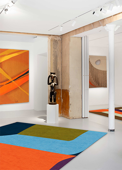
Le designer Gaspard Fleury-Dugy présente Continuum, une collection de tapis dont l’un d’eux est visible à la galerie Chevalier Parsua jusqu’au 18 avril. Un nouveau terrain d'exploration stylistique et colorimétrique pour le créateur connu initialement par ses objets en volume.
Pour changer de dimension, mieux vaut ne pas perdre le fil. Repéré pour ses vases tricotés en 2024 et sa série tournée vers l’univers du totem et de la colonne l’année suivante, Gaspard Fleury-Dugy a exposé à Milan comme à Eindhoven et Stockholm. Mais c’est à Paris, ville de résidence et d’expérimentation, qu’il dévoile Continuum, une première collection de tapis. Après des études à l’Ecole Dupperé puis à la Swedish School of textiles, cette nouvelle typologie aurait pu être un commencement, mais c’est finalement comme une déclinaison de ses précédents travaux qu’elle apparaît. Un choix surprenant qui n’a pourtant rien de décousu. « Il y a tout un cheminement logique entre mes dessins, mes maquettes, les différents objets présents dans l’exposition et les tapis. Effectivement, je viens d’un univers ou le motif à toujours eu une forme attirante. Mais ce qui m’intéresse, ce sont les sauts entre la 2D et la 3D ; entre les plats et les volumes » précise le créateur. C’est d’ailleurs cette idée qui l’a amené à nommer l’exposition, présentée à la galerie Chevalier Parsua jusqu’au 18 avril, Arrondir les angles.
Habiller l’espace
Spécialisée dans le textile mural pour la partie Chevalier, et les tapis avec l’éditeur Parsua, la galerie se dote de tentures au mur et au sol. Deux environnements entre lesquels un espace vide demeure. « Lorsque la collaboration avec la galerie a commencé, je tenais à dessiner les maquettes des tapis. Je suis arrivé avec plein de propositions que nous avons étalé partout par terre. Dans le même temps, je me suis rendu compte que les angles de cet espace blanc et rectiligne n’étaient pas habillés. Je me suis demandé comment y remédier. La réponse a été de retranscrire les perspectives du lieu sur les tapis. » Une approche très géométrique et abstraite de l’architecture qui a amené le designer à travailler de manière moins conventionnelle qu’à l'accoutumé. « Pour un designer textile, son fond de commerce, c’est plutôt de faire des motifs au raccord, c'est-à-dire qui se répètent à l’infini. Ici, la nouveauté pour moi était de créer une composition placée qui puisse se regarder de tous les côtés. C’est ce que l’on appelle un motif placé, unique » explicite le designer également curateur de l’exposition et à qui l’on doit la sélection d’art africain et les photographies de Georges Rousse, dont les anamorphoses dialoguent naturellement avec les tapis.
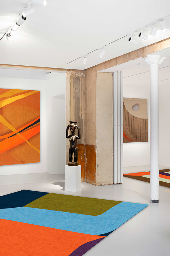
Une identité visuelle assez différente
Habituellement reconnaissable à ses fils polymères aux couleurs vives, parfois fluo, rappelant l’univers du sportswear, Gaspard Fleury-Dugy à cette fois-ci adopté des couleurs plus profondes et calmes. Une contrainte plus qu’un choix, imposée par la gamme Parsua. « Les tapis sont tissés en Iran avec des laines teintées par des colorants naturels. Il a donc fallu réfléchir autrement, et comme je n’étais pas très familier avec ces couleurs, j’ai joué sur les contrastes. » Un parti-pris dont se dégage une certaine vibration, également soutenue par la technique. « Si l’on prend l’exemple des vases, lorsque je les travaille sur ordinateur, un pixel correspond à une maille. Ici, la technique n’est pas la même. Un nœud correspond à une pointe de couleur et la méthode artisanale créée un léger crantage. On peut y voir une sorte de dialogue avec les projets précédents présentés jusqu’au 9 mai au Pavillon Vendôme de Clichy. » Plus qu’un nouvel objet, c’est surtout une déclinaison de son travail habituel, confié pour la première fois à d’autres mains, que le designer propose de découvrir. Un lien entre idée et geste solidement noué tout au long de l’année de travail pendant laquelle Continuum s’est tissée.
Exposition Arrondir les angles, à la galerie Chevalier Parsua, 41 rue de Seine, 75006 Paris, jusqu’au 18 avril.
Exposition Salto, au Pavillon Vendôme, 2 rue du Guichet, 92110 Clichy, jusqu’au 9 mai.
Le portrait de Gaspard Dugy-Fleury est à retrouver dans le numéro 224 d’Intramuros, en vente sur notre boutique.
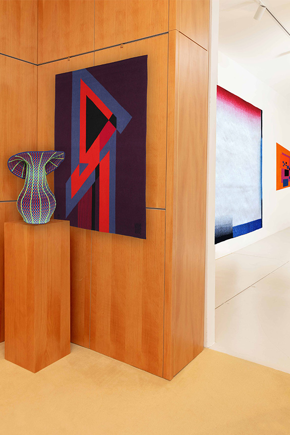

Présentée l’an dernier à Milan, Maap, la dernière création d’Erwan Bouroullec, arrive sur le marché. Une création à fleur de peau imaginée pour Flos.
« Maap est la concrétisation d'un désir qui m'habite depuis longtemps : créer des luminaires imposants dont la lumière se diffuserait au travers d'une grande surface. Et pour imaginer ce modèle, j'ai puisé mon inspiration dans deux obsessions de longue date que sont la géométrie et les structures naturelles » explique Erwan Bouroullec. S’il s’agit certainement de l’un des plus grands luminaires de Flos, Maap compte peut-être aussi parmi les plus légers. Une notion, centrale dans la démarche du designer, à laquelle cette grande applique murale doit sans doute un peu de sa poésie.
Fasciné depuis longtemps par les matériaux ultra-fins dont le papier, le designer s’est intéressé au tyvek, notamment connu sous forme d’enveloppes indéchirables. Une robustesse structurelle qui a amené ce médium dans le monde de l’éclairage ou il n’avait que très peu été utilisé. Mise en forme comme un sac, la matière prend place sur une base murale lumineuse cruciforme dotée de quatre ampoules. Fixée magnétiquement grâce aux Dots (dont le nombre évolue selon la taille du luminaire), la membrane peut être facilement manipulée. Disponible en trois formats (Wall 1, Wall 2, Wall 3 selon le nombre de Dots au mur), Maap peut mesurer jusqu’à 3,2 mètres de largeur par 1,5 mètre de hauteur.

Une matière sensible à travailler
L’une des particularités de Maap, c’est peut-être sa capacité à se magnifier au fur et à mesure des manipulations. Si l’idée d'utiliser des cartes a été un point de départ rapidement abandonné en raison de leurs fragilités, le rendu, lui, n’en est pas si éloigné, rappelant ces papiers usés par les voyages et sur lesquels semblent retranscrites les dénivelées. Mais ici, ce n’est pas tant l’œuvre involontaire du temps que celle consciente des utilisateurs qui est à l’origine des froissements. « Maap aurait tout aussi bien pu s'appeler Maak, clin d'œil à "make", puisque son principe repose sur un geste élémentaire, le "faire" de la main. Sa forme malléable est une invitation à laisser libre cours à notre instinct de création » développe son designer. Lorsque le tyvek est froissé, il adopte des formes organiques et singulières, offrant la possibilité de donner plus ou moins de caractère au luminaire. Au-delà de l’aspect esthétique, cette action relève surtout d’un besoin structurel. Sans ces pliures, le papier perdrait de son volume, et Maap de son effet. Ainsi enveloppée, la création d'Erwan Brouroullec propose également une nouvelle approche de la durabilité. Protégée mais facilement accessible, la source lumineuse dure dans le temps, là ou son design, lui, change d’une simple pression de la main. Comme un nuage égaré, ce produit nouvellement lancé par Flos, évolue au gré du temps.

Avec Malmaison Riviera, Christofle insuffle un vent d’été à sa collection emblématique Malmaison. Entre héritage impérial et inspiration méditerranéenne, cette nouvelle ligne de porcelaine célèbre un art de vivre à la fois chic et décontracté, où la table devient le théâtre d’un éternel été.
Christofle poursuit l’exploration de son patrimoine en proposant une variation inédite de sa ligne iconique Malmaison. Pensée comme une parenthèse ensoleillée, cette nouvelle collection traduit l’envie de faire dialoguer les codes historiques de la maison avec une esthétique plus libre, inspirée par les paysages et les usages de la Méditerranée. Avec Malmaison Riviera, la table devient ainsi un espace d’expression, entre tradition, modernité, formalisme et spontanéité.
Lumière méditerranéenne
Dévoilée comme une déclinaison estivale des collections Malmaison et Malmaison Impériale, la ligne s’inscrit dans une continuité stylistique tout en opérant un déplacement sensible. Fidèle aux codes du style Empire - palmettes, symétries, motifs ornementaux - elle introduit pour la première fois la couleur, avec un jaune profond qui vient capter et diffuser la lumière. Depuis plus d’un siècle, Malmaison incarne un raffinement classique inspiré du château lié à Napoléon Bonaparte et l’Impératrice Joséphine. Avec Riviera, cet héritage se réinterprète dans un registre plus quotidien, à travers lequel les décors, tracés à main levée, déploient rosaces et rayons dans une composition vivante, où chaque pièce devient une variation autour d’un même motif solaire.

La table comme expérience estivale
Pensée comme une invitation au partage, la collection convoque un imaginaire sensoriel composé de longues tablées, d’une lumière dorée et de la douceur du temps qui s’étire. Assiettes, bols, tasses ou plats de présentation composent ainsi un ensemble d’une quinzaine de pièces permettant de rythmer les usages, du petit-déjeuner au dîner. À cette porcelaine répond l’éclat de l’orfèvrerie, avec des accessoires en métal argenté pour dessiner un ensemble qui crée un dialogue entre matière et lumière, incarnant un art de vivre à la fois décontracté et résolument chic.


Pour Workspace, Vitra dévoilait une collection de trois meubles dédiés au bureau et signés Konstantin Grcic et Stephan Hürlemann. Une vision adaptable et adaptée à la flexibilité des utilisateurs et aux différents types d’échanges.
Après avoir repris la distribution européenne de l’« Action Office », conçu par Robert Probst et George Nelson dans les années 1960, Vitra n’a cessé d’explorer l’univers du bureau. Du concept « Citizen Office », développé en 1990 par Andrea Branzi, Michele De Lucchi et Ettore Sottsass, au « Club Office », pensé pour encourager le retour des employés après la pandémie de COVID-19, la marque s’inscrit en phase avec les mutations sociétales. Scout, Reset et Dancing Wall 2 prolongent cette réflexion. Présenté lors de l’édition 2026 de Workspace, l’ensemble Bêta a été imaginé pour répondre aux besoins de flexibilité des utilisateurs. Avec en toile de fond un contexte incertain, tant sur le plan géopolitique que créatif avec l’essor de l’IA, « le monde actuel nous invite à adopter un état d’esprit bêta, fait d’itération et d’inventivité pour continuer d’avancer », explique Karin Gintz, directrice générale France de la marque. C’est dans cette optique que Konstantin Grcic et Stephan Hürlemann ont été invités à repenser les fondamentaux de notre espace de travail.

Un maximum de liberté et de flexibilité
Ici, les projets évoquent des univers de création, de travail et d’apprentissage continu. Aucun élément technique n’a donc était camouflé. Une logique constructive qui fait écho à la vocation des objets. Conçue par Konstantin Grcic, la gamme Scout - déclinée en trois versions de tailles différentes - se présente comme un système de travail mobile. Porté par une structure en tubes d’acier, le module se distingue par sa forme trapézoïdale lui permettant une multitude de configurations. Assortie d’une crémaillère non-électrique pour plus de légèreté et de liberté, la pièce offre à l’utilisateur la possibilité de régler le plateau en hauteur, mais également de l’incliner de sept degrés grâce à une poignée centrale et colorée marquant l’importance de l’approche manuelle. Une gamme de patères et de petits rangement tout comme des panneaux en PET recyclé ou en chanvre viennent enrichir Scout, et permettent à l’utilisateur de composer son espace de travail de manière intimiste ou au contraire plus ouvert. Une grande liberté que Vitra a souhaité porter au-delà du poste de travail et notamment dans les espaces intermédiaires grâce à Reset.

Imaginé par Stephan Hürlemann, ce système investit les « zones mortes » que peuvent être les couloirs, les atriums et parfois les dessous d’escaliers. Autant de recoins généralement utilisés en lieux d’échanges informels. Conçu comme un jeu de construction, Reset se compose de modules carrés entièrement démontables, de 75 × 75 cm pour 23 cm de hauteur. Une dimension de dalle plus importante que celle présente ailleurs sur le marché, car imaginée pour permettre à l’utilisateur de s’asseoir tout en laissant un espace de circulation derrière lui. Une réflexion sur l’accessibilité et le confort (illustrée par la conception d’un coussin pliable) qui tient notamment à la pluralité des usages. Avec une configuration autoportante jusqu’à trois niveaux, ou cinq contre un mur, Reset se mue aussi bien en amphithéâtre qu’en lieu d’interaction aux multiples recoins. Réalisée en polypropylène expansé, la structure ultra-légère en forme de croix maintient de la structure en OSB (naturel, gris, noir ou en plaqué bouleau) grâce à des tiges filetées. Dotés d’angles arrondis, les modules ménagent des espaces libres entre les blocs pour permettre le passage des câbles, multipliant les usages. C’est dans cette même logique d’adaptabilité, que le Dancing Wall 2, également conçu par Stephan Hürlemann, prolonge le système de cloison mobile lancé en 2018 en en proposant une version allégée et plus durable. Enrichie de nouveaux usages - du support TV au mur d’affichage - elle est complétée par une « Dancing Station » polyvalente pouvant faire office de table basse, de console ou de point de service.
Trois nouveautés aux typologies bien différentes mais favorisant conjointement l’émergence d’espaces de travail plus libres et propices aux interactions spontanées.


Avec Formation, le studio Formafantasma présentait à TEFAF Maastricht une collection contemporaine imaginée autour de la planche. Une approche en lien avec un certain goût pour le moderniste et la sobriété.
Qualifiant eux-mêmes leur esthétique de « restreinte », Andrea Trimarchi et Simone Farresin, fondateurs de Formafantasma, présentaient Formation à TEFAF Maastricht. Conçue pour la galerie Friedman Benda, la collection s’inscrit dans la continuité de leurs recherches sur les archétypes du mobilier et l’évolution de notre rapport aux objets domestiques. Cette fois-ci, le studio s’est attaché à la planche comme forme primaire, presque indissociable du mobilier lui-même. Plutôt que de la transformer, les designers ont choisi de l’utiliser telle quelle pour devenir table, assise ou rangement, sans jamais perdre son identité initiale. Ce parti pris donne lieu à un jeu géométrique rigoureux, enrichi par l’introduction d’aluminium brossé et de panneaux LED. Ces derniers, par leurs proportions, évoquent les écrans contemporains, inscrivant le projet dans son époque malgré une logique d’assemblage très classique. Tout l’enjeu réside alors dans cet équilibre temporel. Une démarche nourrie par des figures comme Frank Lloyd Wright, pour sa capacité à conjuguer artisanat et technologie, ou George Nakashima, pour sa vision du bois comme matière vivante.
Avec Formation, Formafantasma revendique ainsi une sobriété expressive. La collection, réduite à une sophistication assez minimale (bien que rehaussée de touches plus contemporaines), propose un salon hors du temps, mais à cheval sur les époques.
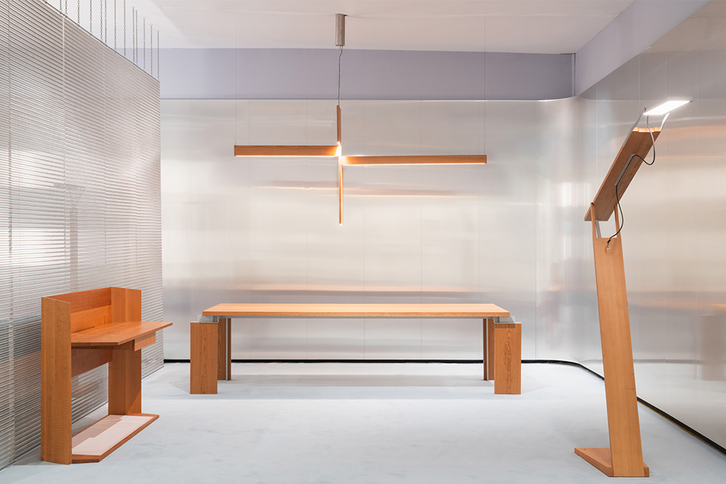
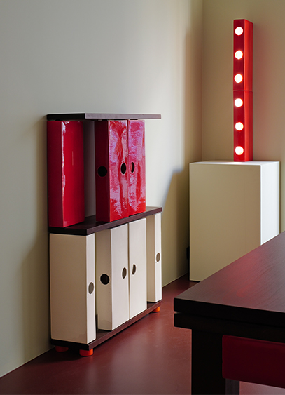
Créateur d’objets en céramique, le designer Stéven Coëffic présente L’Office. Un univers fait de lignes irrégulières et de couleurs vives, imaginé comme un hommage contemporain à cette pièce oubliée dans la maison. Une exposition à découvrir jusqu’au 30 avril dans la Tiny Room d’India Mahdavi.
« L’office, c’est cette pièce située entre la cuisine et la salle à manger. C’est l'espace où l'on sublime le plat. Mais c’est aussi et surtout un lieu dans lequel on ne reçoit pas et où l'on peut de fait retrouver un peu de poussière, des affaires qui traînent ou des cales sous les meubles… » En fait, il s’agit surtout d’un lieu fonctionnel et vivant de l’habitation dans lequel rien n’est dissimulé. Et c’est notamment ce qui a intéressé Stéven Coëffic, nouveau bénéficiaire de la Tiny room d’India Mahdavi, avec qui le designer avait collaboré l’an passé pour la création d’une couleur.
Plus qu’une collection, L’Office est donc une forme d’incarnation visuellement ludique et contemporaine d’une pièce aujourd’hui disparue. « Ici, l’idée est de sublimer ce que l’on cache habituellement dans les pièces d’apparat, que ce soient les tuyaux, la robinetterie ou les assiettes qui sèchent. » Autant de typologies recréées en céramique et contextualisées dans cette petite architecture qu’est la galerie. Un dispositif scénographique habituel pour le designer sensible à l’idée d'aménagement d’espace.
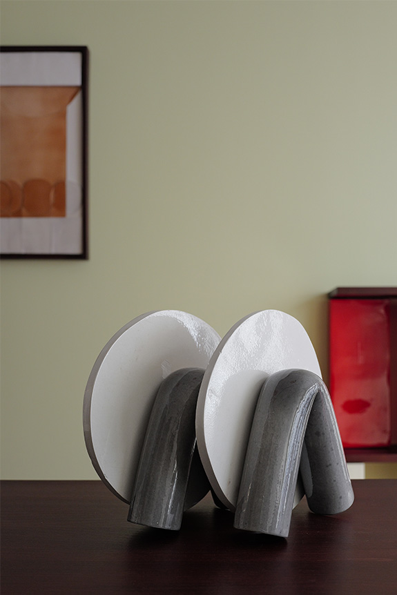
La contrainte technique comme identité
« Ma recherche s’articule autour de ce que je nomme la sculpture quotidienne. Ce sont ces objets omniprésents dans nos espaces de vie, mais oubliés, dont la fonction masque souvent la dimension décorative. C’est pour ça que je me suis intéressé à la plinthe il y a quelque temps. » Un élément architectural que Stéven Coëffic s’est amusé à agrandir puis colorer, et qu’il introduit aujourd’hui comme un module récurrent de sa nouvelle collection. Pour l’occasion, la plinthe devient structurelle et impose sa trame graphique aux meubles. Une connexion entre mobilier, matière et architecture héritée de sa formation à l’École des Arts Décoratifs, et de son apprentissage chez un sculpteur mouleur travaillant la céramique.
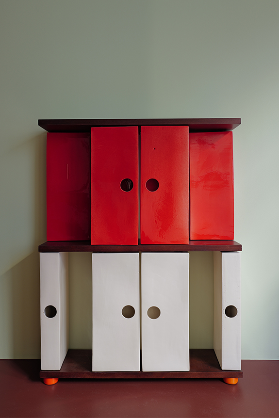
« J’entretiens une certaine fascination pour les objets industrialisés, très orthonormés et modélisables en 3D. Mais ça me semble un peu à l’encontre du design collectible, plus désirable, plus malléable et surtout plus tendance aujourd’hui. J’essaye donc de me placer à la frontière en présentant un répertoire très géométrique mais fabriqué dans une matière sensible qui évolue lors de sa cuisson. » Un rapport entre la forme et le médium qui confère à L’Office, le charme d’une époque passée. « Il y a dans l’esthétique du studio quelque chose que l’on peut rapprocher de Perriand, d’une époque ou il existait des fonctions disparues aujourd’hui. » Un effet renforcé par des arêtes et des courbes comme érodées par le temps. « Pour moi, le rond parfait est patatoïde et c’est ce qui m’intéresse » résume le designer en désignant les trous de coulée volontairement agrandis pour servir de poignées aux différentes portes et tiroirs. Une contrainte technique déformée qui illustre à elle seule l’ambition de conférer aux objets la poésie d’un design terre-à-terre.