Design

With over 1,900 exhibitors this year, Salone del Mobile.Milano 2026 has once again delivered its share of new releases. The Intramuros editorial team shares the ones that caught our eye.
For this new edition, Salone del Mobile.Milano 2026 brought together more than 316,000 visitors to discover new products and reissues. Bringing together both major international firms and young brands, this Milanese event—slightly less dense than in previous years—remained rich in offerings. New materialities, an increased focus on real-world usage, the hybridization of functions... In a fragile but rapidly changing ecosystem—much like the fair itself, which inaugurated new spaces this year—the Intramuros team spotted some great leads. An intuitive and diverse panorama that we invite you to discover.
Kettal
Among all the new products presented by the Spanish brand, which continues to assert its position in the design sector, two stood out. First, Grosso by Patricia Urquiola: a sofa with sculptural forms that invites us to think of comfort as an art form. It reveals itself as a piece with bold yet spontaneous curves, appearing almost in motion. A model designed for both indoor and outdoor use, capable of seating up to three people. In a completely different register, the Atlantic collection by Jasper Morrison combines structure, rhythm, and continuity. This aluminum range with clean lines consists of a lounge chair, a chair with armrests, and a stackable chair. Designed for comfort and daily use, it adapts just as well to a private terrace as it does to a hotel or urban space.

Bitossi Ceramiche
The Italian ceramic brand Bitossi Ceramiche presented several pieces at its stand, including the Dittico vase collection by Martino Gamper. A project that pits the designer's formal research against the identity of a manufacturer with over 150 years of history. Created using white clay slip casting, the collection reveals pieces with organic, almost architectural curves to be appreciated from every angle. The Belgian duo Muller Van Severen—who celebrated their 15th anniversary during this Design Week—presented an extension of their 2024 Onda collection, titled Onda II. This new version revisits the shapes imagined in the first iteration by reworking them based on the principle of inversion. The pieces thus offer a renewed perception of the objects without altering their primary identity. The vases are all available in three colors: vermilion red, dark blue, and pastel gray.

Campeggi
Known for the intelligent design of its transformable objects, Campeggi unveiled "Bienvenue" this year. Conceived by designer Thélonious Goupil, this inflatable mattress is housed in a compact, portable wooden chest. With a simple opening, it provides a portable bed and a foldable, self-supporting headboard that can also serve as a room divider. A compact and colorful set for sleeping wherever you please.

Glas Italia
A sort of tribute to the great names of design, the 2026 collection brought together Piero Lissoni, Philippe Starck, and Patricia Urquiola, to whom we owe, among other things, Glacier. Entirely made of glass, this range of tables plays on the layering of different colored sheets. A reflection on strata reminiscent of glaciers, filtering light through layers of irregular materials. But the brand's presence at the Salone was also an opportunity to introduce Hlynur Atlason, who presented Akur. Behind the desire to challenge the rigidity and linearity of the medium, the designer focused on the meeting of curves and rectilinear grids. Slightly satin-finished, the textured surfaces of the tabletops offer an unusual reading of the material.

Blå Station
The result of a Scandinavian spirit and the desire to create furniture that is pleasant to live with, Blå Station presented the Frankfurter chair by designer Johan Ansander. Simple and classic in appearance, the seat was rethought with new proportions to offer a unique feel. Closer to the body and deeper, the chair is inspired by the shape of a forearm—a form subsequently materialized in bent beech wood. In addition to this new release, the brand also diversified by expanding its Able range, designed by Bernstrand & Borselius, with high tables and a desk. Two new typologies are immediately identifiable thanks to the die-cast zinc nodes combined with steel tubes. A construction that also recalls the wire-frame aesthetic of the Villhem range—designed by Lindau and Bernstrand & Borselius—launched last year and expanded in 2026 with a lower-back chair, an ottoman, and a coffee table.

NII
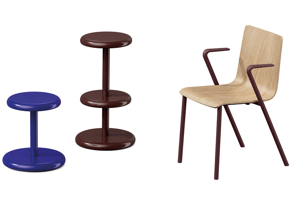
The Japanese brand NII, a member of the Itoki group, unveiled itself outside of Japan for the first time, choosing the Salone del Mobile for its international debut. For this first appearance, NII presented its latest innovations, including the Allround stool by designer Hirotaka Tako and the Hakusan chair by the studio Industrial Facility. The Allround stool stands out for its rounded lines and simple structure, defined by a single central column, resulting in a minimalist product that fits perfectly into any space. As for the Hakusan chair, it asserts its character while remaining subtle and universal. Made of aluminum and steel, it contrasts the solidity of its structure with a certain visual lightness, creating a perfectly balanced result.
B&B Italia
After a twenty-five-year absence (save for a 2019 appearance), B&B Italia made a notable return with a stand designed by Formafantasma. Among the new releases, the Moore lounge chair by Vincent Van Duysen stands out with its woven rattan supported by a frame with continuous curves. Evoking a slightly deformed ring, this fluid design enhances the piece's legibility and highlights its structure. In the same pursuit of formal clarity, Michael Anastassiades presents Metric, a chair crafted from thin sections of solid oak. Its rectilinear construction, reinforced by a crossbar, contrasts with the softness of the slightly curved backrest. Available with or without armrests, it can also be offered in an upholstered version covered in saddle leather. Finally, Ronan Bouroullec completes this selection with the Abaco table, where the object's architecture relies on an entirely visible construction. The precision of the joints and the dialogue between materials—lacquer, cement, or leather—give each configuration a unique identity, leaving the user free to compose as they wish.

Kartell
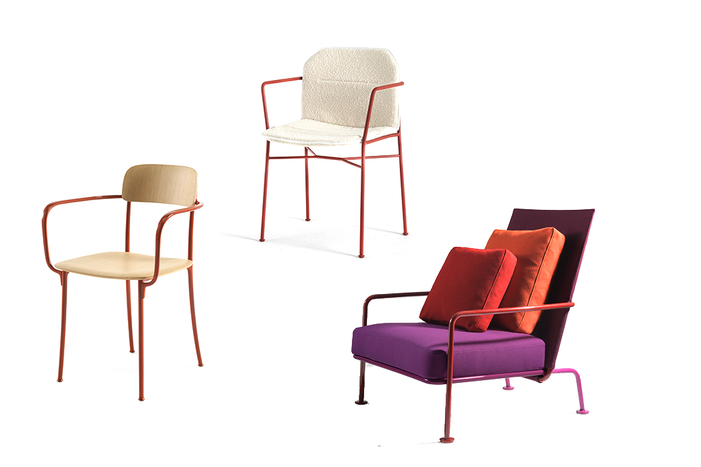
This year, Kartell made a strong impression, both in terms of its offerings and its collaborations. For the first time in several years, the Italian manufacturer expanded its field of experimentation by inviting the British duo Barber & Osgerby to collaborate. They exclusively presented the Savoia chair: an elegant, customizable aluminum piece offered with a seat in recycled plastic, wood, or leather, and available in several colors. It comes with or without armrests and is suitable for both indoor and outdoor use. Eight years after Papyrus, designer Erwan Bouroullec exhibited the Snik chair—a compact, minimalist model in recycled technopolymer with a steel frame, available with or without armrests. A nice bonus: it can be personalized to your liking with interchangeable covers that protect and transform it, ensuring you never tire of it. Meanwhile, Piero Lissoni revealed Yve’s, a minimalist armchair whose tubular structure is defined by a single curved line. Suitable for both indoor and outdoor use thanks to independent covers and cushions, Yve’s is available in various colors and fabrics, resulting in a generous product with a refined aesthetic.
Vergés
Spanish chair manufacturer Vergés was also present at this Milan edition to showcase its latest novelties. Among them is the Trek armchair, designed by the Norwegian duo Andersen & Voll. For this meticulous seat, the designers combined two noble materials—solid wood and leather—for a result that blends flexibility and robustness. Technically, the backrest and seat are covered in a single piece of leather, while the horseshoe-shaped rear crossbar gives Trek a unique character. The London-based studio Mentsen—founded by Japanese designers Risa Sano and Yasuyuki Sakurai—presented the Ensemble bench, inspired by church pews. It is a piece with a simple structure, faithful to Japanese craftsmanship, yet robust and versatile. It will be available with or without a backrest and, for added modularity, can be accompanied by a pivoting side table.

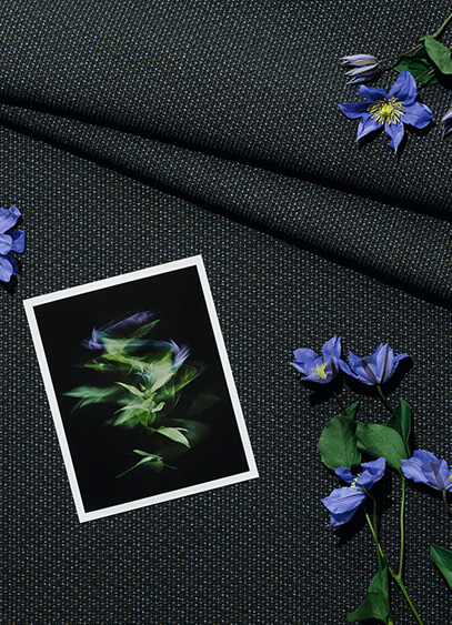
For its participation in Milan Design Week 2026, Kvadrat is unveiling two exhibitions this year: one paying tribute to designer Frans Dijkmeijer, and the second dedicated to the new Twisted Flowers collection, reimagined by Giulio Ridolfo. It is an opportunity for the latter—regularly hailed as a master of color—to discuss his work and his approach.
A key figure in the world of textile design, Giulio Ridolfo has been collaborating with Kvadrat since 2007. Coming from the fashion world, the man who now dresses furniture is the creative force behind several of the Danish brand’s bestsellers, including Canvas 2, Remix, Steelcut, and Zulu. With an approach rooted in color but deeply connected to the technical dimensions of yarn, the designer develops a vibrant, lively, and resolutely contemporary language where innovation takes center stage. His creative process is often described as a blend of intuition, anthropology, and a form of self-taught botany. It was precisely this floral inspiration that led him to explore an archive by Frans Dijkmeijer, which he has reimagined and expanded into 21 colorways. Giulio Ridolfo discusses this technical and stylistic endeavor on the occasion of the "In Rainbows" exhibition. To discover the collection as staged by architect Lorenzo Bini, visit the Kvadrat showroom in Milan at Corso Monforte 15.
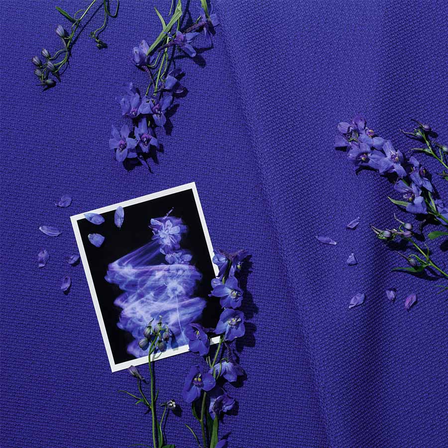
For Milan Design Week, Kvadrat is presenting the "In Rainbows" exhibition, where visitors can discover the Twisted Flowers collection. What is it all about?
Twisted Flowers is a story of composition between my work and that of Frans Dijkmeijer. This collection is a revival of a weave by the designer—who passed away in 2011—which we have reimagined with a real focus on the tactile and visual experience. As is often the case, and it was a shared passion with Frans, I worked with color by drawing inspiration from flowers. We collaborated with a company to select seasonal plants—not exotic ones, but those linked to our environment. For example, you can find the red of the Fritillaria imperialis, the blue of the Ceanothus thyrsiflorus, and the yellow of the Gossypium, which together almost form a bouquet. I sought to translate the very experience of picking flowers into color, by observing them closely and immersing myself in floral paintings like The Dream by Odilon Redon, which I saw in Bern years ago. I was struck by a sense of suspension. It wasn’t exactly dreamlike, but suspended, with undefined colors and a meditative figure. Of course, what we have done is not a literal translation; the blue is not simply blue, and the red is not just red. It’s not like using a Pantone swatch book, which I don’t like at all. Instead, we selected colors capable of creating a kind of interference, a beautiful vibration, a pixelation of the object’s skin.
And you are presenting this in a unique setting…
Absolutely. The showroom area is usually reserved for sales, but not here. At first, I thought about hiring a florist, but I ultimately preferred to work with the structure itself, thanks to Milanese architect Lorenzo Bini. The idea was to invade the space and transform it with a more whimsical, almost magical effect. I didn’t want a clean, minimal space; I wanted to create a pleasant passage where people can linger and appreciate the quality of the colors. In this "hut," there is also furniture—ranging from standard contemporary Danish and Italian designs to pieces by great names like Carlo Scarpa, Cecilie Manz, Finn Juhl, and Jean Nouvel. And since I am very drawn to music, I collaborated with a music programmer in Milan. We have planned four performances based on vibration, intuition, and phasing, which is a technique used by Steve Reich. In fact, this installation is almost a manifesto.
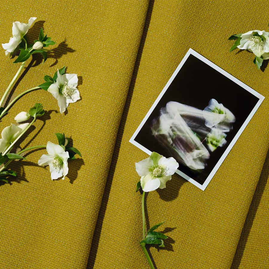
You previously mentioned the work of Frans Dijkmeijer, to whom Kvadrat is dedicating a biographical exhibition at the Triennale. What was your relationship with him like?
The relationship with Frans began with great mutual respect. He thought in black and white to reveal the flaws and beauty of construction, while I worked freely with color. That was the starting point of our relationship. I originally come from the fashion industry, where I was used to handling textiles for dresses, and for the past fifteen years, I have been working on furniture pieces. I gradually became a colorist through long practice in selecting shades, textiles, and materials for companies in the furniture sector. In a way, my primary occupation was to help a project be seen, from the prototype to the industrial solution, which is what I did with Vitra and Moroso, where I started. When I was offered the chance to work with the brand, I knew textile design, but I didn’t want to become a textile designer. However, I was happy to intervene on color, provided I could establish a dialogue with the creator—and as it happens, that creator was Frans Dijkmeijer. One of my first exercises alongside him was to color a fabric with a very pronounced grain, a pinpoint which looks like grains of rice. That is how Steelcut was born; its name comes from "Cut Steel," a Victorian-era technique where iron was cut into diamond shapes to mimic the sparkle of precious stones. It was a foundational project that defined my position.
You are a colorist, but your perspective on textiles is also deeply technical, particularly regarding three-thread weaving, isn't it?
The idea that I work with three threads has become famous, but in reality, I can work with five, six, or just one. It all depends on the situation. I am very drawn to the gouache work of 20th-century artists like Paul Klee, or to a certain musicality, like that of Sibelius. For me, the complexity of a construction adds an extra quality to the color. I once saw Frans use one white thread with two black ones to reveal potential errors in the weave and understand the disruptive element. It was an artisanal way of enriching his creations. But at the same time, working with Kvadrat taught me great rigor. Their textiles must last, be reproducible, and the approach is almost scientific. You cannot have uncontrolled variations. In this context, the idea of working with three colors was born as an intuition. I wanted to understand what vibration might emerge by adding a third thread. When we developed Steelcut Trio, the results were astonishing because there was an iridescent effect, like in silk or taffeta, but with an essential difference. Where taffeta has two sides, this has three. It creates depth, a relationship between light and shadow, a kind of perspective. We continued this research, drawing inspiration from different textiles, until we created a thread composed of three distinct colors. Each thread itself became a complex blend. Two threads constructed this way give an impression of infinity where the color is never fixed. It is this technical expertise that gave rise to Remix, and which we continue to develop today.
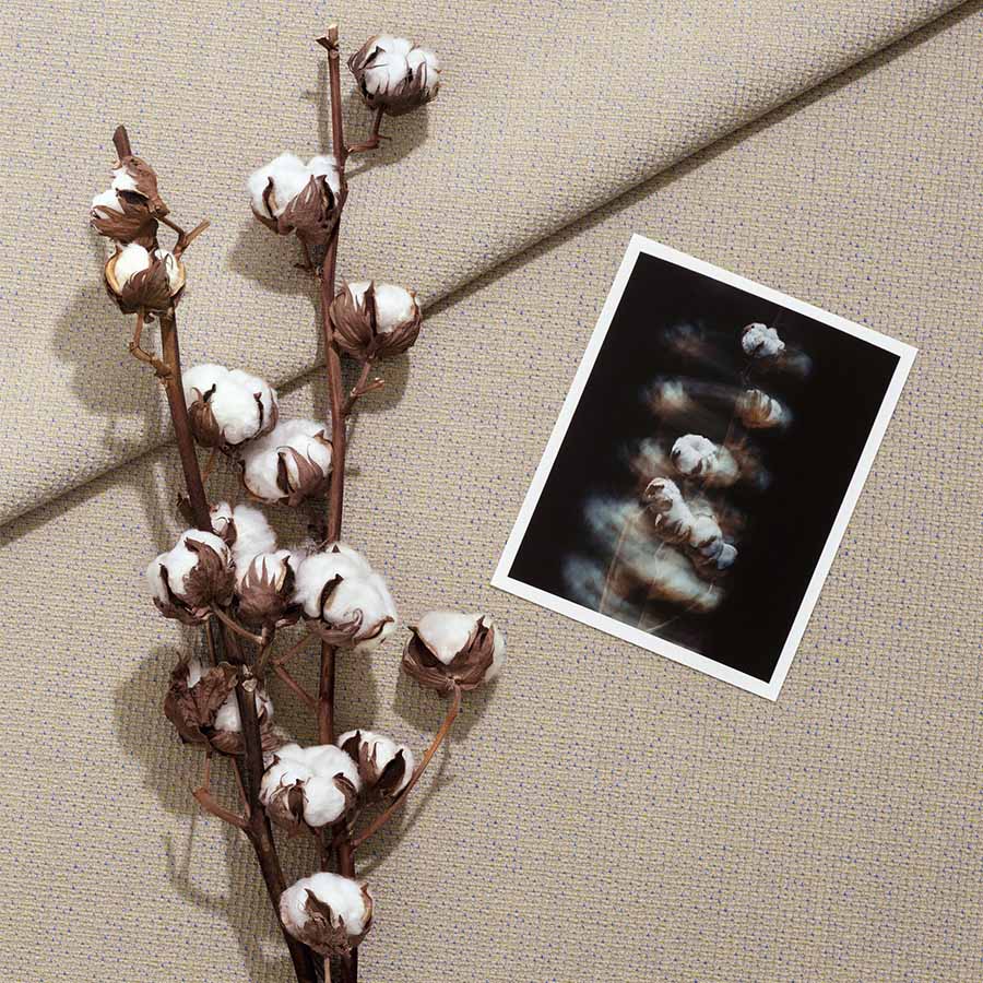
The vibration of colors, the notion of instability, of movement… there is a living quality that almost brings to mind fashion, isn't there?
Movement is inherent to fashion because textiles are on bodies and they move. You have a kind of third dimension that must be taken into account. When I work with a textile for furniture, it is more sculptural. You can walk around it. And then, furniture has the particularity of being able to be equipped with accessories or additions that can modify impressions and feelings. Fabric is one of them. With certain fibers like those from Kvadrat, the structure must be robust, but the fabric can give another impression, of lightness for example. That is specific to furniture.
From that point of view, do you consider textile to be a kind of filter?
If you are referring to semiology like Roland Barthes, then yes, it is a filter. But in reality, it is not. Fabric is the first thing you touch; it is the skin of an object. And in that sense, it is very sensual, because when you see a piece of furniture, you touch it first, then you say "what a beautiful sofa," "what a beautiful object"... It is, let's say, in synchrony with the form of the object. The filter comes into play when you filter information, when you start considering whether it is the right textile, the right sofa for a given use, or the right color... at least, that is how it seems to me. But I am a colorist, and being a colorist means starting with the thread, not the final coloring.
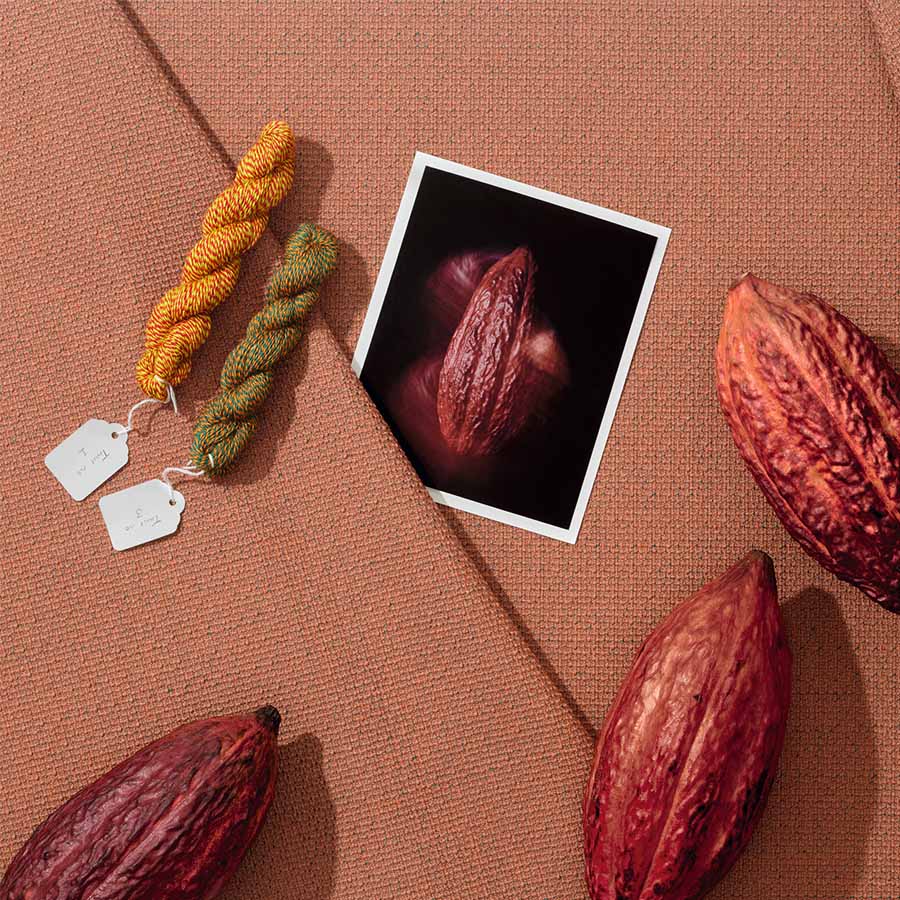

Spearheaded by French Living in Motion, the Design Défilé, with scenography by the agency JAKOB+MACFARLANE, showcases 53 French creations, each illustrating the challenges currently facing the furniture industry. The event brings together brands and design houses committed to "Made in France" and sustainability under a shared ambition.
In the heart of Brera, a fashion show unlike any other is taking place. Initiated by French Living in Motion, the event brings together 53 French creations, including 38 pieces of furniture, through April 26. Among them, 28 brands have mobilized to champion a collection rooted in contemporary sustainability issues. "It is important to understand that the 'French Living' label is an alliance between the French furniture industry, which brings together several brands to support them in the transformation of society, and French design, which aims to drive innovation in the furniture sector through the lens of design. In other words, this union, initiated in 2024, aims to promote French furniture sustainably. That is the whole meaning of 'In Motion,' which embodies this spirit of dynamism.", explains Catherine Vereecke, Director of Communication and Markets for L’Ameublement français.

The collective has drawn from a wide range of SMEs and mid-sized companies active in both the hospitality and residential sectors. The selection is displayed across two spaces. Conceived as an initial glimpse into design creation, the French Design section presents 15 indoor and outdoor furniture pieces, notably by Andrée Putman, Elliott Barnes, and OUD Architecture, and produced by French manufacturers such as Airborne, Atelier Sumbiosis, Maison Pouenat, and Siegeair. This selection is complemented by a second, highlighting 13 French houses—both heritage and contemporary—each presenting three pieces emblematic of their identity. It is a way for houses like Franck Genser, Mercœur Édition, and Sokoa to showcase the breadth of their expertise and the creativity that defines them. According to Catherine Vereecke, "beyond the heritage dimension, this selection was primarily designed to view furniture as a creation in motion, in connection with the body, movement, and time."

A Fashionable Scenography
As the true common thread of the event, the sustainability of the pieces—as well as that of the companies and their processes—prompted the project's initiators to once again call upon the agency JAKOB+MACFARLANE. Having collaborated with French Design on numerous occasions, the agency is this time reinterpreting the codes of fashion. By adopting the concept of a birch-wood runway and playing with light, the duo focused primarily on the fundamental notion of the collective: movement. "The idea that guided us for this scenography was the desire to question design. How do people perceive it, what do they take away from it, and what do they expect from it in a complex world of polycrisis? But the challenge was also one of evolution." Considering that furniture is much more than functional and that it also influences its environment, the designers chose to stage the power of furniture over space and people. Visitors are invited to walk along the runway, which traverses the space from the outdoor courtyard to the interior. "Nothing is partitioned here. The idea is to experience the space as the elements dictate, giving free rein to the expression of craftsmanship." It is a way to create a dialogue between pieces and expertise—some of which has not changed since the 18th century—that finds itself in the spotlight more than ever today, at a time when local sourcing matters just as much, if not more, than traditional techniques.

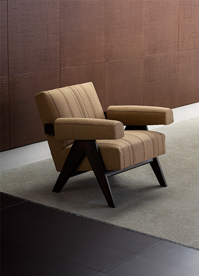
Until August 1st, Carpenters Workshop Gallery is showcasing a selection of contemporary designers. Among them is artist Ingrid Donat, whose works are presented alongside pieces by Pierre Jeanneret, some of which have been reimagined.
It is often easier to start a conversation when everyone speaks the same language. When that is not the case, you have to find a common dialect. For its "Dialogues" exhibition, the Carpenters Workshop Gallery, located at 54 Rue de la Verrerie in Paris's fourth arrondissement, has brought together a diverse collection of works, all (or nearly all) of which are highly contemporary. This theme serves as a focal point for a dozen designers and artists, including the Campana brothers, Nacho Carbonell, Rick Owens Furniture, and Wendell Castle. Despite their distinct personalities, their creative worlds manage to communicate through a layout that highlights connections—particularly in color—across the gallery's three levels. It offers a glimpse into the omnipresence of unique craftsmanship, even in the absence of shared techniques.
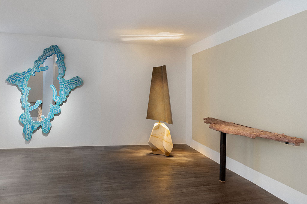
A timeless conversation
On the ground floor, the gallery has sought to establish a different kind of dialogue. More refined than the others, this one does not merely combine aesthetics but fuses them, transcending eras. Bronze specialist Ingrid Donat engages in a conversation with pieces by Pierre Jeanneret. For the occasion, the contemporary artist has reupholstered two Committee chairs and a Lounge Set. Beyond the new stylistic expression provided by the burlap, she offers a more contemporary interpretation of the objects while preserving the soul of this mid-century furniture through the choice of this industrial-coded textile. This is complemented by a desk covered in leather and decorated with the artist's signature motifs—a pictorial and ornamental language also found in the large compositions lining the gallery walls. It is a way of demonstrating that contemporary art can still evolve these well-established modernist icons.

Avec le Piédestal et le Trolley, String Furniture diversifie sa collection Museum. Dessinées par les Suédois de TAF Studio, ces deux nouvelles typologies, destinées à la sphère domestique, poursuivent l’héritage minimaliste et mobile de la marque.
Initiée pour la rénovation du Musée national de Stockholm en 2018, la collection Museum s’enrichit aujourd’hui du bout de canapé fixe Piédestal et du Trolley. Si le premier prolonge la logique d’exposition domestique chère à String Furniture, le second se distingue par une typologie plus inattendue. Faisant suite au bougeoir et à la table d’appoint conçus quelques années auparavant, ce petit chariot s’inscrit dans la continuité d’une collaboration entre deux visions contemporaines du design suédois. Avec ses lignes pures et sa construction orthogonale, la gamme convoque des références industrielles. « Nous nous sommes beaucoup inspirés d’objets utilitaires et plus globalement du monde de l’industrie. C’est ce qui explique notre palette de couleurs ou encore les formes des modules rappelant les poutres en I », explique Mattias Ståhlbom, cofondateur du studio. Un dépouillement autant qu’« une approche pragmatique », traduite notamment par le traitement monochrome de la matière. Le meuble s’efface ainsi au profit des objets qu’il accueille, devenant un support presque muséal pour le quotidien.

Le mouvement comme geste de design
Forts de « cette bibliothèque de constructions et de formes mise en place progressivement avec la création des modules Museum », les designers ont imaginé « un petit meuble dynamique et étroit, dessiné pour s’adapter à de nouveaux emplacements où un chariot peut se glisser et être utile ». En dépit de ses étagères fixes, le Trolley fait du mouvement un principe central grâce à ses roulettes. Au-delà du contraste formel avec la construction rectiligne de l’objet, ce détail lui confère une véritable polyvalence d’usage. « Pour nous, la dimension utilitaire des objets et leur capacité à bien vieillir doivent susciter une forme d’attachement. » Une vision à long terme, fondée sur l’évolution et l’usage, qui rejoint pleinement l’ADN de String Furniture.

Deux créations dans la continuité
Fondée en 1949 par les architectes Nisse Strinning et Kajsa Strinning, String Furniture s’impose comme une figure majeure du design scandinave grâce à une approche rationnelle et évolutive du mobilier. En développant dès l’origine le String System, une structure légère et modulable restée presque inchangée depuis plus de 75 ans, la marque a su s’adapter aux mutations des modes de vie. Cette pérennité repose notamment sur la sobriété visuelle du système initial. Depuis, la gamme s’est enrichie en passant du format compact String Pocket aux évolutions contemporaines comme Pira G2, réinterprétée par Anya Sebton et Alexander Lervik. Fidèle à cette continuité, la marque s’ouvre aussi à des collaborations ciblées, prolongeant son esthétique et son identité fonctionnelle. Outre TAF Studio, les Suédois de Form Us With Love ont développé plusieurs extensions, dont la solution de rangement modulaire Center Center destinée aux espaces de travail grâce à ses cubes métalliques. Véritablement structurantes, ces collaborations sont pour l’entreprise nordique autant d’occasions de conjuguer un héritage moderniste et un certain renouvellement stylistique. De quoi maintenir un dialogue entre rigueur industrielle et usages contemporains pour String Furniture.
Ci-dessous : Museum Piédestal ©String Furniture

The Bureau of Design, Fashion and Fine Crafts is launching the exhibition "30 Faubourg, the art of everyday life made in Paris." It is an opportunity to showcase contemporary fine crafts scattered throughout the capital.
Running alongside the European Artistic Crafts Days (JEMA), which take place from April 7 to 12, the Bureau of Design, Fashion and Fine Crafts (BDMMA) is presenting "30 Faubourg, the art of everyday life made in Paris" until May 16. Curated by the agency Sinople, the exhibition highlights 29 creators based in Paris and its inner suburbs. "You won't find precious materials or objects under glass here, because that's not the point. We wanted to bring fine crafts back into everyday life by showing that these workshops are still present right in our neighborhoods," explains Julien Strypsteen, co-founder of the studio specializing in creative industries.
Beyond the location of the workshops and their expertise, the selection was also based on the contemporary nature of the objects. "At Sinople, we have a minimalist and rather radical vision that defines us. The challenge was to showcase a Parisian heritage without falling into a purely historical perspective." Blending lifestyle, fashion, and art, the agency also wanted to illustrate a heritage firmly rooted in its time by featuring five workshops committed to upcycling. "Whether it's repairing cutlery, transforming shoes, or restoring watches in a more contemporary way, the idea was to highlight the second life of objects, an aspect that is rarely celebrated."

A pop-up store archetype
An exhibition that feels like a shop, "30 Faubourg, the art of everyday life made in Paris" stands out for its staging. Accustomed to more traditional exhibitions, the BDMMA has opted for a retail-inspired scenography this time. Echoing the pieces on display and the desire to integrate craftsmanship into the daily lives of Parisians, the space adopts retail codes. Entrusted to Index Office, the gallery's layout was designed to feel like a natural extension of the many shops on the Faubourg. "The idea was to give the impression that a new boutique had just opened to invite passersby to come in. It's a sort of 'real-fake' concept store, with all the usual codes like wood and metal displays, or even a neon structure by AlexisNeon placed in the window. Since we weren't allowed to sell anything, we also took inspiration from the labels of a famous brand to display prices and QR codes that link directly to the online shops."
With a wide price range starting at 20 euros, the selection aims to reaffirm the unique place of fine artisans in the city and among its inhabitants, even beyond the specific collection presented for the occasion.
Exhibition "30 Faubourg, the art of everyday life made in Paris" until May 16, 30, rue du Faubourg Saint-Antoine, Paris 12th.

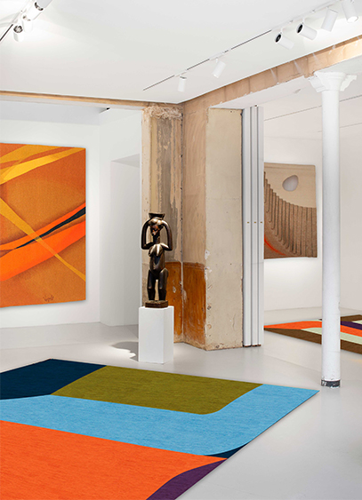
Le designer Gaspard Fleury-Dugy présente Continuum, une collection de tapis dont l’un d’eux est visible à la galerie Chevalier Parsua jusqu’au 18 avril. Un nouveau terrain d'exploration stylistique et colorimétrique pour le créateur connu initialement par ses objets en volume.
Pour changer de dimension, mieux vaut ne pas perdre le fil. Repéré pour ses vases tricotés en 2024 et sa série tournée vers l’univers du totem et de la colonne l’année suivante, Gaspard Fleury-Dugy a exposé à Milan comme à Eindhoven et Stockholm. Mais c’est à Paris, ville de résidence et d’expérimentation, qu’il dévoile Continuum, une première collection de tapis. Après des études à l’Ecole Dupperé puis à la Swedish School of textiles, cette nouvelle typologie aurait pu être un commencement, mais c’est finalement comme une déclinaison de ses précédents travaux qu’elle apparaît. Un choix surprenant qui n’a pourtant rien de décousu. « Il y a tout un cheminement logique entre mes dessins, mes maquettes, les différents objets présents dans l’exposition et les tapis. Effectivement, je viens d’un univers ou le motif à toujours eu une forme attirante. Mais ce qui m’intéresse, ce sont les sauts entre la 2D et la 3D ; entre les plats et les volumes » précise le créateur. C’est d’ailleurs cette idée qui l’a amené à nommer l’exposition, présentée à la galerie Chevalier Parsua jusqu’au 18 avril, Arrondir les angles.
Habiller l’espace
Spécialisée dans le textile mural pour la partie Chevalier, et les tapis avec l’éditeur Parsua, la galerie se dote de tentures au mur et au sol. Deux environnements entre lesquels un espace vide demeure. « Lorsque la collaboration avec la galerie a commencé, je tenais à dessiner les maquettes des tapis. Je suis arrivé avec plein de propositions que nous avons étalé partout par terre. Dans le même temps, je me suis rendu compte que les angles de cet espace blanc et rectiligne n’étaient pas habillés. Je me suis demandé comment y remédier. La réponse a été de retranscrire les perspectives du lieu sur les tapis. » Une approche très géométrique et abstraite de l’architecture qui a amené le designer à travailler de manière moins conventionnelle qu’à l'accoutumé. « Pour un designer textile, son fond de commerce, c’est plutôt de faire des motifs au raccord, c'est-à-dire qui se répètent à l’infini. Ici, la nouveauté pour moi était de créer une composition placée qui puisse se regarder de tous les côtés. C’est ce que l’on appelle un motif placé, unique » explicite le designer également curateur de l’exposition et à qui l’on doit la sélection d’art africain et les photographies de Georges Rousse, dont les anamorphoses dialoguent naturellement avec les tapis.
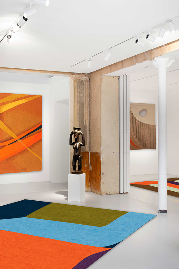
Une identité visuelle assez différente
Habituellement reconnaissable à ses fils polymères aux couleurs vives, parfois fluo, rappelant l’univers du sportswear, Gaspard Fleury-Dugy à cette fois-ci adopté des couleurs plus profondes et calmes. Une contrainte plus qu’un choix, imposée par la gamme Parsua. « Les tapis sont tissés en Iran avec des laines teintées par des colorants naturels. Il a donc fallu réfléchir autrement, et comme je n’étais pas très familier avec ces couleurs, j’ai joué sur les contrastes. » Un parti-pris dont se dégage une certaine vibration, également soutenue par la technique. « Si l’on prend l’exemple des vases, lorsque je les travaille sur ordinateur, un pixel correspond à une maille. Ici, la technique n’est pas la même. Un nœud correspond à une pointe de couleur et la méthode artisanale créée un léger crantage. On peut y voir une sorte de dialogue avec les projets précédents présentés jusqu’au 9 mai au Pavillon Vendôme de Clichy. » Plus qu’un nouvel objet, c’est surtout une déclinaison de son travail habituel, confié pour la première fois à d’autres mains, que le designer propose de découvrir. Un lien entre idée et geste solidement noué tout au long de l’année de travail pendant laquelle Continuum s’est tissée.
Exposition Arrondir les angles, à la galerie Chevalier Parsua, 41 rue de Seine, 75006 Paris, jusqu’au 18 avril.
Exposition Salto, au Pavillon Vendôme, 2 rue du Guichet, 92110 Clichy, jusqu’au 9 mai.
Le portrait de Gaspard Dugy-Fleury est à retrouver dans le numéro 224 d’Intramuros, en vente sur notre boutique.
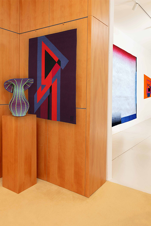

Présentée l’an dernier à Milan, Maap, la dernière création d’Erwan Bouroullec, arrive sur le marché. Une création à fleur de peau imaginée pour Flos.
« Maap est la concrétisation d'un désir qui m'habite depuis longtemps : créer des luminaires imposants dont la lumière se diffuserait au travers d'une grande surface. Et pour imaginer ce modèle, j'ai puisé mon inspiration dans deux obsessions de longue date que sont la géométrie et les structures naturelles » explique Erwan Bouroullec. S’il s’agit certainement de l’un des plus grands luminaires de Flos, Maap compte peut-être aussi parmi les plus légers. Une notion, centrale dans la démarche du designer, à laquelle cette grande applique murale doit sans doute un peu de sa poésie.
Fasciné depuis longtemps par les matériaux ultra-fins dont le papier, le designer s’est intéressé au tyvek, notamment connu sous forme d’enveloppes indéchirables. Une robustesse structurelle qui a amené ce médium dans le monde de l’éclairage ou il n’avait que très peu été utilisé. Mise en forme comme un sac, la matière prend place sur une base murale lumineuse cruciforme dotée de quatre ampoules. Fixée magnétiquement grâce aux Dots (dont le nombre évolue selon la taille du luminaire), la membrane peut être facilement manipulée. Disponible en trois formats (Wall 1, Wall 2, Wall 3 selon le nombre de Dots au mur), Maap peut mesurer jusqu’à 3,2 mètres de largeur par 1,5 mètre de hauteur.

Une matière sensible à travailler
L’une des particularités de Maap, c’est peut-être sa capacité à se magnifier au fur et à mesure des manipulations. Si l’idée d'utiliser des cartes a été un point de départ rapidement abandonné en raison de leurs fragilités, le rendu, lui, n’en est pas si éloigné, rappelant ces papiers usés par les voyages et sur lesquels semblent retranscrites les dénivelées. Mais ici, ce n’est pas tant l’œuvre involontaire du temps que celle consciente des utilisateurs qui est à l’origine des froissements. « Maap aurait tout aussi bien pu s'appeler Maak, clin d'œil à "make", puisque son principe repose sur un geste élémentaire, le "faire" de la main. Sa forme malléable est une invitation à laisser libre cours à notre instinct de création » développe son designer. Lorsque le tyvek est froissé, il adopte des formes organiques et singulières, offrant la possibilité de donner plus ou moins de caractère au luminaire. Au-delà de l’aspect esthétique, cette action relève surtout d’un besoin structurel. Sans ces pliures, le papier perdrait de son volume, et Maap de son effet. Ainsi enveloppée, la création d'Erwan Brouroullec propose également une nouvelle approche de la durabilité. Protégée mais facilement accessible, la source lumineuse dure dans le temps, là ou son design, lui, change d’une simple pression de la main. Comme un nuage égaré, ce produit nouvellement lancé par Flos, évolue au gré du temps.

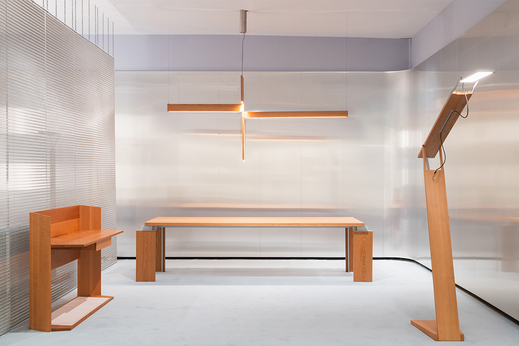
Avec Formation, le studio Formafantasma présentait à TEFAF Maastricht une collection contemporaine imaginée autour de la planche. Une approche en lien avec un certain goût pour le moderniste et la sobriété.
Qualifiant eux-mêmes leur esthétique de « restreinte », Andrea Trimarchi et Simone Farresin, fondateurs de Formafantasma, présentaient Formation à TEFAF Maastricht. Conçue pour la galerie Friedman Benda, la collection s’inscrit dans la continuité de leurs recherches sur les archétypes du mobilier et l’évolution de notre rapport aux objets domestiques. Cette fois-ci, le studio s’est attaché à la planche comme forme primaire, presque indissociable du mobilier lui-même. Plutôt que de la transformer, les designers ont choisi de l’utiliser telle quelle pour devenir table, assise ou rangement, sans jamais perdre son identité initiale. Ce parti pris donne lieu à un jeu géométrique rigoureux, enrichi par l’introduction d’aluminium brossé et de panneaux LED. Ces derniers, par leurs proportions, évoquent les écrans contemporains, inscrivant le projet dans son époque malgré une logique d’assemblage très classique. Tout l’enjeu réside alors dans cet équilibre temporel. Une démarche nourrie par des figures comme Frank Lloyd Wright, pour sa capacité à conjuguer artisanat et technologie, ou George Nakashima, pour sa vision du bois comme matière vivante.
Avec Formation, Formafantasma revendique ainsi une sobriété expressive. La collection, réduite à une sophistication assez minimale (bien que rehaussée de touches plus contemporaines), propose un salon hors du temps, mais à cheval sur les époques.
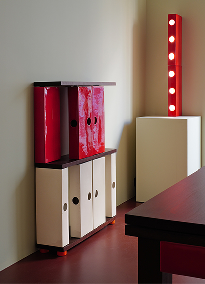
Créateur d’objets en céramique, le designer Stéven Coëffic présente L’Office. Un univers fait de lignes irrégulières et de couleurs vives, imaginé comme un hommage contemporain à cette pièce oubliée dans la maison. Une exposition à découvrir jusqu’au 30 avril dans la Tiny Room d’India Mahdavi.
« L’office, c’est cette pièce située entre la cuisine et la salle à manger. C’est l'espace où l'on sublime le plat. Mais c’est aussi et surtout un lieu dans lequel on ne reçoit pas et où l'on peut de fait retrouver un peu de poussière, des affaires qui traînent ou des cales sous les meubles… » En fait, il s’agit surtout d’un lieu fonctionnel et vivant de l’habitation dans lequel rien n’est dissimulé. Et c’est notamment ce qui a intéressé Stéven Coëffic, nouveau bénéficiaire de la Tiny room d’India Mahdavi, avec qui le designer avait collaboré l’an passé pour la création d’une couleur.
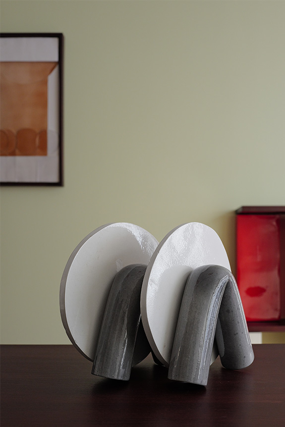
Plus qu’une collection, L’Office est donc une forme d’incarnation visuellement ludique et contemporaine d’une pièce aujourd’hui disparue. « Ici, l’idée est de sublimer ce que l’on cache habituellement dans les pièces d’apparat, que ce soient les tuyaux, la robinetterie ou les assiettes qui sèchent. » Autant de typologies recréées en céramique et contextualisées dans cette petite architecture qu’est la galerie. Un dispositif scénographique habituel pour le designer sensible à l’idée d'aménagement d’espace.
La contrainte technique comme identité
« Ma recherche s’articule autour de ce que je nomme la sculpture quotidienne. Ce sont ces objets omniprésents dans nos espaces de vie, mais oubliés, dont la fonction masque souvent la dimension décorative. C’est pour ça que je me suis intéressé à la plinthe il y a quelque temps. » Un élément architectural que Stéven Coëffic s’est amusé à agrandir puis colorer, et qu’il introduit aujourd’hui comme un module récurrent de sa nouvelle collection. Pour l’occasion, la plinthe devient structurelle et impose sa trame graphique aux meubles. Une connexion entre mobilier, matière et architecture héritée de sa formation à l’École des Arts Décoratifs, et de son apprentissage chez un sculpteur mouleur travaillant la céramique.
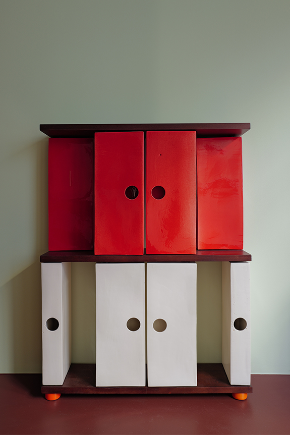
« J’entretiens une certaine fascination pour les objets industrialisés, très orthonormés et modélisables en 3D. Mais ça me semble un peu à l’encontre du design collectible, plus désirable, plus malléable et surtout plus tendance aujourd’hui. J’essaye donc de me placer à la frontière en présentant un répertoire très géométrique mais fabriqué dans une matière sensible qui évolue lors de sa cuisson. » Un rapport entre la forme et le médium qui confère à L’Office, le charme d’une époque passée. « Il y a dans l’esthétique du studio quelque chose que l’on peut rapprocher de Perriand, d’une époque ou il existait des fonctions disparues aujourd’hui. » Un effet renforcé par des arêtes et des courbes comme érodées par le temps. « Pour moi, le rond parfait est patatoïde et c’est ce qui m’intéresse » résume le designer en désignant les trous de coulée volontairement agrandis pour servir de poignées aux différentes portes et tiroirs. Une contrainte technique déformée qui illustre à elle seule l’ambition de conférer aux objets la poésie d’un design terre-à-terre.
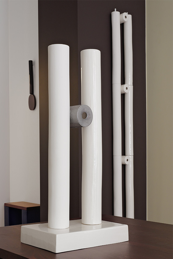
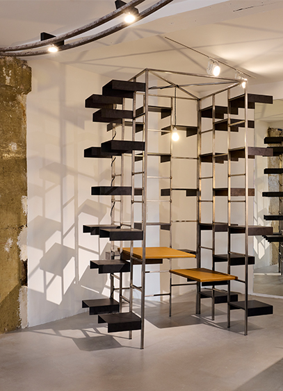
To mark the opening of its new space on Rue de Seine, Pulp Galerie is presenting an exhibition dedicated to the radical German collective Pentagon Gruppe.
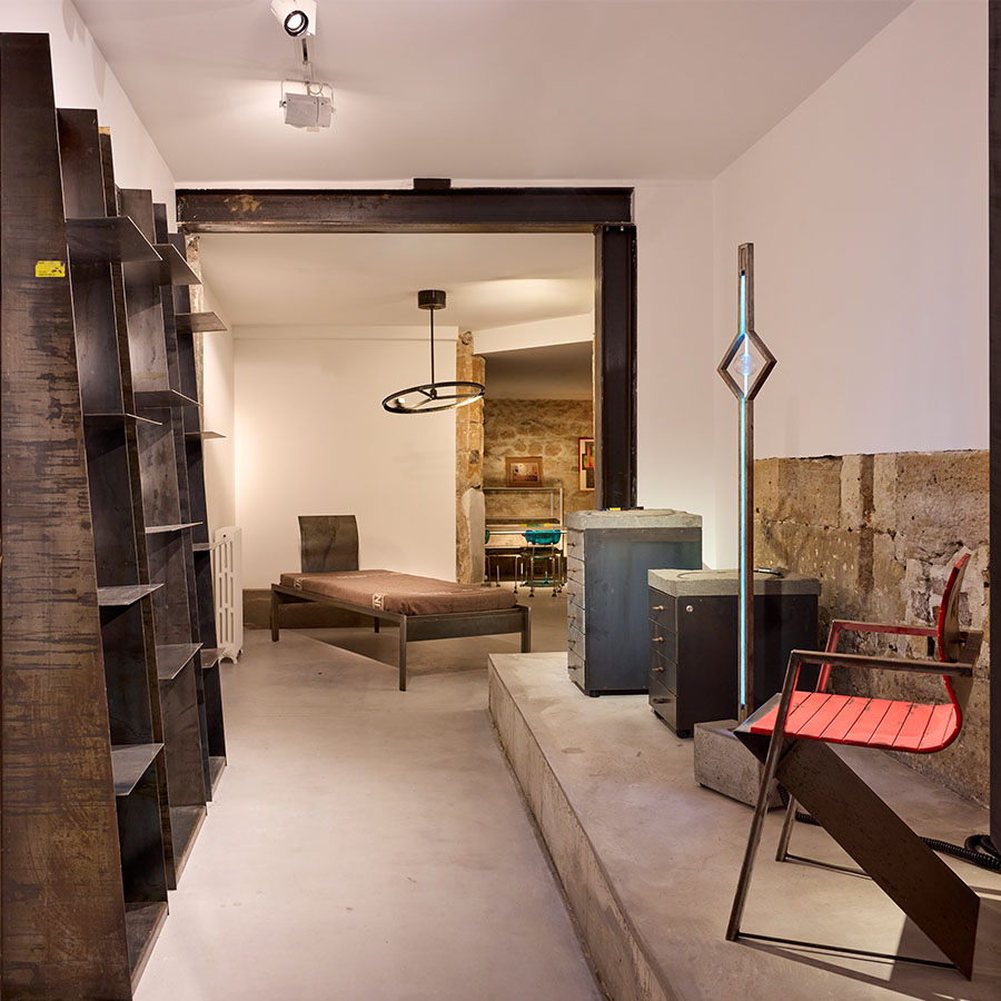
Five designers, one singular perspective: the radicality of the object. For the opening of its new showroom, Pulp Galerie, founded by Paul Ménacer-Poussin and Paul-Louis Betto, is showcasing the German collective Pentagon Gruppe until March 21. Comprising Gerd Arens, Wolfgang Laubersheimer, Reinhard Müller, Ralph Sommer, and Meyer Voggenreiter, the group champions the aesthetic of the unfinished. Founded in 1985 in Cologne at the height of the Cold War, Pentagon Gruppe was built on the belief that design could spark a revolution. At a time when the artist was largely overlooked and the synergy between industry and design was far from the Italian model, these creators went against the grain of their era. Disregarding the functionalism and formal sobriety inherited from the Bauhaus, the studio prioritized ideas over comfort. The object had to be a manifesto, and radicality was that manifesto. With massive, heavy pieces, visible scratches, and intentionally raw welds, the concepts conveyed were meant to be visible and inherent to the objects themselves. The structure commands attention, much like Wolfgang Laubersheimer’s Seerose sideboard, crafted from steel and raw lava stone.
A desire to push boundaries
While the collective remains unclassifiable—though objectively driven by a radicality where style dominates all else—the exhibited pieces hint at the concept of movement. This omnipresence is particularly evident in the Folding bed, which adopts Jean Prouvé’s compass structure, the Shelf Unit for Cheap Glasses on casters, and the Mai 68 magazine racks, which serve as clear material transpositions of the instability reigning in France at the time. These are all references to the industrial sector. Yet, this notion also takes on a more poetic form. From the miniature stream watering the plants on the imposing Amazonia table made of Ruhr stone, to the Voyage à Milan mobile pendant light featuring a circling train, movement reflects the studio’s total creative freedom, expressed through cold materials and rigid volumes. This approach came to an end after only a decade of activity, when an ambitious project for an itinerant, robotic artist’s café led Pentagon Gruppe to bankruptcy. It was a total and radical adventure in every sense, which Pulp Galerie invites you to discover through a selection of around twenty objects.
The exhibition Pentagon Gruppe: Silent Brutality is on view until March 21, 2026, at Pulp Galerie, 30 Rue de Seine, in the 6th arrondissement of Paris.
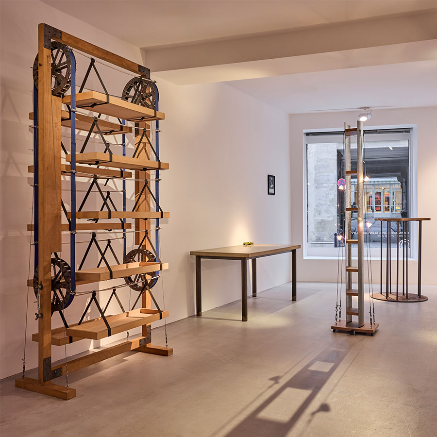
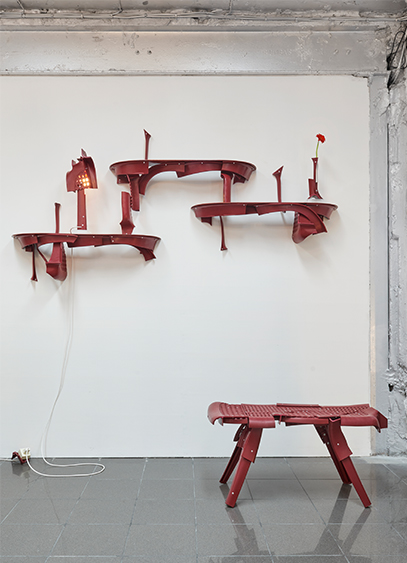
Pierre Castignola presents Unwanted Guest, a furniture collection crafted from deconstructed Pierre Paulin chairs.
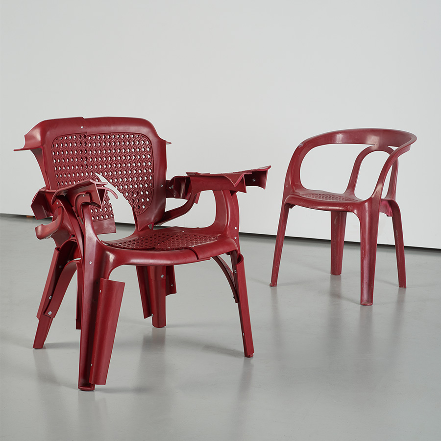
Beneath the silver ceiling of the ITEM IDEM gallery—a sort of Warholian factory where creations by Castiglioni and Sottsass sit side-by-side on Starck shelves—Pierre Castignola presents his second solo show. It is a natural fit for a designer influenced by Italian radical design and interested in semiotics. True to his deconstructivist approach, he presents Unwanted Guest, an exhibition whose title evokes "the idea of a respectful subversion of the original work". For this occasion, the Tango chair designed by Pierre Paulin has been cut up and reassembled. Following in the footsteps of the Fauteuil 300, the first monobloc chair released in 1972, the Tango quickly became a staple of our summer landscapes. "I salvaged 39 of these chairs during the renovation of a swimming pool in Geldrop, in the suburbs of Eindhoven where I studied. I really liked their red color, but they sat in my studio for a long time without me knowing how to use them. Then one day, I decided to take four of them, cut them up somewhat randomly, and see what happened," explains Pierre Castignola. A radical approach that gave birth to the first of the 21 pieces that make up the collection. "My first solo show focused on the living room. For the second, I wanted something different, and since I consider myself, in a way, an involuntary guest in Pierre Paulin's world, the guest room came to me quite naturally, leading to several objects ranging from a chandelier to a foosball table."
A Re-cut Legacy
Neither a true homage nor a total break from Pierre Paulin’s work, Pierre Castignola offers a reinterpretation of the original furniture in the form of "countless variations." As an intentional transition from mass production to unique pieces, the designer also takes the opportunity to rethink his process. "I usually work with flexible plastic. However, this material is 3 to 4 millimeters thick, and its rigidity forced me to rethink my approach." Beyond the characteristic look of his objects, the designer delivers a collection where angles become sharper and curves are dictated more by the limitations of the plastic. "To make the armchair, I only used cut-out seat sections, whereas the stool is made entirely of armrests." These groupings by similarity make the designer less of "a shaper and more of a selector" guided as much by his imagination as by constraint. A structural peculiarity that also led the designer to reflect on Pierre Paulin’s legacy. "Someone once explained to me that Pierre Paulin made extensive use of tubing in his frames. It’s something I’ve adopted here to graft on my own approach and create something new, yet resonant." A confrontation between two worlds, as much as between two radically opposed eras.
Pierre Castignola’s exhibition Unwanted Guest, on view at ITEM IDEM, 12 rue Bleue, Paris, 9th arrondissement, from March 4 to April 12, 2026.
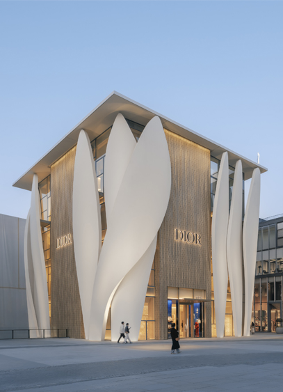
L’architecte français Christian de Portzamparc signe une troisième boutique pour Dior. Un projet inscrit dans la continuité de deux autres espaces de vente, mais repensé pour s’intégrer en plein cœur de la capitale chinoise.
« J’ai fait ces bâtiments dans un esprit de collectionneur. » Après Séoul en 2015 et Genève il y a deux ans, Christian de Portzamparc livre à Pékin sa troisième boutique pour Dior. Fruit d’une rénovation, cette dernière s’inscrit dans la continuité stylistique de ses deux consœurs coréenne et suisse. « L’idée m’est venue lors de la conception du premier projet. Sidney Toledano et Bernard Arnault m’ont appris que Christian Dior travaillait à partir de grandes toiles blanches suspendues, qu’il sculptait directement pour créer ses volumes. » Une image fondatrice transposée à travers des monolithes de résine toujours réalisés en chantier naval, mais constamment redessinés selon leurs destinations.
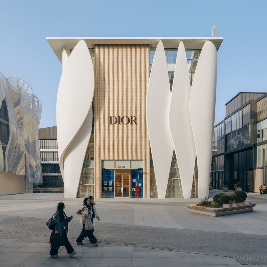
Une réflexion architecturale globale
« Pour moi, la question de l’architecture est intimement liée à celle du contexte, du site », affirme l’architecte. Implanté en plein cœur d’un complexe dessiné par Kengo Kuma, ce flagship, l’un des plus grands de la marque, s’inscrit dans une vaste place réunissant plusieurs pavillons de luxe et ceinturée par un long rideau de verre à la trame irrégulière. « L’espace dans lequel se situe le projet est tellement vaste que n’importe quel bâtiment y trouverait sa place et formerait une unité. C’était l’un des avantages. » Une interprétation de la ville et du contexte qui n’a rien d’anecdotique. « À Séoul et Genève, les bâtiments étaient situés à des intersections ; à Pékin, il s’agit d’une place. Cela change tout. » Le projet genevois, marqué par un équilibre entre verticalité, largeur et ouvertures, ne pouvait être transposé tel quel. « À Pékin, le bâtiment devenait trop large et visuellement insupportable. Nous avons donc décidé de déplacer les montants verticaux dans les angles du bâtiment et d’introduire des briques de verre. » Une évolution respectueuse de l’image de marque véhiculée par l’architecture, mais transposée à un site particulier.
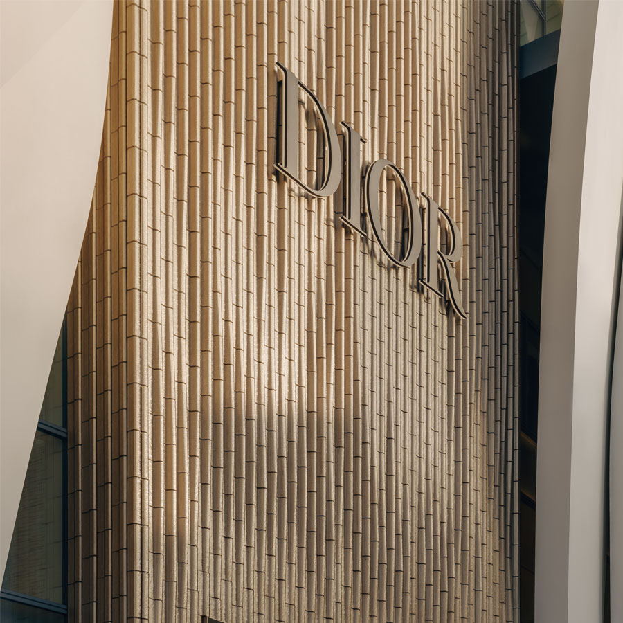
Une superposition de styles
Pour comprendre le bâtiment, il faut en saisir la constitution. « Ici, nous avons trois enveloppes distinctes. La plus visible et peut-être la plus virtuelle, est celle des pétales ou des cariatides. La seconde est la paroi dorée en briques de verre. Derrière se trouve une troisième peau, semblable à une toile de Mondrian, en acier et en verre. » Une superposition en écho à la vision de l’architecte selon qui l’art doit avoir sa place. « Mis van der Rohe disait : “Je ne cherche pas à être intéressant, je cherche à être juste.” Ici, j’aurais pu être juste simplement avec la couche interne, mais de mon côté, je cherche à susciter un certain intérêt, la curiosité de regarder et comprendre. » Mais outre l’aspect manifeste de la construction, l’architecte joue également avec les différentes peaux pour générer des jeux de lumière et de transparence offerts par les volumes courbes des montants verticaux. « Je parle des cariatides en écho à l’architecture antique. Ce qui est beau dans les temples grecs, c’est la notion d’espacement entre les éléments. C’est cette idée de plein et de vides, et le détachement des formes. Ici, les écarts sont très faibles entre les éléments, mais comme ils sont bombés - à la manière de l’entasis chez les Romains - cela dégage une certaine profondeur. » Une impression renforcée par la toiture carrée, introduite initialement à Genève, et affirmant l’appartenance du bâtiment à la rue, à sa discipline. « Tout est une histoire d’équilibre. Il fallait que mon architecture exploite correctement la surface commerciale tout en offrant une sensibilité particulière à la construction lorsqu’elle est vue de l’extérieur. Et c’est encore plus flagrant la nuit, lorsque la lumière de l’intérieur se diffuse dans les courbes de la résine et vient donner vie à l’édifice » affirme Christian de Portzamparc.
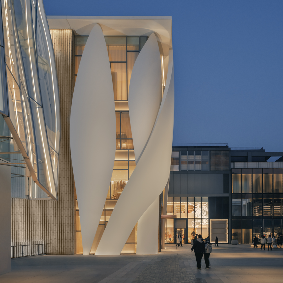
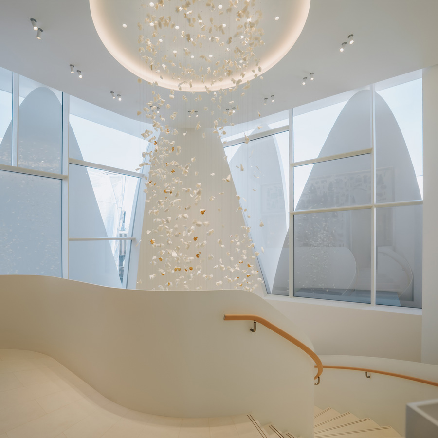
Pensé d’abord comme un geste architectural autonome, le bâtiment a été conçu indépendamment de son aménagement intérieur, réalisé dans un second temps. Néanmoins, la disposition des cariatides dans les angles permet à la lumière de pénétrer naturellement dans l’édifice. « Je suis convaincu qu’il y a un véritable besoin d’ouvertures vers l’extérieur dans un bâtiment. C’est important de savoir où l’on se trouve vis-à-vis de l’extérieur. Je crois que c’est une forme d’élargissement de la conscience » conclut l’architecte.
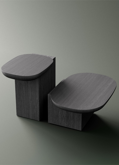
Le designer Alain Gilles présente la collection Dialog. Des tables basses dessinées pour évoquer le déséquilibre.
Basculeront-elles un moment ? La réponse est non. C’est pourtant toute l’impression dégagée par la collection Dialog du designer français Alain Gilles pour la marque croate Milla & Milli. Réalisée en chêne massif, la table d’appoint a été imaginée autour de l’idée de déséquilibre. Une impression suscitée par la combinaison d’une base parallélépipédique et d’une tablette encastrée aux courbes douces. Assemblée en débord, cette dernière est stabilisée par un lourd piètement monolithique.
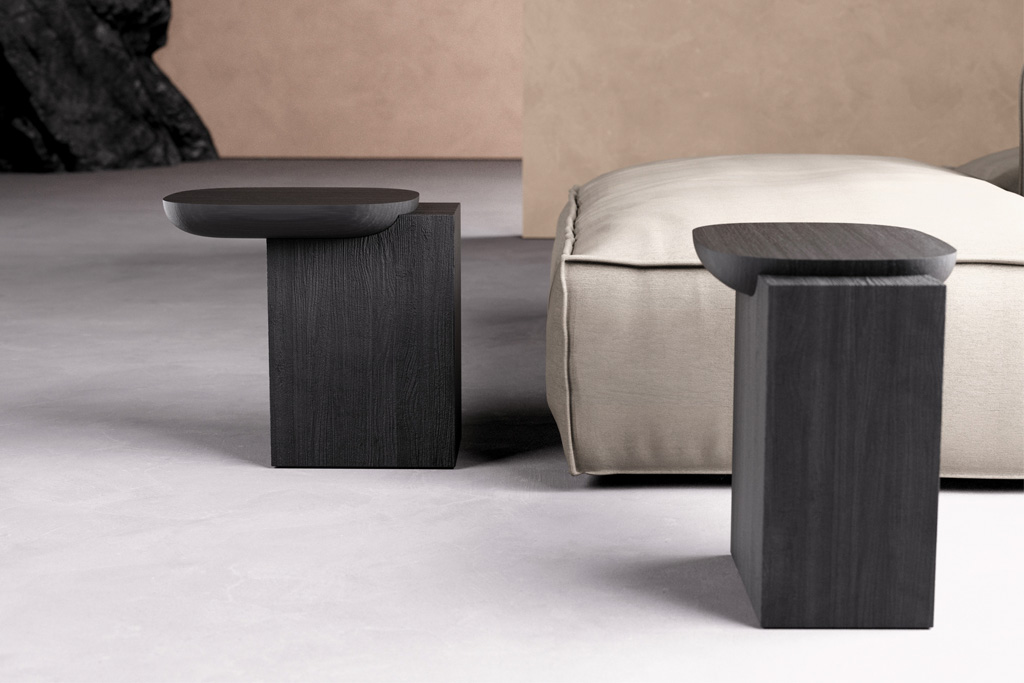
Avec son veinage légèrement creusé, la partie basse s’oppose au plateau lisse. Un dialogue entre deux matérialités et deux approches formelles au sein d’un même objet. Disponible en trois dimensions et en bois teinté noir, ce petit meuble trouve sa place en bout de canapé autant qu’en sellette basse.
Un ADN stylistique étendu à une gamme de tables basses nommées Edge, reprenant la même logique de construction. Également disponibles entre trois diamètres et deux hauteurs différentes, les tables peuvent se superposer renforçant l’idée d’équilibre !
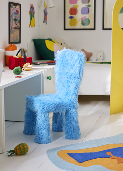
Ikea lance la collection GREJSIMOJS. Dédiés aux enfants, les objets ont été pensés pour stimuler l’imagination tout en s’intégrant naturellement dans la maison.
Et si les monstres n’étaient pas si méchants ? Et s’il n’y avait vraiment pas d’âge pour intégrer des aires de jeu à son intérieur ? Avec des “si”, on peut refaire le monde, tout comme avec un peu d’imagination et quelques touches de couleur. C’est ce que propose IKEA avec sa nouvelle collection GREJSIMOJS, dédiée aux plus jeunes. Un nom peu familier à nos oreilles, mais qui renvoie à l'idée universelle « d’un petit bidule qui traîne dans la maison », explique Enrica Magnalardo, responsable France de l’aménagement et de l’inspiration. Un objet sans catégorie précise, qui trouve simplement sa place dans le quotidien. C’est précisément cette typologie libre qui est au cœur des 33 produits imaginés par 12 designers internationaux, qui, après avoir défini ensemble les grandes lignes du projet, ont développé leurs pièces indépendamment. « En Suède, nous avons une notion très forte, celle de l’“allowing”. C’est l’idée qu’un certain désordre est non seulement accepté, mais essentiel à l’apprentissage. Cette approche est indissociable du sens de la praticité qui fait partie de notre ADN », poursuit Enrica Magnalardo.
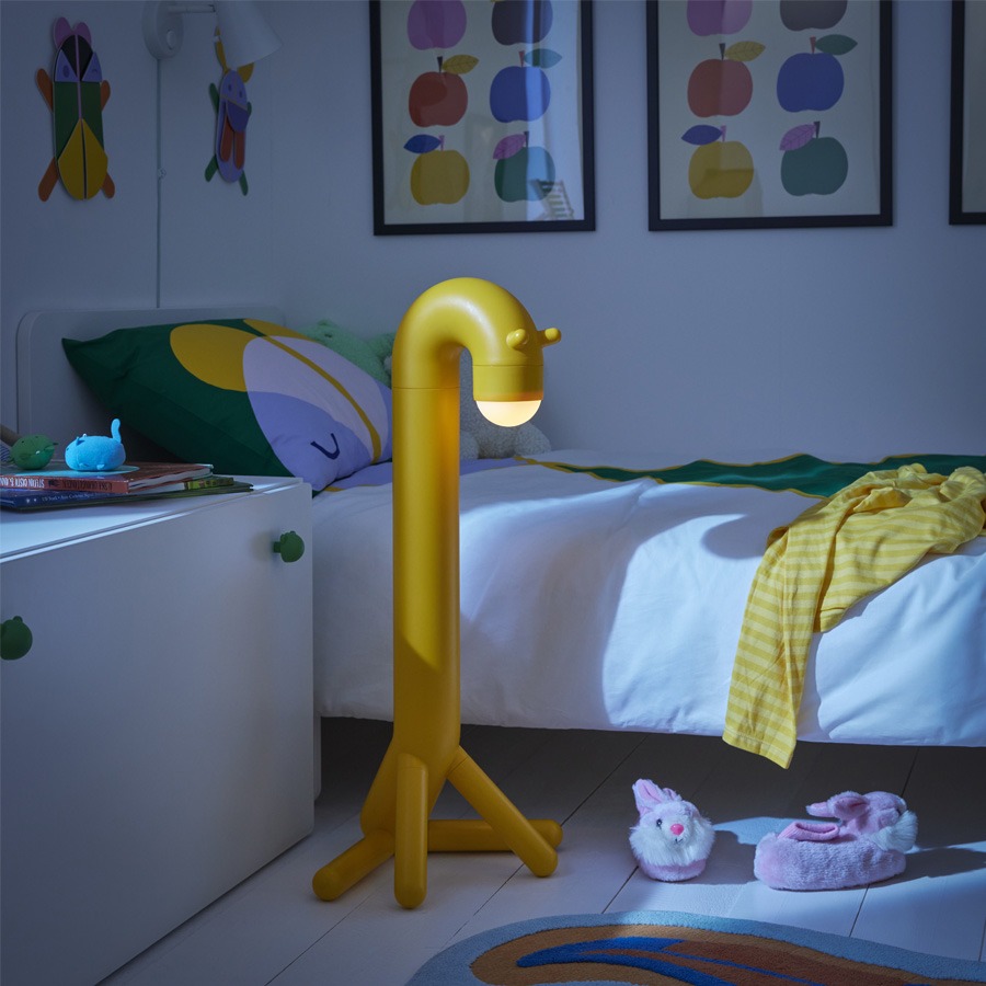
Conjuguant fonctionnalité et fantaisie, la collection interroge notre manière de rendre les objets du quotidien plus ludiques. Cela passe par un usage assumé de la couleur, par des géométries qui transforment les surfaces en terrains de jeu ouverts, ou encore par des figures animales stylisées. Parmi les designers invités, Akanksha Deo revient sur la genèse de GREJSIMOJS.

Quelles directives vous ont été données pour développer cette collection ?
Avant de recevoir le brief pour GREJSIMOJS, tout notre département de conception a été invité à jouer pendant deux jours. On nous a demandé de repenser à notre enfance, aux objets que nous aurions aimé avoir autour de nous, ceux qui auraient pu susciter notre émerveillement, nous réconforter, nous inciter à faire des bêtises ou à inventer sans fin. Mais nous ne concevions pas uniquement pour les enfants. Nous devions également tenir compte du point de vue des adultes qui partagent leur univers, ceux qui vivent parmi ces objets et en prennent soin. Le défi consistait donc à trouver un équilibre subtil pour créer des produits qui placent les enfants au cœur de l'histoire, tout en s'intégrant harmonieusement dans le quotidien des adultes à la maison. Par exemple, pour mes coussins empilables, je me suis inspirée de la façon dont les enfants voient des possibilités là où les adultes ne voient que des objets. Une forme douce sur le sol peut devenir un galet flottant sur de la lave, des bonbons ou des boutons géants et colorés, ou encore un gâteau à plusieurs étages. Ces coussins sont destinés à évoluer au gré de l'imagination, s'empilant en tours, roulant comme des pneus, s'alignant pour des jeux ou se transformant en parcours d'obstacles, changeant constamment au fil de l’histoire. L’autre élément à prendre en compte est la stratégie des couleurs. Elle combine des tons vifs et des teintes plus sourdes et « sales », créant une palette expressive mais visuellement sobre. Au final, il s'agissait de concevoir des objets qui véhiculent le jeu non pas comme une activité, mais comme un sentiment qui peut habiter l'espace, prêt à être intégré à tout âge.
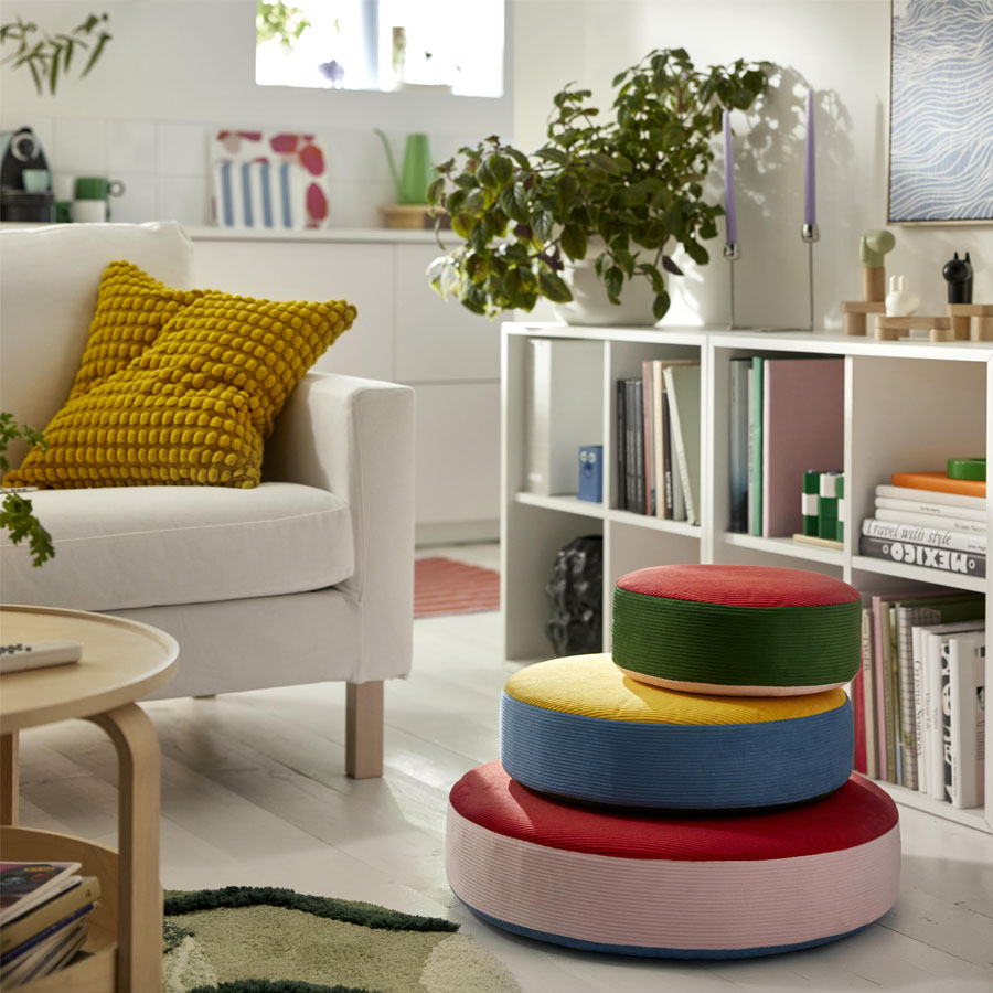
Mais en tant que designer, quelle image aviez-vous de l'univers enfantin d’IKEA avant de commencer ?
J'ai toujours pensé qu’il s’agissait d'un petit monde à part entière. C'est un endroit où l'imagination peut s'épanouir, où les objets ne sont pas seulement fonctionnels, mais ouvrent la porte à de petites merveilles quotidiennes. En même temps, concevoir des produits pour les enfants est une grande responsabilité. Nous disons souvent que les enfants sont nos clients les plus importants, et cette conviction façonne tout ce que nous faisons. Pour en revenir à l’aspect créatif, si nous voulons stimuler l’exploration ou de nouvelles façons de jouer, la sécurité reste primordiale. Nous étudions donc différents groupes d'âge, nous cherchons à comprendre comment les enfants bougent, pensent et interagissent avec le monde, et parfois, nous les invitons directement à participer au processus de conception. Pour cette fois, un petit groupe est venu au siège de la marque utiliser nos prototypes et nous avons regardé.
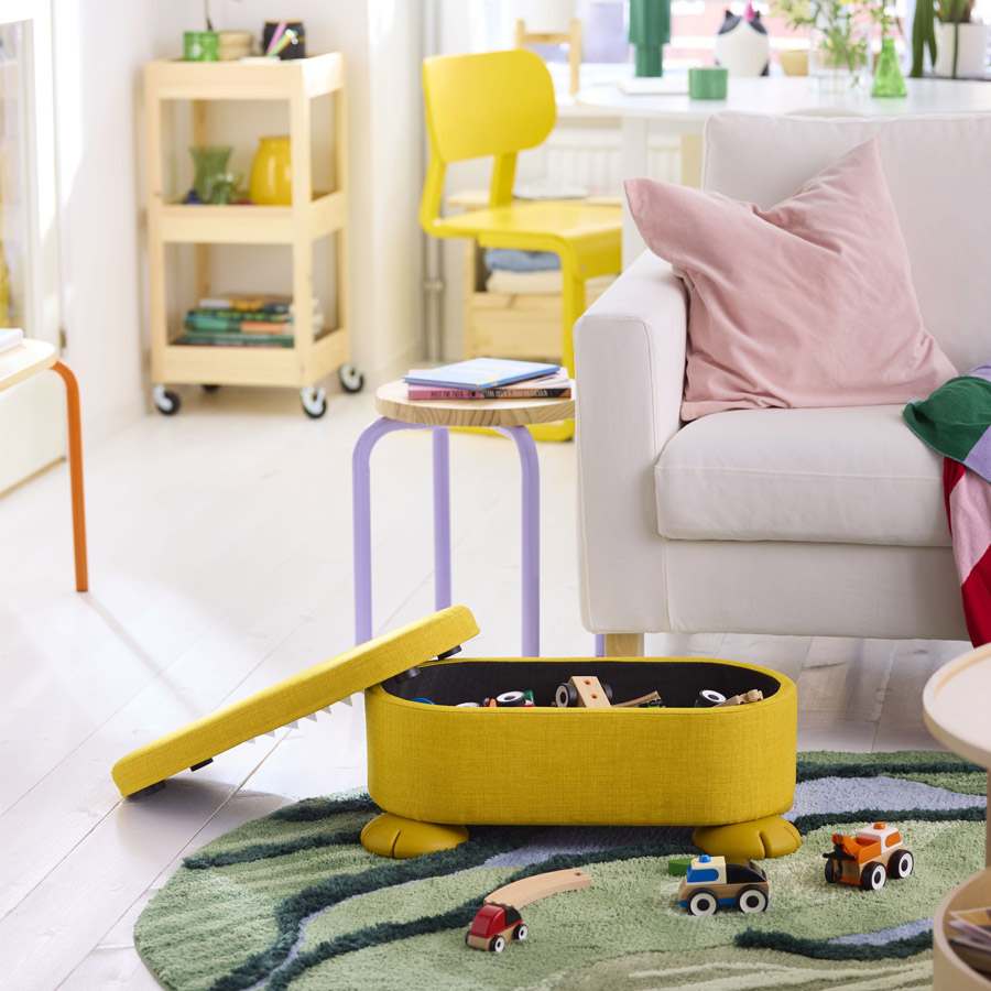
Lorsque l’on regarde la collection, on voit que les animaux sont omniprésents et semblent évoquer des monstres sympathiques ?
Les animaux apparaissent tout au long de la collection et, dans mon cas, ils ont pris la forme de deux personnages imaginaires conçus comme des décorations murales à assembler soi-même. J'ai été séduite par l'idée de créer comme moyen de tisser des liens, car fabriquer quelque chose de ses propres mains permet de se sentir connecté à cet objet d'une manière plus profonde et plus personnelle. Enfant, j'aimais collectionner des objets issus de la nature, courir après les papillons, observer la forme de leurs ailes, leurs motifs, leurs minuscules détails. Ces pièces sont une réinterprétation ludique de ce souvenir fondamental. Aux côtés des oiseaux et des insectes, elles vivent quelque part entre réalité et imagination.
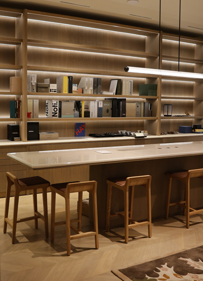
Nouvellement constitué, le groupe Accent Rouge a ouvert un nouveau showroom rue du Mail, à Paris. L’occasion d’échanger avec Daniel Setton, son PDG.
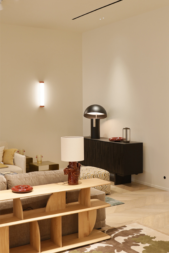
Avec l’ouverture de son showroom de 400 m² rue du Mail, en plein cœur de Paris, Accent Rouge franchit une nouvelle étape de son développement. Pensé comme un lieu de démonstration et d’échanges, cet espace met en scène l’ensemble de ses expertises - lumière, chauffage, portes & poignées et mobilier - au service des architectes, prescripteurs et professionnels de l’immobilier. Fort de 40 ans d’expérience, de 120 collaborateurs et de trois espaces d’exposition entre Paris et Lyon, le groupe affirme à travers cette adresse la volonté de proposer des solutions concrètes, techniques et adaptées, portées par un interlocuteur unique. Daniel Setton, PDG du groupe, revient pour nous sur la genèse de ce projet et sur la vision qui accompagne cette dynamique.
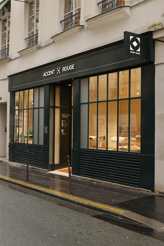
Le groupe Accent Rouge est l'héritier de quatre marques. Pouvez-vous nous en parler et nous expliquer cette volonté d'évoluer sous une seule et même bannière ?
Accent Rouge est né de la réunion de quatre marques historiques : Le Cèdre Rouge Business, Inédit Lighting, Passage Portes et Poignées sans oublier Worldstyle. Depuis plus de 40 ans, chacune d’elles a développé une expertise forte et une légitimité reconnue dans son domaine respectif. Cependant, au fil des projets, nous avons remarqué que nos clients ne cherchaient plus une réponse segmentée, mais une vision globale. Il nous manquait un lien visible, une bannière commune capable d’exprimer notre capacité à accompagner un projet dans son ensemble.
La création d’Accent Rouge marque cette évolution. Elle incarne le rassemblement de nos savoir-faire sur fond d’expertise, d’exigence et d’un sens du service. C’était aussi une manière d’affirmer notre positionnement en proposant des solutions décoratives et architecturales globales, cohérentes et sur mesure. Aujourd’hui, le groupe offre un accompagnement transversal, de la conception à la mise en oeuvre.
Votre expertise se scinde en 4 volets, à savoir le mobilier, la lumière, les portes et poignées sans oublier le chauffage. Qu’est-ce que cela change d’avoir une expertise globale ?
Cette approche transforme profondément la manière de concevoir un projet. Elle permet d’offrir une vision d’ensemble, portée par un interlocuteur unique capable de coordonner toutes les expertises. Pour nos clients, quels qu’ils soient, cela représente un véritable gain de temps. Mais c’est également la garantie d'une cohérence esthétique et technique.
Il faut bien comprendre qu’un projet ne se résume pas à juxtaposer des éléments. La finition d’un interrupteur peut dialoguer avec celle d’une poignée de porte, d’un montant, ou même d’un sèche-serviettes. Les matières, les teintes, les textures se répondent. L’ensemble doit s’accorder pour créer une harmonie globale. C’est cette capacité à penser le détail dans une vision d’ensemble avec nos clients qui fait la différence.
Vos projets s’étendent dans les secteurs de l'hôtellerie, des appartements privés, mais également des institutions culturelles, de l’urbain etc…. Comment le travail de votre bureau d’études s’articule avec celui des prescripteurs ?
Notre bureau d’études joue un rôle central. Il fédère les expertises techniques de chaque pôle et travaille en étroite collaboration avec les architectes, designers et maîtres d’ouvrage. Chaque domaine possède ses exigences spécifiques. En éclairage, par exemple, nous intégrons les contraintes normatives, les niveaux d’éclairement, l’efficacité énergétique ou encore la scénographie lumineuse. En chauffage, nous travaillons sur les puissances nécessaires selon les volumes, les usages, les systèmes de pilotage — notamment dans l’hôtellerie où le confort et la gestion énergétique sont essentiels. Sur les portes et le mobilier, la maîtrise des normes (coupe-feu, acoustique, tissus non-feu, accessibilité…) est déterminante. Notre rôle est d’anticiper ces contraintes techniques pour permettre aux prescripteurs de conserver une liberté créative totale. En fait, nous nous positionnons comme un partenaire technique et esthétique.
Vous travaillez avec des marques très connues comme Vitra pour le mobilier, et d’autres plus confidentielles comme l’éclairagiste espagnol Parachilna. Comment ce corpus est-il choisi ?
Le choix d’une marque résulte généralement d'une vision partagée. Nous privilégions des partenaires - majoritairement européens - qui défendent un véritable savoir-faire technique, une identité forte et une qualité de fabrication irréprochable. A partir de là, chaque marque doit apporter un univers distinct, tout en offrant une complémentarité avec les autres. Nous aimons révéler des signatures plus confidentielles, mais nous assumons aussi la présence d’icônes du design. Notre rôle est d’orchestrer cet équilibre tout en étant attentifs aux engagements environnementaux, aux matériaux recyclables, aux démarches RSE et aux innovations durables, qui deviennent aujourd’hui incontournables.