


Kvadrat
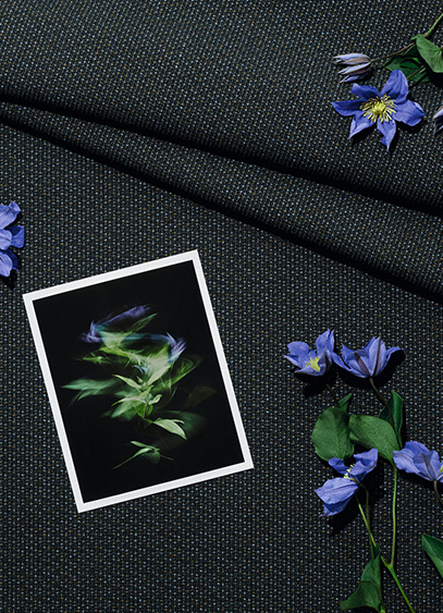
For its participation in Milan Design Week 2026, Kvadrat is unveiling two exhibitions this year: one paying tribute to designer Frans Dijkmeijer, and the second dedicated to the new Twisted Flowers collection, reimagined by Giulio Ridolfo. It is an opportunity for the latter—regularly hailed as a master of color—to discuss his work and his approach.
A key figure in the world of textile design, Giulio Ridolfo has been collaborating with Kvadrat since 2007. Coming from the fashion world, the man who now dresses furniture is the creative force behind several of the Danish brand’s bestsellers, including Canvas 2, Remix, Steelcut, and Zulu. With an approach rooted in color but deeply connected to the technical dimensions of yarn, the designer develops a vibrant, lively, and resolutely contemporary language where innovation takes center stage. His creative process is often described as a blend of intuition, anthropology, and a form of self-taught botany. It was precisely this floral inspiration that led him to explore an archive by Frans Dijkmeijer, which he has reimagined and expanded into 21 colorways. Giulio Ridolfo discusses this technical and stylistic endeavor on the occasion of the "In Rainbows" exhibition. To discover the collection as staged by architect Lorenzo Bini, visit the Kvadrat showroom in Milan at Corso Monforte 15.
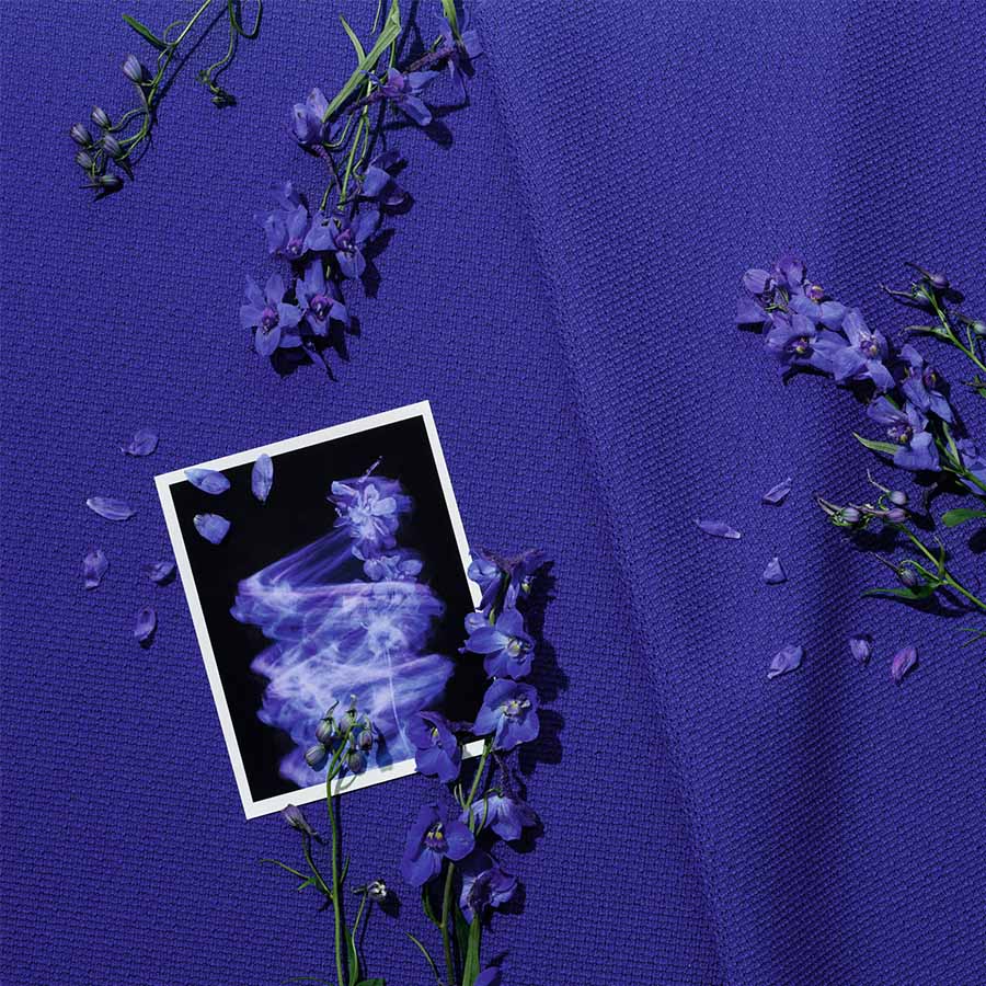
For Milan Design Week, Kvadrat is presenting the "In Rainbows" exhibition, where visitors can discover the Twisted Flowers collection. What is it all about?
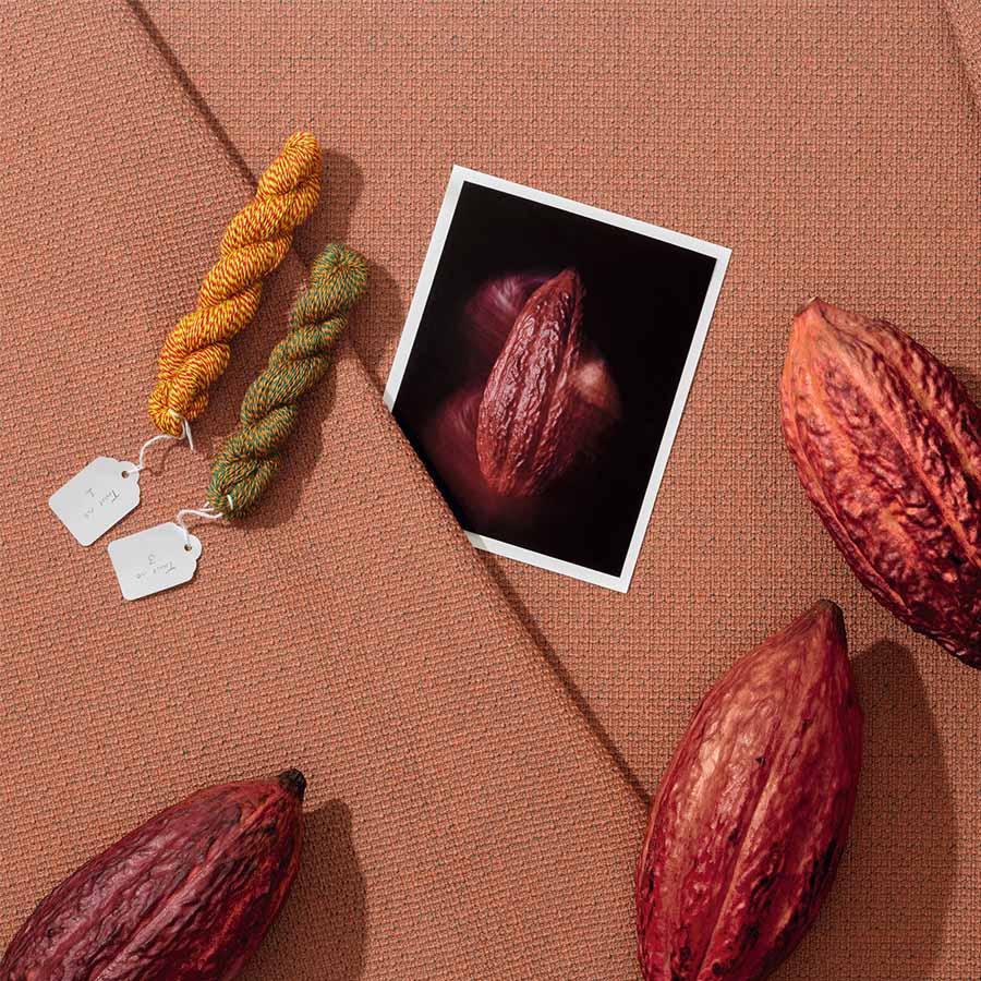
Twisted Flowers is a story of composition between my work and that of Frans Dijkmeijer. This collection is a revival of a weave by the designer—who passed away in 2011—which we have reimagined with a real focus on the tactile and visual experience. As is often the case, and it was a shared passion with Frans, I worked with color by drawing inspiration from flowers. We collaborated with a company to select seasonal plants—not exotic ones, but those linked to our environment. For example, you can find the red of the Fritillaria imperialis, the blue of the Ceanothus thyrsiflorus, and the yellow of the Gossypium, which together almost form a bouquet. I sought to translate the very experience of picking flowers into color, by observing them closely and immersing myself in floral paintings like The Dream by Odilon Redon, which I saw in Bern years ago. I was struck by a sense of suspension. It wasn’t exactly dreamlike, but suspended, with undefined colors and a meditative figure. Of course, what we have done is not a literal translation; the blue is not simply blue, and the red is not just red. It’s not like using a Pantone swatch book, which I don’t like at all. Instead, we selected colors capable of creating a kind of interference, a beautiful vibration, a pixelation of the object’s skin.
And you are presenting this in a unique setting…
Absolutely. The showroom area is usually reserved for sales, but not here. At first, I thought about hiring a florist, but I ultimately preferred to work with the structure itself, thanks to Milanese architect Lorenzo Bini. The idea was to invade the space and transform it with a more whimsical, almost magical effect. I didn’t want a clean, minimal space; I wanted to create a pleasant passage where people can linger and appreciate the quality of the colors. In this "hut," there is also furniture—ranging from standard contemporary Danish and Italian designs to pieces by great names like Carlo Scarpa, Cecilie Manz, Finn Juhl, and Jean Nouvel. And since I am very drawn to music, I collaborated with a music programmer in Milan. We have planned four performances based on vibration, intuition, and phasing, which is a technique used by Steve Reich. In fact, this installation is almost a manifesto.
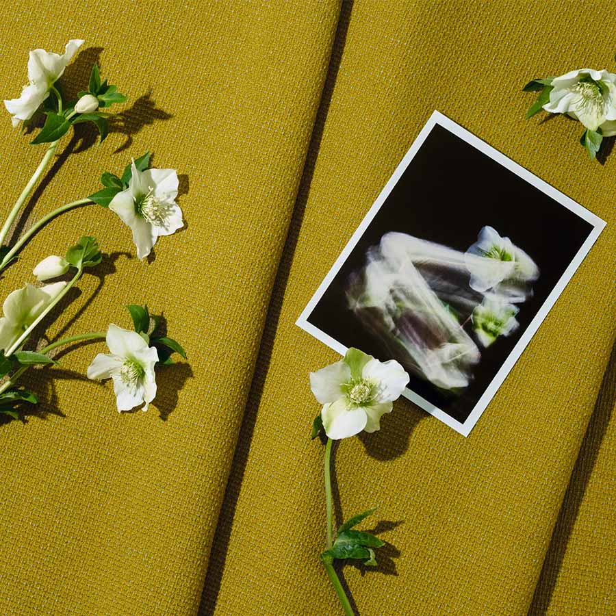
You previously mentioned the work of Frans Dijkmeijer, to whom Kvadrat is dedicating a biographical exhibition at the Triennale. What was your relationship with him like?
The relationship with Frans began with great mutual respect. He thought in black and white to reveal the flaws and beauty of construction, while I worked freely with color. That was the starting point of our relationship. I originally come from the fashion industry, where I was used to handling textiles for dresses, and for the past fifteen years, I have been working on furniture pieces. I gradually became a colorist through long practice in selecting shades, textiles, and materials for companies in the furniture sector. In a way, my primary occupation was to help a project be seen, from the prototype to the industrial solution, which is what I did with Vitra and Moroso, where I started. When I was offered the chance to work with the brand, I knew textile design, but I didn’t want to become a textile designer. However, I was happy to intervene on color, provided I could establish a dialogue with the creator—and as it happens, that creator was Frans Dijkmeijer. One of my first exercises alongside him was to color a fabric with a very pronounced grain, a pinpoint which looks like grains of rice. That is how Steelcut was born; its name comes from "Cut Steel," a Victorian-era technique where iron was cut into diamond shapes to mimic the sparkle of precious stones. It was a foundational project that defined my position.
You are a colorist, but your perspective on textiles is also deeply technical, particularly regarding three-thread weaving, isn't it?
The idea that I work with three threads has become famous, but in reality, I can work with five, six, or just one. It all depends on the situation. I am very drawn to the gouache work of 20th-century artists like Paul Klee, or to a certain musicality, like that of Sibelius. For me, the complexity of a construction adds an extra quality to the color. I once saw Frans use one white thread with two black ones to reveal potential errors in the weave and understand the disruptive element. It was an artisanal way of enriching his creations. But at the same time, working with Kvadrat taught me great rigor. Their textiles must last, be reproducible, and the approach is almost scientific. You cannot have uncontrolled variations. In this context, the idea of working with three colors was born as an intuition. I wanted to understand what vibration might emerge by adding a third thread. When we developed Steelcut Trio, the results were astonishing because there was an iridescent effect, like in silk or taffeta, but with an essential difference. Where taffeta has two sides, this has three. It creates depth, a relationship between light and shadow, a kind of perspective. We continued this research, drawing inspiration from different textiles, until we created a thread composed of three distinct colors. Each thread itself became a complex blend. Two threads constructed this way give an impression of infinity where the color is never fixed. It is this technical expertise that gave rise to Remix, and which we continue to develop today.
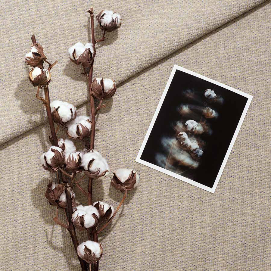
The vibration of colors, the notion of instability, of movement… there is a living quality that almost brings to mind fashion, isn't there?
Movement is inherent to fashion because textiles are on bodies and they move. You have a kind of third dimension that must be taken into account. When I work with a textile for furniture, it is more sculptural. You can walk around it. And then, furniture has the particularity of being able to be equipped with accessories or additions that can modify impressions and feelings. Fabric is one of them. With certain fibers like those from Kvadrat, the structure must be robust, but the fabric can give another impression, of lightness for example. That is specific to furniture.
From that point of view, do you consider textile to be a kind of filter?
If you are referring to semiology like Roland Barthes, then yes, it is a filter. But in reality, it is not. Fabric is the first thing you touch; it is the skin of an object. And in that sense, it is very sensual, because when you see a piece of furniture, you touch it first, then you say "what a beautiful sofa," "what a beautiful object"... It is, let's say, in synchrony with the form of the object. The filter comes into play when you filter information, when you start considering whether it is the right textile, the right sofa for a given use, or the right color... at least, that is how it seems to me. But I am a colorist, and being a colorist means starting with the thread, not the final coloring.

En ce début d’année 2024, la marque de mobilier basque Alki s'associe au danois Kvadrat à travers une nouvelle gamme de tissus dédiée à ses assises.
En proposant une gamme de tissus texturés faisant la part belle à la matière, Kvadrat vient rehausser, sans dénaturer, l'esthétique simple et précise d'Alki. Avec cet apport de matérialité en radicale opposition avec les lignes directes des modèles en chêne, la marque danoise joue avec le regard et fait du relief un élément graphique. Une manière d'intégrer une autre sorte de fantaisie dans tous les espaces, du café au bureau.

L'alliance de la technologie et de l'artisanat
Spécialiste du textile dans l'architecture et connue pour ses produits décoratifs (tapis, rideaux...) ou ses solutions acoustiques, Kvadrat propose son expertise dans un domaine qui lui est complémentaire. Particulièrement attachée à l'esthétique scandinave, l'entreprise fondée en 1968 intègre ses connaissances techniques et technologiques à une marque française dont les lignes contemporaines ne sont pas si lointaines de celles du Nord. Une collaboration entre deux pays, mais également entre deux savoir-faire, rassemblés par un goût commun pour les formes et les volumes.


Jusqu’au 9 mai, Kann Design présente ses nouvelles collections au showroom Kvadrat. L’occasion de découvrir en avant-première la collection Atlas et la nouvelle version de la chaise Tal imaginées par Leonard Kadid, ainsi que les tables Toucan d’Anthony Guerrée.
Crée en 2010 par Houssam Kanaan, Meghedi Simonian et Rudy Bou Chebel qui partage une même passion du design moderne et fonctionnel, Kann Design s’est très vite démarqué en multipliant les collaborations avec les designers. Toutes les pièces sont réalisées à l’atelier Kanaan dans un petit village du Liban. Un héritage du père d’Houssam, ancien artisan ébéniste et gage d’un véritable savoir-faire et d’une maîtrise de l’ensemble de la chaîne de production : des premières ébauches à la commercialisation.
Des collections qui allient confort, durabilité et fonctionnalité
Pour la collection de canapés et fauteuil Atlas, Léonard Kadid a effectué de nombreuses recherches sur le confort et la durabilité. Avec une structure intégralement réalisée en acier tubulaire thermolaqué, celle-ci est facile à transporter et peut être installée aussi bien en intérieur qu’en extérieur. Par ailleurs, tous les coussins fixés sur la structure grâce à un système de clips sont amovibles et peuvent être retirés facilement. La forme « ouverte » de l’assise, offre une diversité de positions à ses utilisateurs. Disponible en plusieurs couleurs, le tissu Kvadrat choisi pour couvrir les coussins peut être adapté à une utilisation intérieure ou extérieure.

Aussi, pour l’occasion, Léonard Kadid présente une version grise de sa chaise Tal. Une réalisation dont la structure est faite d’aluminium et de bois, et dont les profilés en aluminium en T renforcent l’assise en contreplaqué et permettent aux pieds en bois massif de s’y verrouiller. Assemblés en quelques mouvements seulement, tous les modèles sont livrés en kit, à plat.


Kann Design présente également les nouvelles tables Toucan, dessinées par le designer Anthony Guerrée. Une collection particulière puisque les plateaux de ces dernières sont réalisés à partir de tissu recyclé Kvadrat Really.

Après Raphaël Navot en janvier, c’est le studio Muller Van Severen, composé de Fien Muller et Hannes Van Severen qui a été désigné comme designer de l’année pour l’édition de septembre de Maison&Objet.
Studio fondé en 2011, Fien Muller et Hannes Van Severen étaient respectivement issus de la photographie et de la sculpture avant de se lancer dans le design. Basé à Gand, le duo belge devenu Muller Van Severen, s’est affranchi de leurs deux champs créatifs d’origine pour investir le vaste territoire du design, avec l’envie de bousculer les codes et les usages du mobilier d’intérieur.
Des pièces alliant couleur et avant-gardisme
A travers un langage stylistique basé sur la juxtaposition de matériaux et de couleurs dans une étonnante épure formelle, le duo s’est vite démarqué comme figure incontournable du design contemporain. Leurs pièces souvent avant-gardistes, anticipent autant les tendances que les mutations sociétales.


Pour les mettre à l’honneur, la prochaine édition de Maison&Objet, qui se tiendra du 7 au 11 septembre prochain, retracera leurs douze années de création du duo à travers une exposition toute en couleur, imaginée comme un reflet de leur territoire créatif et qui réunira des pièces de leurs séries iconiques comme Future Primitive, Wire ou Alltubes. L’occasion également de présenter de nouvelles productions et commandes, telles qu’une série de vases pour Bitossi, un tapis imaginé pour le leader du textile d’ameublement Kvadrat, ou encore une lampe de sol développée pour valerie_objects.

.svg)


.svg)